VISUAL ART: A Summer Feast
Critic Mason Riddle took in the second annual "Summer Invitational" group show at Thomas Barry Fine Arts (on view through August 29). She found the selection of work to be varied and satisfying, a good example of Barry's unique curatorial vision.
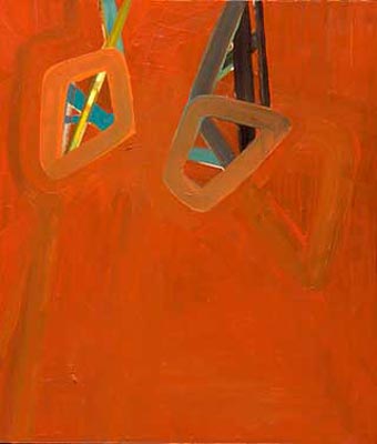
WITH THE DOG DAYS OF SUMMER UPON US, THE ART WORLD barely sounds a whimper. But, when the work of a deceased artist appears in a summer invitational show, you know that gallery has it goin-on, heat doldrums or not (apparently, even with the Other Side). In addition to drawings by the late French artist Medina, Thomas Barry Fine Arts Summer Invitational II also features a mélange of work by nine others: Ute Bertog, Gregory Euclide, Alexa Horochowski, Wing Young Huie, Suzanne Kosmalski, and Clarence Morgan, all of whom are based in the Twin Cities; there’s also work from Ulrike Heydenreich (Dusseldorf, Germany), Constance Lowe (San Antonio, TX), and Jennifer Onofrio (Augusta, GA). The exhibition has no specific thematic focus which links the pieces. Rather, the assembled group reveals something key about Barrys curatorial eye, offering up a mix of paintings, drawings, photography, prints and sculpture.
Each of Medinas two marker-on-paper drawings, Tattoo # 11 and #14, both from 1990, is a trippy web of black lines animated by biomorphic shapesflora, fauna and strange tower-like forms whose interiors are sometimes filled in like coloring book imagesin a vivid red, yellow, blue and green (marker colors, natch). The overall effect is a dense brew of sensibilities, variously suggesting work by untrained artists, idiot savants, children and certain Surrealists. (Although Barry is uncertain of the year of her death, documents show that Medina was working in Sarasota, Florida as recently as 2001.)
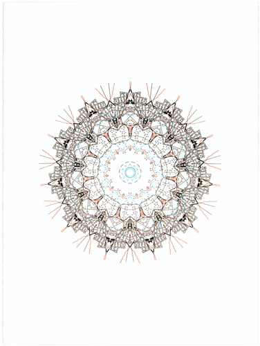
Polar opposite in tone, but equally complex are Heydenreichs three elegant letterpress prints: Doily (1), (2), and (3), all 2008. Where Medinas drawings are expansive in gesture Heydenreichs are restrained, cerebral expressions evocative of the hypnotic nature of Hindu mandalas. Although Heydenreich’s prints do not symbolize the universe (as do mandalas), and though their ironic titles certainly dissuade us from thinking of them in such lofty terms, the Doilies‘ elaborate circular forms are singularly focused around place. Their intricate systems of lines, dots and geometric forms are, in fact, derived from actual city maps.
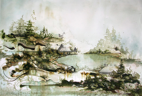
Gregory Euclides pencil-and-acrylic-on-paper painting (While the fissures filled long coffees and sinking rooftops) is as ethereal and mesmerizing as an 11th-century Sung landscape painting. Created this summer in Budapest, the paintings muted palette of greens, browns and neutral hues meld with Euclides superb sense of line and composition, evoking a palpable weightlessness. Here, structural forms suggest winding roads, bridges, and all-but-hidden rooflines flow in and out of a rugged terrain of boulders, fir trees and placid water. In certain areas of the picture plane, Euclide asbstracts the landscape by collapsing the physical space depicted and employing multiple perspectives simultaneously, imbuing the scene with a mystical quality.
If Euclides work is dreamlike, Suzanne Kosmalskis series of digitally altered images of Marlene Dietrich border on nightmare. Titled The Face of Dietrich (14, etc.), the series of images of the film star range from merely unsettling to horrific. Individually, each piece is disturbing, but when installed collectively in a grid-like pattern, in spite of their modest small scale (7 x 5), the ghostly images form a narrative portrait that is cinematic in scope and which, ultimately, transfigures Dietrichs austere beauty into something macabre.
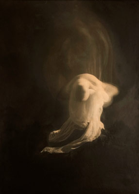
Leaving the viewer only a shade less uneasy are Jennifer Onofrios two oil-on-silver print works, which conflate the anxiety found in a Francis Bacon painting with glimpses of the nocturnal, visionary world of William Blake‘s watercolors. Ostensibly self-portraitsone work depicts Onofrio, shrouded in white, against a ghostly backdrop of a second rendering of her facethese visually and psychologically dark pieces seem to explore the nature of apparitionsor selfin convincing Romantic-Era style. Titled Mist and Breath, the paintings intentionally deny any clear reading, leaving the viewer apprehensive, if not unfulfilled.
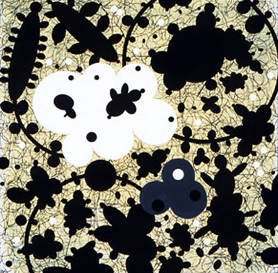
Clarence Morgans three, 12″-square, mixed-media-on-panel paintings, although modest in scale, depict a peculiar universe of floating biomorphic forms in black, white, and grey, on a subdued yellow ground. Highly stylized, the exuberant bulbous shapes suggest abstract, sexualized forms and the flat, stenciled patterning could work as a textile or wall-covering. However, the works content is belied by this decorative enthusiasm. The black and white forms function as symbols for Morgans personal exploration of race relations, bearing titles such as Cultural Cross Roads (2007) or Fragility of a Civilization (2008).
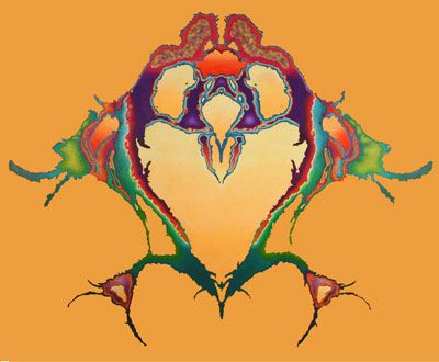
Constance Lowes two paintings, depicting vagina-like forms in psychedelic colors, are strangely reminiscent of the art of the late ’60s era in other respects as well. The works genesis lies in lowly inkblots on a folded piece of paper, each side the mirror of the other, which Lowe scans into the computer. The inkblot is then digitally altered and transformed into oil paint on panel. Titled Orange Alert Afterglow and Opal Island (both 2008), these highly retinal pieces are curious and graphic but, in the end, have a relatively short shelf-life.
Ute Bertogs two gestural, oil-on-canvas paintings are the antithesis of Lowes work. Where Lowes project a sense of process and perfection, Bertogs evoke the technical naiveté of a self-taught artist; yet they possess the compositional sophistication of a more experienced practitioner. What, at first, seems to be a simply constructed picture plane of abstract forms is, upon further viewing, a more complex layering of color and form. Slow to reveal their compositional integrity, the works’ tactile passages of off-key colors undergird clumsy, ambiguous shapes to create puzzling, but oddly associative work. In Eyes Wide Shut, the title seems to reference the simple but baffling maze-like form depicted; it’s evocative enough to prompt the viewer to try to make visual sense out of it, even if those efforts are to no avail.
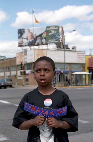
I have always thought of Wing Young Huies images as more creative non-fiction than documentary photography. A master of visually defining the essence of his subjectsshop vendors, people on the street, neighbors on a front porch watching the world go byHuie intensifies the everyday by magnifying significant details, no matter how mundane. It is as if he rids his images of irrelevant background noise, leaving only the beauty, the spinal cord of his subject. Such is the case with his three C-prints: Painter, University Avenue; Braiding Salon, University Avenue (both 2004) and, the striking Obama Street Vendor, University Avenue, (2008). In the latter, an African-American boy stands at a University Avenue intersection wearing a baggy black Obama T-shirt, pinned with a pro-Obama red, white and blue political button, while he’s holding an Obama-for-President bumper sticker in front of his chest which partially obscures the candidates face. With the streetscape of asphalt and storefront buildings splayed out behind him, the boy looks off-camera in puzzlement, perhaps even concern, at something (of which we’ll never know). The image is so topical and immediate at one level, and so mysterious and unknowable at another; it perfectly exemplifies Huies unique practice.
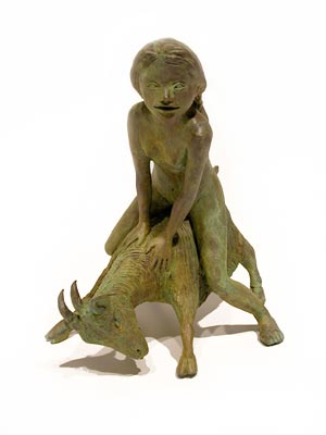
The only sculptor in the show, Alexa Horochowski, is represented by three small bronze figurative sculptures of young, naked girls (Arcadia I, II, and III). In one, a pubescent female sits on a tree stump, legs spread and smiling. Another is completely absorbed in brushing her hair, oblivious to the outside world. The third straddles a small goat. In the abstracted realism of their youthful, but not idealized forms, and tinged with the girls’ palpable self-absorption, Horochowskis sculptures suggest an art historical lineage to Degas bronze sculptures of young female ballet dancers, or even his bronze Le Tub which depicts a female bathing in a circular tub. However, there is something more disconcerting, naughtier about Horochowskis works than you see in Degas figures; and it catches the viewer off-guard, left to feel as if we’re voyeurs of intimate moments never intended for public view.
As with all group shows with no explicitly stated thematic focus, Summer Invitational II presents an ecletic range of work, with some pieces more provocative than others. But going to group shows at Thomas Barry Fine Arts is always bit of an adventure, if not a treat, because the visitor sees what one of the most individualistic curatorial eyes in town is up to, often highlighting work heretofore given little, if any, visibility in town. The viewer has the luxury of exploring ideas and accepting or not the work at hand. And that, alone, is worth the trip. Hopefully there will be a third.
About the writer: Mason Riddle is a critic and writer on the arts, architecture, and design. She is the current president of the Visual Arts Critics Union of Minnesota.
What: Summer Invitational II
Where: Thomas Barry Fine Arts, Minneapolis, MN
When: The exhibition is on view through August 29
Admission is FREE and open to the public