The Illustrated Man
Nate Patrin talks shop with prolific gig poster creator, illustrator, and comics artist DWITT.
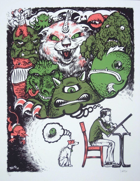
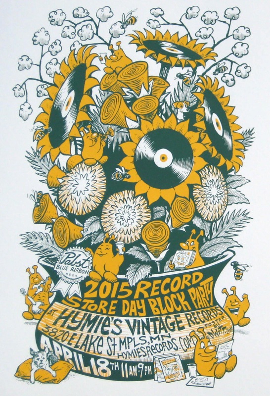
If you’ve been in a bar or a club at any point in the last 15 years or so, there’s a high likelihood you’ve seen some of David Witt’s art—and remembered it. As DWITT, he’s illustrated countless posters for band gigs, festivals, and special events: his Zombie Pub Crawl, Art-A-Whirl, and Record Store Day posters mix the fanciful and the everyday, often falling somewhere between outlandishly morbid EC Comics horror of the ’50s and subsequent decades’ psychedelic and punk-era Pop Art deconstructions of the same. There’s a versatility to his work that’s the end product of a wide-ranging portfolio—he’s equally at home illustrating identities for sunny bluegrass shindigs and subterranean metal throwdowns alike—and given his enviable inking prowess and eye for color, there’s a remarkable craft to his work that makes every line count. In an email Q&A, we talked about his education, his technique, and his appreciation for the local comics and illustration scene.
Who (or what) were some of your formative influences as an artist and illustrator?
The daily comic strips in the newspaper when I was a kid certainly got me excited about art early. First Garfield and Family Circus, then The Far Side and Calvin and Hobbes. Seeing new work daily makes an impression on you and starts forming your idea of what it will take to be a professional. When I was a teenager, I finally got into comic books and that was, and continues to be, a major influence.
Did the identity and sensibility of your work start falling into place through illustration, comics work, or a mixture of both?
It’s a constant work in progress. I got my BFA in painting and drawing with an art history minor at Bemidji State University (something you can’t do any more, because the administration gutted the program). When I was in school, I purposefully didn’t apply my comic book/cartooning know-how to my course work, because I already knew how to do that. I wanted to learn everything else. As a result, I have a big arsenal of styles to draw from, and they are forever in flux at to the top of my ‘favored look’ list, though I naturally lean towards a comic book/cartoony style.
How did you break into the band-poster scene, and how did that scene shape your work?
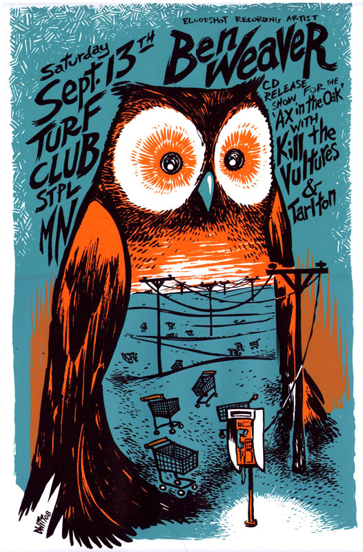
It all started as a joke in college. My friends and I forever talked about how, once we got out of college, we’d start a band. So we graduated, got jobs, then realized we could buy instruments. We decided who was going to play what, got our gear, figured out how to play it, and started playing together. Hammered was my first band and, as a result, became the first poster I ever drew after we booked our first gig. It was a eureka moment for me, as I instantly realized I could also draw posters for other bands. The appeal of [doing the] posters was huge. I didn’t need a gallery to show my work; I’d just slap posters up around town, which other bands would see and then hire me to create work for them. That’s how my work attracted the attention of Erik Funk of the Triple Rock and Dillinger Four in 2003. He asked me to be the official poster-maker for the Triple Rock venue when it opened; I was doing up to five flyers a week for them for awhile. All those touring bands coming through would see them, which spread around my work even more. The exposure eventually led to my designing an enormous banner for the band Bury Your Dead that hung behind them at Ozzfest, and later, drawing the opening screen, main menu page of the video game Guitar Hero II. Frank Kozik, largely regarded as the godfather of modern poster art, said, “You never know where your posters will end up and who will see them.” Brian Ewing, another great of modern poster design, said: “Think about every poster you do as a giant business card for yourself. Always include your contact info.” Heeding that advice and working all the time fed my idea that, if I constantly produced work, those efforts would continue to bring in still more work. And by some strange universal fate, that has proven true. Jobs keep showing up.
You’ve been freelancing full-time for more than a decade—what have been some of the unique challenges and benefits you’ve experienced along the way?
I haven’t had any regular income during that entire time. I’ve felt comfortable when I’ve landed big jobs, and then really stressed when nothing was showing up. It involves constant problem-solving on how to make ends meet, and that’s an ongoing process. I’ve appreciated the challenge, but would like some relief from the stress of the roller coaster.
Was there a particular way you found a stylistic balance between personal and commercial work?
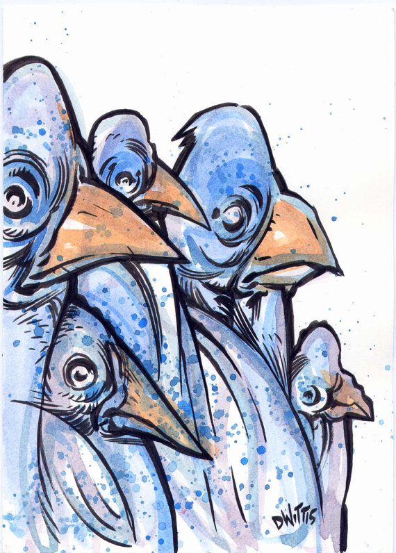
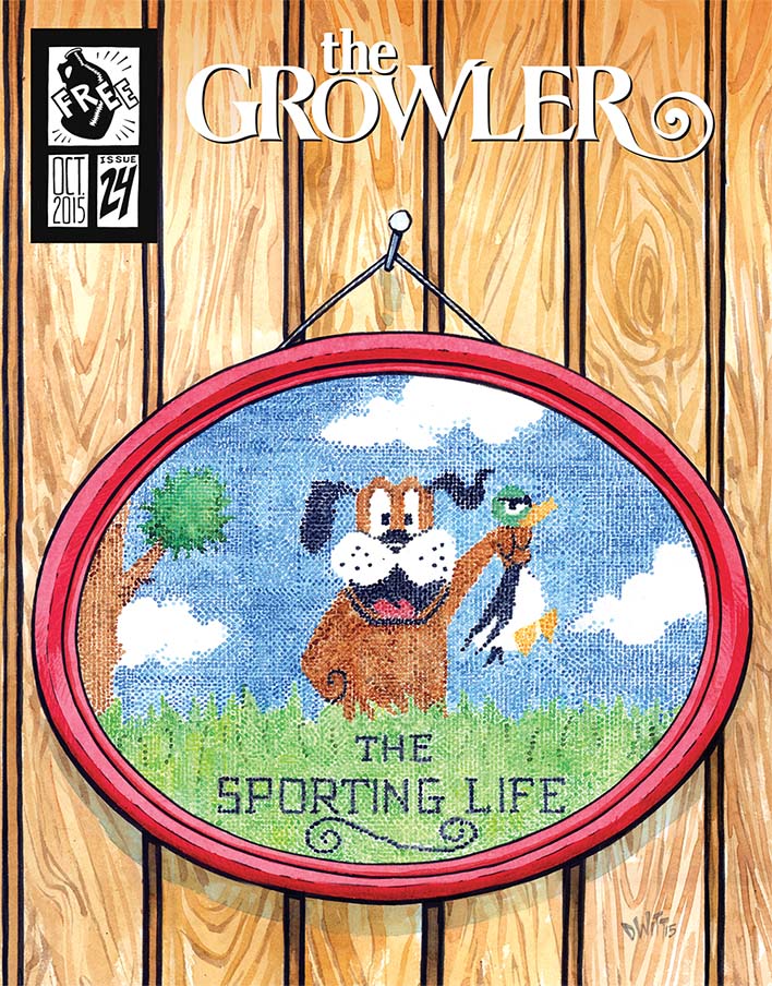
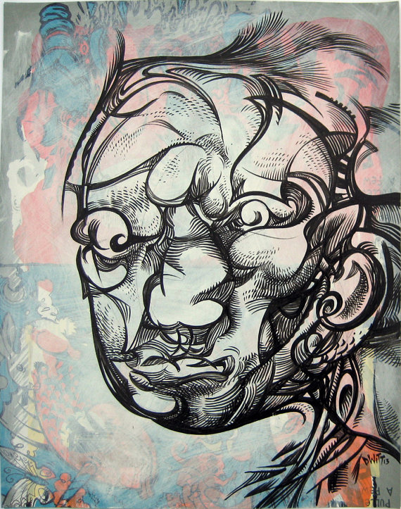
The work I do solely for myself, for instance my Portaits series, doesn’t yet have an audience. I make it ‘cause I have to and because it makes me feel better, not because I think it will sell. The commercial work often asks me to do things outside of my comfort zone (perfect example is issue #24 of The Growler, where I painted in watercolor a scene from a video game to look like a needlepoint image). I do enjoy challenging myself. As long as I am working, I am happy, and both sides of my artistic practice benefit from each other.
What are some elements of working and creating in the Twin Cities that seem the most uniquely beneficial to you?
The talent pool in our towns is ridiculously rich. Some of the best designers in the world live and work here, and because we’re not a giant metropolis like Chicago, we all know each other, too. It keeps you constantly trying to push yourself. I can’t look like I’m slacking when so many people who I respect and admire are essentially my neighbors. Having that kind of major talent is also great when you need to ask for advice; I’ve never been let down with getting valuable information from others’ experiences.
Related links and information:
Look for DWITT’s ink in the new comic written by Brent Schoonover, Back to the Future #1, published by IDW Publishing. See more of DWITT’s work on comic strip blog, DWITT Dailys, and on his website.
Nate Patrin is a lifelong Twin Cities resident currently residing in St. Paul’s Uppertown neighborhood. He has written about arts and culture, particularly music, for over 15 years, and also counts graphic novels, film, and visual design among his many aesthetic interests. His work currently appears in Pitchfork, Stereogum, Red Bull Music Academy, and elsewhere.