Undecided, But Leaning toward Skull: Political Art in the Age of Spin
Geoffrey Sirc thinks about democracy, what an informed public might be, and the role of image and images in this election, in this piece on the show "Art of Democracy: Tools of Persuasion," at the Minneapolis Institute of Arts.
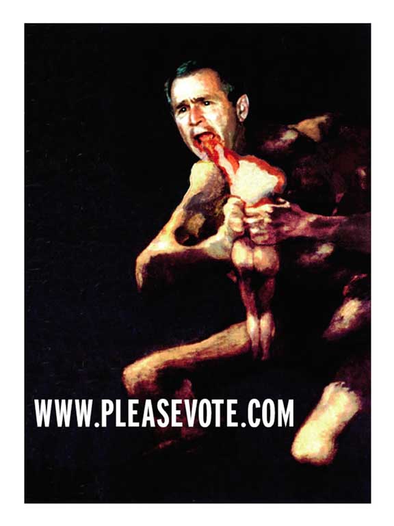
On the back cover of its July 5, 2004, issue, The Nation published an advertisement for www.pleasevote.com, an internet site serving, in their words, as “a call to vote the Bush administration out of office.” The ad’s image, designed by Richard Serra, was simply a digitally reproduced copy of Goya’s painting Saturn Devouring His Son, which had been altered so that Saturn now had George W. Bush’s head.
The original painting is pretty horrific, showing the manic Titan in a feeding frenzy, having already consumed the head and one arm of his son, now starting in on the second limb. As it’s one of Goya’s Black Paintings, the bright blood covering the child’s partially consumed body is especially gruesome, luridly gleaming amid the darker tones. Serra’s use of this painting to comment on Bush might seem obvious: Goya’s art strongly evokes a politics of humanity, of basic decency, of the need to combat our awful, war-like instincts. Robert Hughes, in his discussion of the Black Paintings, calls the Saturn picture “the most melodramatically horrible of the lot.” Hughes sees the work asking, and answering, a question that speaks precisely to why Serra decided to link the image to George Bush: “In what sort of a society would the fathers eat their young? Surely, one in which the old perceive the new as a deadly threat: a society so reactionary that ‘tradition,’ imagined as the absolute reign of total authority, is worth murdering for.”
What Serra has employed is a fairly common artistic strategy used to create propaganda – recasting a classic artwork, along with its specific associations, to make a contemporary political point. Take, for example, Mary Beth Edelson’s Death of the Patriarchy (1976), an offset poster in which she took Rembrandt’s The Anatomy Lesson of Dr. Tulp and replaced every male head in the picture, except that of the corpse being dissected, with those of feminist artists, in order to show how feminism was taking apart male domination. Or Russian artist Andrei Kolosov’s 1990 poster Homo Sovieticus, which simply superimposed a five-pointed red star on da Vinci’s drawing of the ideal human body, in order to mock notions of the perfect Bolshevik. But to the readers of The Nation, one of the country’s most prestigious and storied leftist magazines, Serra’s gesture was anything but common.
Readers (their comments published in the August 2/9 issue), were disgusted: “Its ghoulishness is akin to posters of aborted fetuses,” “Common decency dictates that this picture has no place in a respectable magazine,” “over the top,” “tasteless and out of bounds,” “obscene,” and “It will be used by the right wing to illustrate the values and desperation of liberals” were just a few of the angry comments registered. Clearly, these literate liberals were simply unfamiliar with the Goya original (no reader made note of its appropriation). Serra answered their flurry of outrage about the only way he could: “It’s a protest poster, and people ought to relax.”
The good news in all this – and relevant, I think, to the MAEP show, “Art of Democracy: Tools of Persuasion,” held at the Minneapolis Institute of Arts – is that a political poster can still unnerve. More worrisome is the way the Serra/Nation flap becomes one more example of the topsy-turvy, Orwellian strangeness that is present-day America, this opposite-land Maureen Dowd has termed “Bushworld.” You know the routine: want to roll back environmental protection and really let industry pollute? Just term your eco-crime the “Clean Skies Initiative.” And so now we have the very audience Serra tried to rally, the liberal left, spinning him instead of supporting him. What good is propaganda if it ends up unnerving the wrong people?
The “Art of Democracy,” then, is the perfect show of political propaganda for post-9/11 America, this era of the war on terror, when we supposedly can’t go back to business as usual – the “new normal,” as many call it. This show, open to all Minnesota artists, asked participants to create original artwork in any of the genres of contemporary political propaganda (lawn signs, posters, effigies, bumper stickers, T-shirts, buttons, and infomercials). The results range from the personal and crude to the slick and official, but with very few exceptions, they mostly leave the viewer with either a hollow sort of agreement or a vague disgust, depending on the color of your ideology. Not surprising: given this new normalcy, along with the stubborn reality of red/blue divisiveness, not to mention an undeniably thinned-out knowledge-base among our citizenry (Nation readers’ ignorance of Goya’s work being just one more painful example), can there be any effectively persuasive activist art?
It’s a weird time for propaganda, definitely its post-golden age. Fascists and freedom-lovers throughout history could always assume unmistakable clarity in the interpretation of their political art. But now, in the “new normal,” propaganda has become so thoroughly integrated in the everyday, spin having almost wholly subsumed news, that counter-propaganda’s enemy isn’t the might of the repressive regime, it’s the dazed, overmediated consciousness of its citizenry.
The only images that seemed to make powerfully persuasive sense in the past couple years were the little driblets of the real that somehow leaked out of the collective media pipe-dream: scenes of prison-abuse horror with which American soldier-torturers unwittingly incriminated themselves, the photos of US soldiers wounded in Iraq that the Times published, the President’s shifty eyes in a Florida classroom as he held a copy of The Pet Goat while a clock in the corner showed minutes ticking by, a picture of an airplane cargo hold filled with flag-draped coffins (a picture that cost its photographer her job), scenes of devastation in the Middle East, even the flash of Janet Jackson’s breast during the Super Bowl (the outraged response to which revealed that in Bushworld the horrors of war are nothing compared to the horrors of a black woman’s anatomy).
Such scenes had a power and immediacy that, while perhaps not changing minds, were effective in further reassuring, in adding to the horribly resonant complexity of the situation. They operated according to Virginia Woolf’s definition of photographs: “not an argument; they are simply a crude statement of fact addressed to the eye.” But even the response to crude facts today has been depressingly new normal: 248 dead in Iraq this week alone? Gosh; We went to war and there were no WMD? Huh; He knew about bin Laden’s plans? Oh well. Any one of these (or a dozen other abuses) would have been enough to lay a presidency low in the old normal. But now, it’s simply spun into spin.
The artists in the MAEP show, then, had a rough job penetrating these “fog facts,” as novelist Neil Genzlinger terms them (“important things that nobody seems able to focus on any more than they can focus on a single droplet in the mist. They are known, but not known”). I confess to feeling a bit underwhelmed at the results, though. Earnestness of whatever ideological stripe somehow isn’t enough anymore.
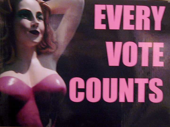
Several of the works in the show predictably try simply to get out the vote. Well, sure, of course. But you just can’t present that message in a way that’s uninflected by the Election 2000 debacle. There’s a lot of black voters in Florida who aren’t going to take the phrase “every vote counts” unironically. One poster in this show provides a nice antidote to simplistic pro-vote messages: an image of the flag and Lady Liberty with the caption “Are we really a democracy? Think about it – military absentee ballots not counted, Prevented from voting at the polls, Hanging chads.” The best of the few pieces here pointing out the way the “every vote counts” slogan comes laced with irony in 2004 is a lawn sign that uses that phrase to caption the photo of a blow-up sex doll, implying free elections as just another fantasy.
I’m a liberal, but most of the anti-Bush posters – as playing card joker, as idiot (with empty word balloon or, in bowling pin effigy, as “pin head”), as imperial (a Serra-like copy of David’s “Coronation of Josephine,” with the Bush Regime’s personalities Photoshopped in), as a computer-morphed Abe Lincoln (captioned with an excerpt from the letter Lincoln wrote as U.S. Representative during the Mexican War, on the folly of a president making war at his own pleasure) – in no way fanned my indignity. The various takes on the “Curious George” children’s book covers, featuring Bush as “Incurious George” (e.g., he “Goes to a Costume Party” wearing that appalling flight suit get-up) are undeniably clever. And the portrait of Bush composed of the small photos of soldiers killed in the Iraqi war is of course powerful. The problem, I think, is the one that underscores this election year for liberals. It’s all negative. It’s a NOT year. Who do we want? NOT Bush. And so one of the pieces in the show features Bush and Kerry being weighed in the balance, Kerry having the edge, and the caption reading one of the most popular phrases this election year, “The lesser of 2 evils.”
Almost all the leftist art simply cooed along with everyone’s outrage, congratulating the audience on their correct politics. You could reduce them all to the “Black Flag” piece (stars and stripes all black) — it’s bad, awful, emergency, what a mess; he’s a creep, isn’t he? But I don’t want to be congratulated, cause I’m not sure I should be. Where was the art that made us squirm, that made us feel guilty as hell? Where was the art that very rudely told us just how complicit we are in all this? I don’t want an easy truth about how superior someone’s humanity or concern is to George W. Bush’s. If I can’t have something that shows how we’ve at some level enabled it, then I’ll take something that entirely sidesteps piety to simply reveal the horror, as Serra’s Saturn rip tried to do, giving us, as Hughes reads Goya’s work, “a metaphor of human extremity – of the brutishness [. . . ] and terminal cruelty of an unchained appetite.”
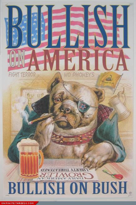
What I hated about the pro-Bush propaganda pieces was how perfectly they mimicked official media. That ‘KNOW/NO KERRY’ lawn sign — what a bore, what a perfectly dull simulacrum of the real thing. Worse are all the various old-timey posters (done by the same artist I assume, a busy little anti-Kerryite, I must say) – one, for example, showing a Winston Churchill bulldog in a pub, surrounded by phrases like “No phoneys” and “Fight terror” – which are classic examples of fascist art. It’s fascist art that always harkens back to the tradition, in both form (never forging a new style, so the nostalgic lettering and imagery of these throwback posters) and content (a longing for the lost golden age – hence, Churchill). In 1930’s Germany, for example, there were similar posters of Hitler on a horse, clad in a suit of shining armor. I want the old normal, too, but not that badly.
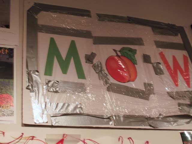
Like classic fascist art, the pro-Bush pieces reduce complexities to simple dichotomies (there are either phonies or the real terror fighters). Fascist art has always had that slick “look” to it (cf. Albert Speer); I’ll take a the simple rebus of “M+PEACH+W,” wrapped in Homeland Security’s officially sanctioned materials (plastic and duct tape) any day. And I guess I’d even take the fascist, pro-Bush stuff over the smarmy, arrogant, pseudo-critical work that righteously attempts to rise above the two-party system – such as the picture of two empty suits, one blue, one red – which, after 4 years of Bush, can only be seen as either ignorant, naive, stubborn, or insane. It’s like deciding to vote Nader in 2004; might as well tattoo “KICK ME” on your ass.
Most surprising, maybe, was the total lack of shocking imagery. Where was the nudity, the obscenity, the over-the-top tastelessness, anything to cut through the fog? For example, given the way the evangelical right has tried so hard to hijack this election, reducing the whole mess to the two non-issues of abortion and gay marriage, how about a “Jesus Was Gay” bumper sticker or something? Or something that exposes pro-lifers, who have nothing to say about the rising body count in Iraq, let alone uninsured children here at home, as pro-fetal-lifers only? There are a couple of welcome pro-gay posters, the best of which is the simple one showing very sweet school photos of 2 young boys, telling us these two have been committed partners for years. But still, where is ugly outrage? Where is Marilyn Manson now that we need him? The “Rapture Now! (And take the Bushies with you!” poster came closest here. I admit I liked it cause it voiced the “Hurry, Rapture!” mantra I’ve been using myself for years.
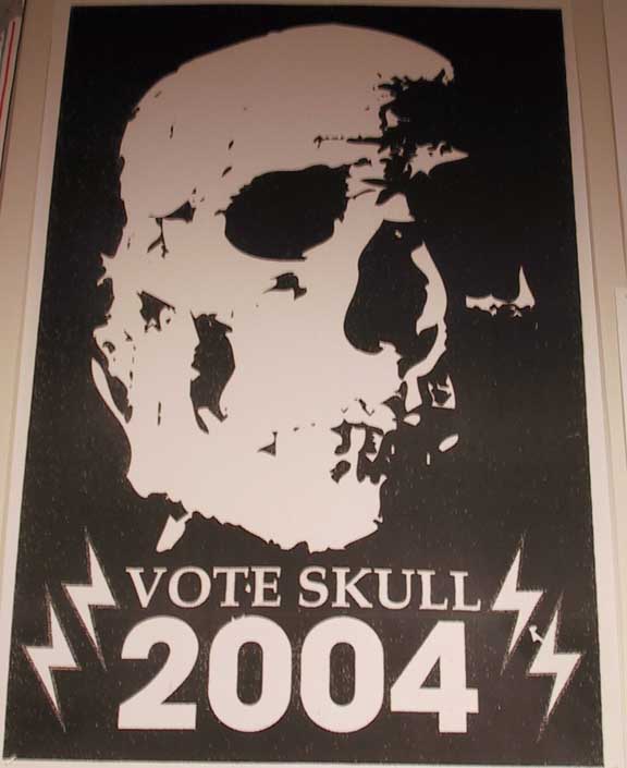
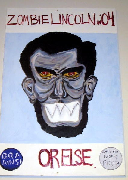
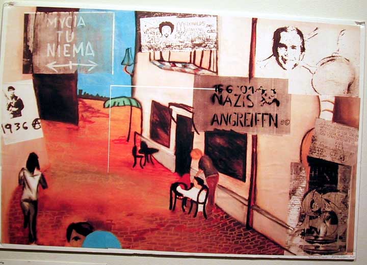
The show’s best work had no easy resolution. A photo of the young John Kerry, dreaming of a horse with an incredibly big erection. Queen Elizabeth, her pillboxed head flanked by two Houston Oilers helmets. The photo of a bishop in shades presiding while an American Legionnaire proffers a flag to a visibly distraught older couple. A stencil of a suit-jacketed skeleton pointing out “True politics are dead.” And who couldn’t support the two campaign posters from Dadaist fantasy elections – “Vote Skull 2004” and “Zombie Lincoln,” each with wonderfully outré images – which didn’t even take a second thought to seem utterly appropriate to 2004? Best, maybe, was the odd sidewalk cafe scene, which triangulated Ronald McDonald, Huey Newton, and the year 1936. It was a poetic text, refreshingly out of place in this collection of literal earnestness.
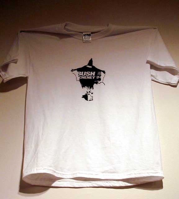
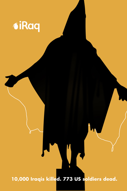
Mention must also be made of the ones that showed how the Abu Ghraib “Hooded Man” has now replaced Uncle Sam as the official logo of America. One was especially good, incorporating the image onto a slick “Bush/Cheney ‘04” re-election T. For many in the U. S. the Abu Ghraib images shocked in their seeming aberrance; for most in the Islamic world the prison abuse photos merely confirmed deep suspicions. Mark Danner comments on the power of those photos as a tool of Islamic fundamentalist democracy and captures the way, graffitied throughout Islam, they have assumed a shorthand power to represent new-normal America: “Had bin Laden sought to create a powerful trademark image for his international product of global jihad, he could scarcely have done better hiring the cleverest advertising firm on Madison Avenue.” Not only are they “perfect masterpieces of propaganda,” Danner writes, but they have “the considerable advantage of being true.” Another one of Serra’s pleasevote.com images also uses the Hooded Man, but more appropriate, certainly, were the “iRaq” posters that Forkscrew Graphics has been plastering all over L. A. since summer: showing how media slickness is the air modern American poster-makers breathe, their imagery uses the visual grammar of the iPod ad campaign, with all-black images of soldiers and the Hooded Man rather than hip hop dancers, to point out the insanity of our war against Iraq.
I don’t want to be too negative; I’m a victim of overmediation and a negative election year myself, of course. This show has been crowded with visitors each time I’ve been there. The presidential debates were widely viewed; people are hungry, perhaps, for some kind of political discourse that seems unspun. The Daily Show’s “fake” (i.e., “real”) news outdraws “legitimate” (= “spun”) network news among some demographic groups. So maybe posters make sense now; in a world where truth has coolly warped into a terrifyingly sophisticated new form of propaganda, people may be nostalgically drawn to the old-fashioned, clunky kind. Czech curator Marta Sylvestrová, who put together the Smithsonian Institution’s show of revolutionary posters from Central and Eastern Europe, noted how
“In liberal democracies such as America, poster art is overshadowed by television, broadcasting, film and video. However, under the totalitarian regimes of Central and Eastern Europe, all mass communications were under strict control of the governments; the way to communicate unofficial ideas was through posters, leaflets, and banners, ‘samizdat’ literature, and other forms of underground culture. The censoring authorities could not stop the production of hand drawn and privately printed posters appearing and reappearing on the streets, walls, and windows of the cities and towns during anti-totalitarian revolts.”
But in America today, the corporatized, centralized media seems synonymous with government, clamped down as tightly as it was in the former European regimes. So perhaps the need for posters has returned to our imperiled democracy. We are, indeed, back to wartime, a time in which the powerful image is needed because, as Henry James claimed about World War I, “The war has used up words, they have deteriorated.” But still I wonder about the artists in this show, so many of whom appear too cautious to exploit the full measure of whatever artistic license still remains: they talk a good anti-Bush game, but don’t they think free-speech abridgement is a rapidly evolving work-in-progress?
The thing that at first struck me strangest about the “Art of Democracy” show is how it’s confined to a small room in an art museum, rather than out in the streets. Of course, it’s wonderful to see crude, homemade passion exhibited on cool gallery walls. But it’s odd to have these works excised from the more typical everyday. I haven’t seen one of these posters in a Minneapolis context other than this gallery. It’s a dilemma: these works lose the battle of great art, of course, when compared with the other works in the museum; but, equally, they lose the power of clever, effective propaganda by being removed from the spaces in which they’d interrupt the daily flow of the passers-by who encountered them. The political poster, according to Polish poster artist Krzysztof Ducki, was supposed to be “a mediator between the street and the gallery.” Amassing them like this actually robs them of the force that one alone might have when encountered on a building front or utility pole. As populist revolution bubbled up throughout Europe, posters became the expressive medium of the movement, helping to topple regimes; they were a key exchange-space, which meant that the posters needed to be accessible to all, not just the museum-going public – a public which, if we are to believe the NEA’s latest statistics, is fairly low (26.5% of American adults attended an art museum or gallery in 2002).
I am rooting for this show, of course. Art can certainly help foster political change, but perhaps you need a populace that knows why it should look to art, one that has an informed viewing apparatus? A democracy’s artistic legacy seems vanishing before our eyes, taking with it the associational logic that enables its status as persuasive tool; if you don’t know the Goya referent, then you may very well have a pious, blathering response to Richard Serra’s heartfelt attempt to change the course of our nation.
This is a tough time for a show on art and democracy. On one hand, it never seemed more necessary (how many times have you read/heard/thought that the 2004 contest was the most crucial election in our nation’s history?); on the other, it’s a show about democracy in a time when democracy has never seemed more meaningless. Uh, democracy, that’s what we’re foisting on Iraq, whether they like it or not, right? Democracy, that’s what the disenfranchised Florida voters wish they’d had, isn’t it? Oh, I know: it’s when five partisan people in robes get to decide the course of a nation. Joan Didion writes recently about this time in our nation’s history when authority, to some, is worth murdering for. She casts her essay as if it’s a backward glance, reflecting back on a weird time gone by, the time when our country’s commitment to democracy proved to be as deep as its commitment, say, to art. It was a time, Didion writes, one could interpret either benignly or, more likely, disastrously: “That large numbers of Americans continued to support [President Bush] could be construed as evidence of their generosity, but it was also evidence of how shallowly rooted our commitment to self-government had turned out to be.” I’m awfully glad there’s interest in this show. I hope it means artists here are being galvanized in the same way they are in other states. I guess the best thing about this show is that it gets people into an art museum.