The Whole Point Is Wanting To Go: Concert Posters
Chris Olwell brings us news of the little-known world of concert poster design -- the big show last summer of the archives of such posters in Minneapolis was eye-opening. Here's what life's like for those who make concert posters in Duluth nowadays.


Designing concert posters is a tough job. Most people will pay no mind to the silent screams of these posters as they go about their work, their shopping, their errands, whatever it is that has them walking the streets of Duluth in the first place. Despite nagging questions about the effectiveness of their work, poster designers keep trying to create the image compelling enough to convince random passersby that it’s in their best interest to—indeed they must!– check out this show.
“That’s the whole point of a fucking poster!” Adam Guggemos said between sips from a PBR tallboy in the bar at Pizza Luce, where so many of his own posters have hung over the years. “The only thing it’s for is to engage people to show up at shows. If I could get away with putting more live, nudie girls on posters, I would.” Guggemos is himself a prolific designer; he’s done hundreds of posters in various roles for The Ripsaw, as a promoter, and for his publication The Transistor (a folded weekly broadside of entertainment news and scabrous lit, a fine Duluth feuilleton).
Mindy Johnson goes to great lengths to create attention-grabbing posters when her band, The Keep Aways, plays a show. Call her old-fashioned, but Johnson usually makes her posters by hand from felt and construction paper and stuff she cut out of some unfortunate periodical. Once she made dozens of interactive posters that gave viewers the option of changing the picture on the poster by turning a paper wheel, like a children’s book.
If some of Johnson’s posters do have a children’s-book feel to them, that’s because Johnson admits to being influenced by them. These influences lying behind the images, in the lives of the designers, are often what makes each designer distinct.
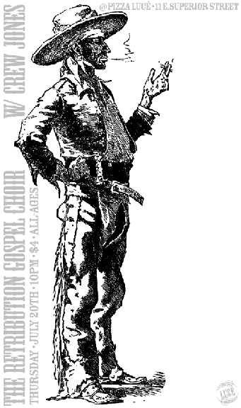
In fact, people familiar with Guggemos’s designs could pick his work out of a wall full of posters. Guggemos uses images from a wide, though distinctive, array of sources: Antique photography, 1970s romantic comic books for teenaged girls, clip art of old woodcuts, almost anything, preferably old and obscure, and always with a certain Guggemos air about it. His refers to his work as a “single-handed revival” of stuff that “for all intents and purposes, nobody’s ever going to see again.”
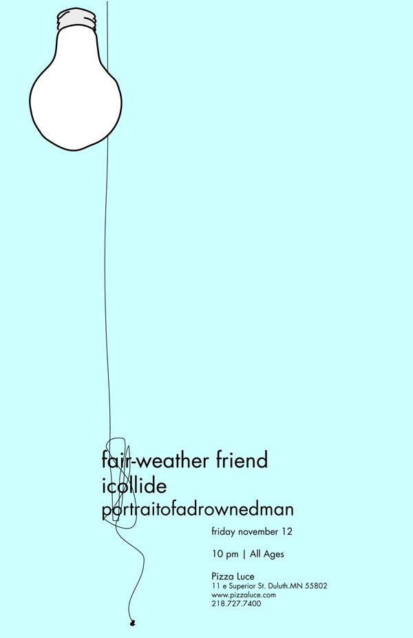
Others take a more measured approach to design. Paul Connolly and Zac Bentz both admit to being heavily influenced by Swiss Modernism, a design style that involves using grids to determine where images and text will go.
“It is like puzzles,” said Bentz’s wife, Steph, who met Zac when they were both students in the graphic design program at the University of Minnesota-Duluth. Sometimes they finish each other’s sentences. She continues: “A lot of design is like puzzles–”
“–They call graphic design problem solving,” said Mr. Bentz, who admits to spending days agonizing over the placement of some text or skull in his posters, “but sometimes a cool image just does it.”
With all these influences swirling through the minds of the designers, is there any room left for the music to inspire the posters? This may come as a surprise, but the music the posters are there to promote rarely influences the posters themselves.
“I just try to find something that’s compelling enough,” Guggemos said, “it doesn’t necessarily have to relate to the music. It’s gonna be harder to figure out what their style is like so I just go 100 percent the other direction.”
Johnson used to try to design images that give viewers a sense of The Keep Aways’ musical style, but making a poster look “punk rock” is no longer a priority.
“At first I thought ‘it has to look this way because it’s this kind of music,’” she said, “but I got out of that and started just doing things that look cool.”
By day, Mr. Bentz is a mild-mannered graphic designer for a local design firm. He likes his job, but the mass-produced corporate brochures he limns there leave him with a creative itch. Posters are his way of scratching.
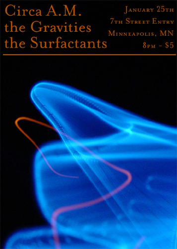
Mr. Bentz plays drums for two local bands, The Surfactants and The State Champs, and he has a solo project called Dirty Knobs. Designing for his bands pays significantly less, but Mr. Bentz said his most rewarding designs are often the result of work on their shows.
Paul Connolly knows that feeling too well. He’s corporate designer by day and a musician slash ‘zine publisher slash promoter slash poster designer by night, but he used to work at a local record store. He said he loved working at the record store because he’s always been into all kinds of music. But it still got old listening to music chosen by other people all day, so it was always sweet to hear the music of his choice when he got home–and that’s what designing posters is like for him. Sure, Connolly has to do them to meet his obligations, but that doesn’t mean he doesn’t glean some pleasure from it.
“It’s a good release,” Connolly said, “I think if I didn’t have anything else to do I’d probably make posters about how to get up and find my bathroom.”
Connolly puts out copies of his posters at concerts for the kids to take home. They pick up the posters and then go to a concert by some hardcore, punk, death metal band and when they leave the shows they still have the posters.
“They’ll roll ‘em up and save ‘em for a whole show,” he said. “I like to think it’s flattering.”
There are many ways to measure the effectiveness of a poster. To Guggemos, having his poster stolen is something to be proud of. If they care enough to tear down your posters, at least you know they’re paying attention.
“The only way you know when you’re doing a good poster,” Guggemos said, “is when you put it up and come back and look around–” Guggemos paused for dramatic effect, “–and it’s gone.”
“I hope someone is enjoying it somewhere,” said Connolly, who’s also had his posters stolen, too, and finds it a nuisance, “because now I have to come back on my lunch break.”
Many of these designers know that even their best poster could be more effective if they could reach just a few of the thousands of college students in Duluth and the surrounding area. But the college kids are a tough crowd to reach.
“It always sort of bewildered me,” Connolly said, “that no UMD kids would come down to shows.”
Over the years both Connolly and Guggemos have worked hard to promote shows that ultimately drew very small crowds. Guggemos calculates that if only one percent of the roughly 20,000 (his estimate) college students in Duluth are “weirdos,” (meaning they might attend a show) that there should be 200 kids at some of these shows. Of those 200, half will be “underage, uninformed or unaware.”
But his calculations are flawed, and when the reality sets in, Guggemos admits frustration with the enigma that is the college audience.
“It’s so hard. Getting people to check out music they’ve never seen before is the hardest part of my job,” he says. “Trying to crowbar people out of Grandma’s is impossible. Unless it’s like ‘free beer and boobies,’ people won’t come.”
But that is the life these designers have chosen. And they will no doubt continue, against the long odds, in their struggle to attract large crowds to the small bars and other venues of Duluth. One poster at a time.