East Calhoun Sculpture Living Stone or Dead Zone?
Another in our series of public art pieces, this is an attempt to assess what makes public art work.

Public art has a place; we need more of it, so that walking down the street is an adventure and a pleasure. We need it so that artists can make full-sized work and be paid for it. We need it to bring people together.
We need it, even though it sometimes doesn’t work out.
It was April, 1998. I was editor of a small neighborhood newspaper that covered the two neighborhoods east of Lake Calhoun, hence the East Calhoun News (ECN) was aptly named. We reported on an effort to take an abandoned triangle of land at the corner of East Calhoun Parkway and Lake Street and turn it into a vest-pocket park. It wasn’t big enough for something too big or too designed. There are no natural amenities, like a beach. It was not appropriate for a kid’s playground, because it was close to the heavily trafficked thoroughfare, and also because of lead in the dirt. So the idea went up to commission a sculptor and landscape artist to do something with this piece of turf.
A committee was formed, designs were considered, and a plan was chosen. Philip Rickey was the artist selected. He was at the time a professor at Gustavus Adolphus and working on an MA. He was instrumental in designing the site. “I view the whole site as a sculpture,” he said in the April 1998 issue of the ECN. “I was building from the base, looking for harmonious orchestration of the space and the sculpture. Once I saw the site, it came together quite easily. The sculptures serve as an overlay to the site itself.”
Sounds good on paper. Maybe he should have taken a second look at his design, instead of taking the first “easy” answer he had.
I look at this thing maybe ten times a week, and my opinion of it varies from thinking it is mediocre and acceptable to thinking it is a big fat waste of space and budget. Am I too literal? I don’t think so. I like abstract work, but it has to hit you right between the eyes or it just doesn’t need to be looked at. Henry Moore? Yes. Marc Chagall? Yes. Their forms say something, even if they can’t be defined or spoken about in anything but abstract terms.
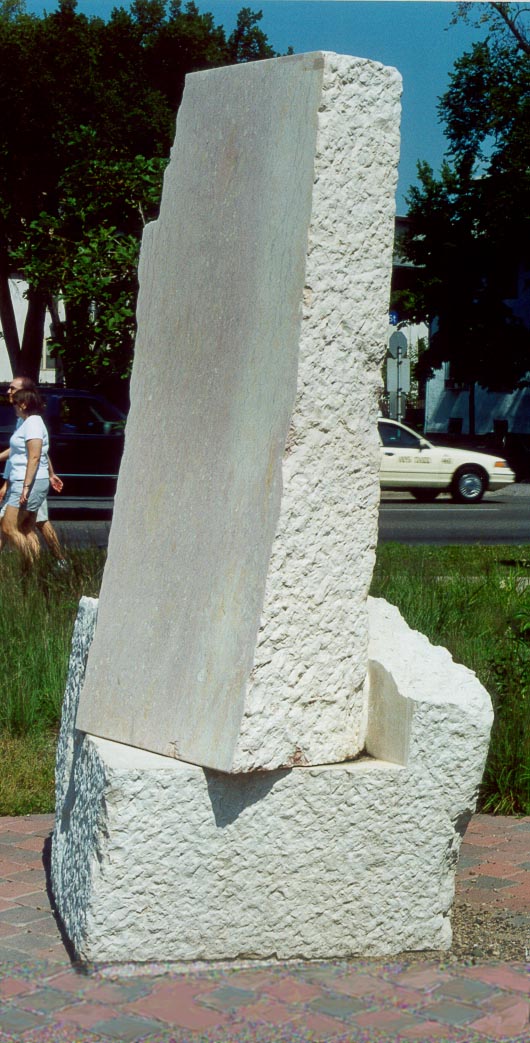
But here we have a set of 12 blocks, weighing in at 40 tons of stone, and I cannot see what it is saying. It looks half finished, like funding ran out before the sculptor could complete the work. Rough surface and smooth surface coexist, but do they create movement or excitement? Do they make a sense of anything besides being carved and uncarved? Not to me.
The piles of stone are surrounded by natural grasses and wildflowers, so that it has an emerging look, like this is a ruin of an ancient site where something used to happen. That’s just a guess. It looks to me and others like a series of sacrificial altars where goats used to be burned to placate the anger of Baal.
There is nothing in the assemblage that says Gateway, although it is technically called Gateway Park. There is nothing that says North America, or native America, or Minnesota, or European history, or anything. The stones are set in a way that in theory invites people to come and sit, to gather, but I have seen someone sitting there I think once in four years. There are no trees to provide shade, so you’d have to want to sit in the sun. The stone benches are as hard as a rock, frankly, so you’d have to prefer the stone throne to a grassy hillock, of which there are plenty within sight just a few yards away at the lake. Why sit here? No effort has been made to take this piece of triangulated real estate and give it something that sets it apart while becoming attractive. It is set apart, as in saying to everyone, “We are surrounded by welcoming environments. This is not one of them.”
The Gateway Park sculpture is not named in any visible way (maybe it’s there and I can’t see it, but should I have to hunt for it?). It’s not dedicated to anyone or anything. It fails as a gathering site, as a way-station for those on long walks, as a place for kids to play and hang out at, and as something to look at. It’s not grouped together enough to look intentional, and it’s not consistent enough to bring Stonehenge to mind. It is not enough in content and a little much in form. This is not a balanced, attractive, inviting piece.
It looks like something that does not want to be looked at.