Where Angels Fear to Tread: Douglas Padilla at Gallery Co
Michael Fallon finally reviews a show by Douglas Padilla, "Puerta de Angeles" (Door of Angels): it's up at Gallery Co on the seventh floor of the Wyman Building (400 First Ave. N.) through March 26.
Anyone who’s dipped a toe in the local visual arts pond knows the ubiquitous Doug Padilla. He’s the quintessential scenester, appearing at gallery openings, on artist panels, at museum gatherings, at artistic events. He himself has been known to arrange exhibitions, salons, and other events, mostly by the sheer force of his personality.
Full disclosure: Padilla has been a significant figure in my career as an arts writer in the Twin Cities. I first met him while writing a story for the local city weekly more than six years ago. But something has always kept me from writing a review of Padilla’s work–much as he’s tried over and over to get me to do so, sending me slick and savvy p.r materials and making occasional personal appeals. It could be Padilla’s very genius with p.r. that’s made me so wary of writing about his work.
Whatever the reasons for my past aversion, however, we are here now, my friends—with me checking out Padilla’s massive show, “Puerta de Angeles (Door of Angels),” up currently at Gallery Co through March 26. I’m taking this task on while doing my best to forget that I even know Padilla. I’m seeking honesty in my assessment, and I’m guessing that he’d prefer at least a semblance of impartiality in any assessment of his work (though I could be wrong about that).
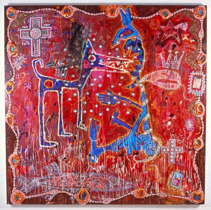
It’s clear up front what Doug Padilla would want any art critic to write about his work. From first glance, his work has a knowing naivete, an outsider funkiness that he has assumed without the true outsider experience of poverty and rural upbringing that would make it real. It looks like the work of second-run neo-expressionists of the 80s (Basquiat especially, but also Rothenberg, Clemente, Penck, et al.) but with far less freshness and invention, and with more reliance on kitschy trickery and self-identification–Day of the Dead skeleton heads, Mexican religious cards, odes to adoptive favorite Spanish poets, etc.
Padilla is a painter locked in a smeary Freudian love-affair with his own splash and splatter. In a quest to get at the heart of who he thinks he is, he sees the act of artmaking as a sacred shamanistic obligation to emote, regardless of the actual final appearance of the art.
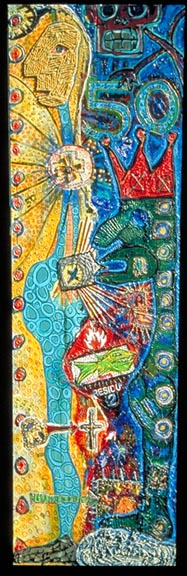
This may seem like a judgment based on my own prejudices about what art should be and what sort of experience artists should give to viewers, but consider some empirical evidence. The problem I have most of all with Padilla’s sort of work is it’s about one thing: the art maker’s attention-starved id. For instance, you walk into Gallery Co, turn to your immediate right, and what do you find? Ten self-portraits. And these are not just ordinary, run-of-the-mill, I’m-going-to-say-something-about-appearances self-portraits, rather they are crudely rendered self-portraits as proclamations-that-define-the-artist’s-current-age-and-epoch. Along with their enigmatic titles– “Self-portrait @ 50.25: Mr. Chihuahua,” “Self-portrait @ 52.50: Heart of the Matter,” and “Self-portrait @ Chango Macho”– they are conglomerative masses of poured-out, seemingly personal, inaccessible imagery. That the titles themselves don’t mean anything to anyone other than the artist is telling, and coincides with the intention of the artist to spew out marks and splotches and crust and crud without regard to what someone else might find pleasing, or interesting, or intriguing to look at.
Take one image in particular (as there are 52 overall in this show, I can’t even begin to talk about all of them), “Self-portrait @ 50: Sat Nam”: on the whole it’s a visual vomitorium on a six-foot scale. Aside from the basic compositional clashes of disharmonious color combinations (mustard yellow against teal blue next to alizarin crimson against pthalo green) and lack of enough breathing space for the eye to travel through the picture-plane, its imagery is random (why religious icons?), occasionally kitschy (why the Day-of-the-Dead skull?), maddeningly self-promotional (why the big 5-0? Who cares?). A thin harlequin-like figure to the left is painted like a third-grade craft project—with macaroni noodles comprising the blank head—presumably the artist, pot-bellied, expressionless, a cartoon of the self. There is no subtlety in this figure, nor in a red-crowned figure with dull-green oozy skin and a mass of undecipherable shapes and starbursts and a religious icon and a cheesy floating skeleton head holding the 50 like a neon sign in the right hand of the composition. The paint is thick and cloying, the gestures crude, the movement across the image cluttered.
Certainly, there are people who like to see visual overload in images, and are likely lots of collectors who like “outsider” imagery, but Padilla’s attempts along these lines come across as false even beyond the difficulties of looking at the actual picture. This is a value judgment I make knowing full well that Padilla holds sophisticated knowledge of art and culture—after all, it’s present in the titles of his works, which mention poet Garcia Lorca, as well as a whole slew of streets in Paris.
Further evidence of this push-pull between knowledge and unknowing: The electronic file I received from Padilla of the above image was self-deprecatingly called “Mr. Noodlehead,” yet in the gallery it is subtitled with the “Sat Nam” thing—a phrase I can only guess refers to a ancient yogic technique that uses the transcendent consciousness to heal. So while Padilla downplays the image and his role in it (Mr. Noodlehead), his personal goal is seemingly nothing short than healing the world through paint—a goal made all the more sad and poignant by the fact that in no way does he seem to get that the expression of his messy consciousness may not readily transfer to others.
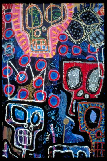
I’m not certain either why an artist working in the “outsider” milieu would become so enamored of kitschy, touristy, pseudo-folk imagery like his ever-present skeletal heads; all I know is the motif bugs me to no end. Consider the first image in the show, and one used for the postcard, which is also the painting I most want to scream at here: “27 Songs for Garcia Lorca.” The 27-odd kitschy cartoony skeleton heads (songs?), ripped from craftsy souvenirs from Mexico, are not much to contemplate, and do not disguise deep flaws in the painting’s execution. That is, this painting is a coloristic nightmare, a child’s crayon-box exercise. Never does a color appear twice, never is a clashing combination–pink against yellow, then blue against red, then black against blue, and so on and so on throughout—left unused.
The lack of subtlety and craft, coupled with the diverse skeletons, presumably is supposed to equal energetic expressiveness. Instead, I take it as a sign that we’ve now completely forgotten as a culture of artists that rules once existed for color composition, that once upon the Renaissance artists used color schemes in pigment combinations that went back hundreds of years, that paintings used to be structured and built around coloristic moods of complementary and analogous colors. Even the neoexpressionists knew this, and made some compelling images evoking remnants of ancient artistic tradition, but they may be the last generation to have kept that link to the past.
In the end, Padilla’s work is too ugly and self-absorbed to really break through to other consciousnesses—as he might wish. It is too self-referential and solipsistic to make most viewers care, too calculated and false to reach, let alone heal, an audience of more than one, too busy and overloaded for one to even take a breath in it.
Painting like Padilla’s makes me angry and, above all else, truly critical in the most negative sense of the word. Still, despite all my anger at the failure at this work, I admire attempts to evoke such things, to change the world through paint, to reveal the imperfect heart at the core of one human’s experience. While I find the effort to make more out of paint than paint an empty exercise, and simply don’t care much for work that overreaches, I find the fact that the artist made it admirable–sort of like how one can admire a massive mansion on Summit Avenue (so many trees died to make this extravagance!) without ever wanting to live in it. I’m not the audience for Padilla’s work, and I don’t know that there is much of an audience for it—though I do wish there was one.