Ways, Counted: Drawing at the Katherine E. Nash Gallery and Franklin Art Works
Collier White pursues the deeper meaning of drawing in the current moment.


Three local galleries – the Soo, the Nash, and Franklin Art Works – are currently hosting drawing exhibits. Among them are thousands of works and several approaches to curating. At the Soo show, Draw, the works of local artists explode uncultivated and volunteered. To this wildflower approach, the Nash Gallery responds with Drawing: Seven Curatorial Responses, an English garden of curatorial excess. Each curator’s area is cultivated and pruned to offer a cohesive (or in some spaces, puzzling) vision. Finally, the Franklin Art Works hosts a single artist show, Hope You Like It by artist Zak Smith.
Like the Soo exhibit, the Katherine E. Nash gallery hosts a survey of drawings, and the term “drawing” is liberally interpreted. But in the Nash, the curators are on display. These seven hermeneutic visions, rather than the original works, are placed in dialogue with each other. Each gallery is its own utterance, whose syntax vies with the others, preventing the works from engaging individually. But to reduce each work to a single point – useful only for describing lines – ignores the subtler provocations of the works themselves. For clarity I will follow the diagram offered by the space, which divides the Nash into seven numbered galleries, each named for its curator but, cryptically, bearing no title, nor any other statement of vision or intent.
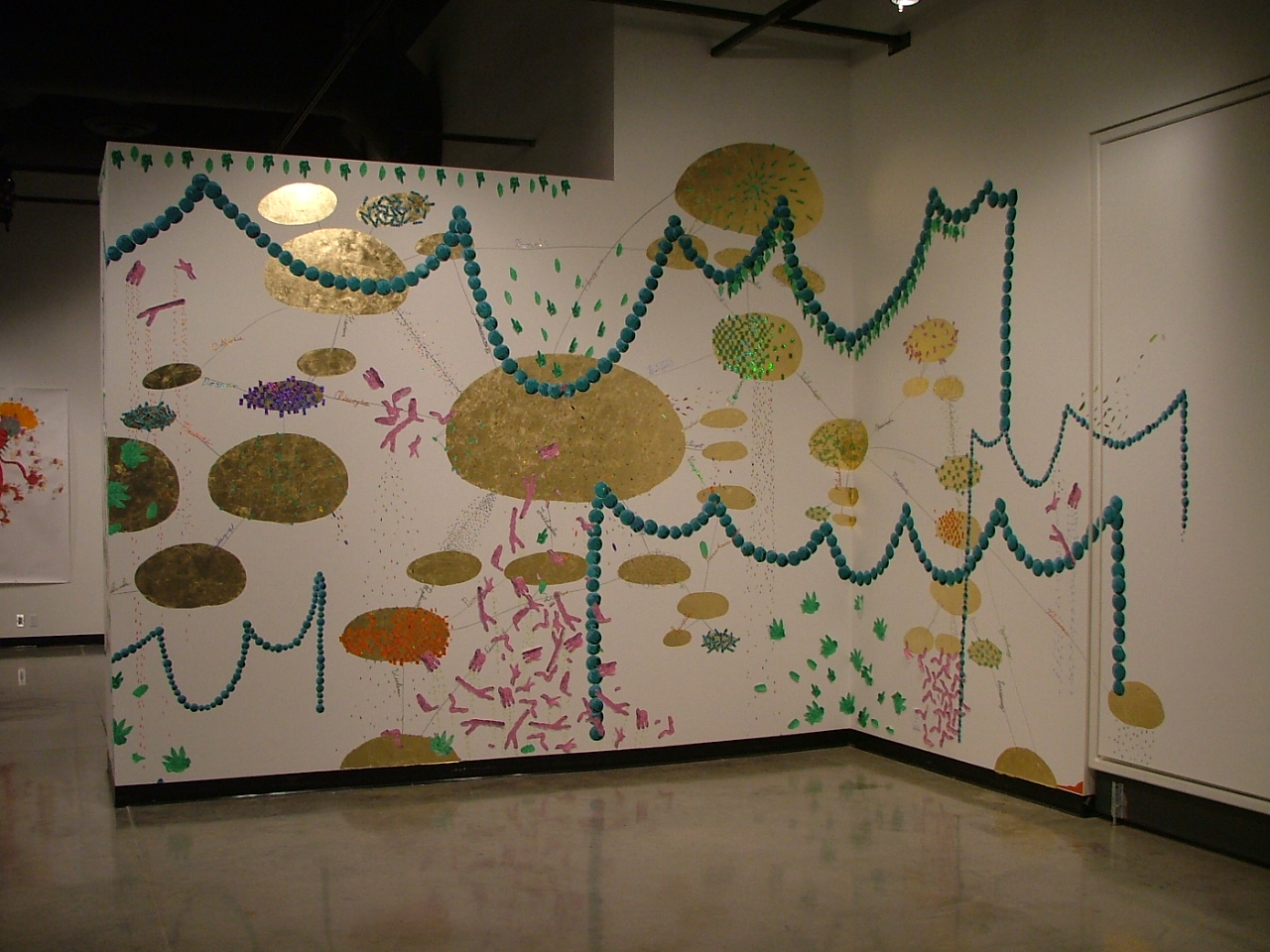
At one corner of the Nash, in Gallery 2, the installation piece by Erik Ullanderson pokes fun at the conceit. Figuring Out the Situation and the Feelings that Come … diagrams Cartesian self-analysis as a mishmash of tiny drawings of organs, mitochondria, painted ovals and nonsense words organized into a muddled cluster diagram. Hastily constructed (painted directly on the gallery wall) and transparently contrived, the piece ridicules the abstraction of the organic, even as it sets the tone for curator Kristopher Douglas’s Gallery 2. In Ullanderson’s work – as throughout Gallery 2 – junk materials are forced into expressions of junk ideas, and Andreas Fischer’s pencil drawings end the proceeding with wry humor.
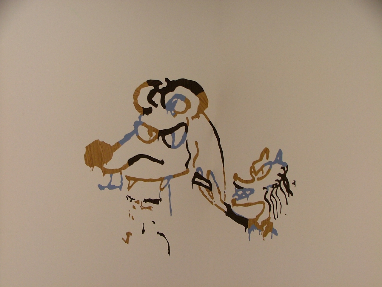
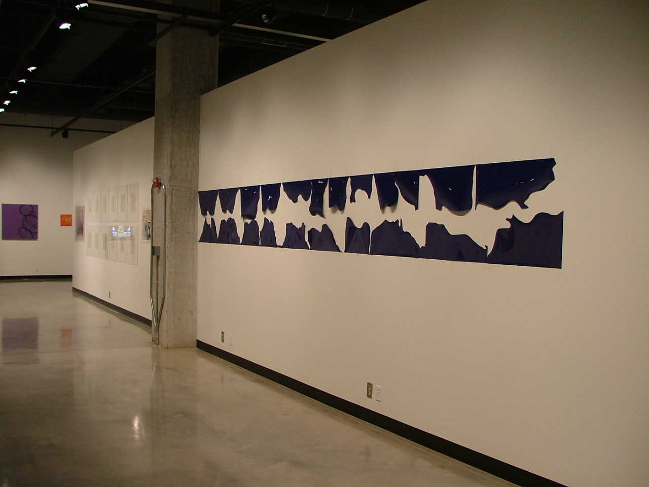
Scott Wolniak’s Up From the Midst of the Deep / Onward into Forever uses carbon-paper blue to create a Wedgewood mandala that is part bric-a-brac and part Da Vincian diagram. Wolniak’s interest in found and recycled materials is demonstrated by his Bongwatercolour (rendered with bongwater) and The River (made of an altered Old Style case). Whether there is anything beyond lifestyle and gesture to these two works is debatable, but the wave-like peeling back of strips of the beer case creates a surprisingly pleasing pattern. David Lefkowitz’s Adrian’s Wall gleefully conflates ancient history, the nomenclature of revision, and personal methods of self-representation into a towering cardboard work depicting, appropriately, cardboard boxes.
Turning backward to Gallery 1, we find Christi Atkinson on loan from the Soap Factory. The works here bear the fanciful youthfulness that often epitomizes that space. Three large and vivid acrylic paintings by Alexa Horochowski begin the exhibit. While the figure/ground relationships are consistent across the works, they can’t appropriately be called a triptych. As in Horochowski’s Vaquera, in these untitled pieces, race and gender are mapped onto characters whose bodies are rendered road-sign flat – paper dolls against cartoonishly significant backgrounds. Here some mushroom-eaters, there one of her now-famous cowgirls. But what does it mean to place Horochowski’s playful provocations alongside Teresa Seeman’s Rand McNally Road Atlas in which each state has been cut out and repasted into an imperfect map of the lower 48? Atkinson’s curatorial contribution tells of a love of colors, of kitsch and of cleverness, but it doesn’t quite describe a set of problems or aesthetic concerns. We have a battery of artists here, of varying depth, but the stoneware blossoms of Yumi Janairo Roth’s Livingware do not converse with the panoramic reiterations of Seeman’s video collaboration with David Galbraith. Some drawings from Mary Esch dangle precipitously off the edge of this exhibit, with no magnetism to draw them back in.
The University Art Department’s Clarence Morgan has also offered his own gallery, and his cabinet of artists is arranged for breadth, not coherence. Without a rubric to stifle them, however, the self-portraits of Peter Williams (three from Madrid Notebook) are allowed space to breathe. The pencil drawings – self-portraits of the artist – are jarring still lifes of tableaux vivants. The artist, the woman, a child and a dog interact, in paranoia and its defiance.
The word drawing implies nascency, ideation and the speculative. With her own gallery currently hosting 280 drawings from 70 artists, it’s at first remarkable that Soo Visual Arts Center curator Suzy Greenberg has elected to use the Nash’s space to present works that could easily slide into that gallery’s exhibit (even representing some of the same artists). This month’s Soo sees a collection of unsent letters lost under the bed on the first of November, the submission deadline for the show (though some were received a few days later). But while at the Soo the works commingle and shout and spurt an incredible wealth of ideas, the works here seem more focused. The concern is the human figure in space. Space describes feeling and movement in Gregory Euclide’s mixed media diagrams. In his Sway Walking Wit h the Bird Lover, landscape and graphic elements are layered in analytic meditations. Clea Felien’s miserable cartoons glimpse infirmity in untitled domestic spaces, while Melba Price’s pastel and gouache drawings invoke a semi-serious appreciation for oversized snapshot portraiture. Finally, the apotheosis of a Gap model is taken to bizarre extremes as ground is lost entirely in the gleefully heralded Annunciation. The overall effect of Greenberg’s Gallery 3 is of the ground slowly slipping away until we walk – in sky and in suburb – listening to beautiful but incorporeal angels.
Other curators offer their own visions as well. John Rasmussen’s is the most intrusive and loud. An obnoxious video installation by Aaron Young, High Performance, plagiarizes a single gesture from Matthew Barney and plays the chainsaw peel of a motorcycle tire on continuous loop. The black streak of the burnt rubber is Young’s medium. Jay Heikes’ White Light Stills and Wade Guyton’s Untitled Printer Drawings are arranged to suggest a Pop-art kiss-off tinted in early eighties advertising kitsch. Kirk McCall, whose Imaginary White Pine Tree Drawings appear here and elsewhere, embodies a kind of gentleness that seems inappropriate to this gallery’s rock and roll bravado.
The serene gallery of Tim Peterson, like the entire space, is intruded upon by the cycle engine drone. It’s a shame, because this creamy-toned gallery might otherwise provide a kind of respite from the busy intentions of the other displays. The blue-and-white Mylar piece by Margaret Honda and the soft white fringed photos of Stevie Rexroth invite a retreat into the soothing and abstract.
Epilogue:
Zak Smith’s Hope You Like It at the Franklin Art Works
To all this careful arrangement, the spastic and joyful explosion currently on display at the Soo is one alternative. At the other extreme stands the current single-artist exhibit at Franklin Art Works. But rarely does a single artist give us such a large sampling as Smith has.
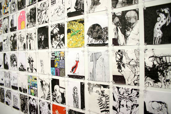
Smith’s One Picture for Every Page of Thomas Pynchon’s Novel ‘Gravity’s Rainbow’ contains 755 small drawings. In smaller samplings, with less discipline, Smith’s comic-book style might be dismissed. But here, the depthless facility of the drawings serves as a counterpoint to the enormous scope of the project. Pynchon’s novel is something that is obsessively referenced – its completion is a merit badge – but almost never in terms of its story. Smith’s work is like a series of personal footnotes, annotations, and condensations.
Smith is working in a cyberpunk idiom, one that may seem to be a cast-off of late nineties advertising. But for each stylish but empty gesture – a self-portrait with too much Schiele, too much Burton – there is something striking, like I Want a Holiday in the Sun, making postcard desire into a rumination on the flattened and abstracted female form. Eight Variations, Drawn, Painted On, then Printed has some kind of repetition – but does not immediately divulge its meanings. Figures recur, altered. Multiple characters share the same pose. Hidden camera candidness prevails. The works suggest a cold and distant life. The contrast to the other drawing exhibits is pronounced. While others count the ways that line can mean or count the possibilities of artistic intervention, Smith simply counts and counts and counts: the pages of a book, the drips of the faucet and the ticking of the clock.