Vol 1, No 1: Local Confidence: “Untitled V” at Soo VAC
Alex Starace gives a sampling of the wide variety of art available at the Untitled V exhibition at the Soo Visual Arts Center. The show runs through August 12th

“Untitled V,” the current show at the Soo Visual Arts Center in Uptown, Minneapolis provides an excellent example of how juried exhibitions of local artists should be run: it’s small enough to be easily managed in one visit, the variety of pieces displayed ensures that there’s something for everyone’s taste, and none of the art is hopelessly dated, derivative, bland, or boring. And, even if the show’s artists aren’t all spectacular, they’re at least all entertaining, which makes a trip to “Untitled V” an easy, breezy pleasure.
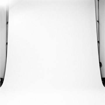
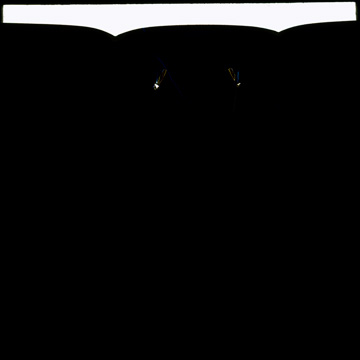
Photographer Cameron Wittig’s range of work most clearly mirrors the eclecticism of the show. In one of his Untitled (2006) photographs we see almost exclusively white: an industrial-sized sheet of paper has been unfurled in front of the camera. On the far edges of the photograph (outside the field of the paper) are the vertical bars of the apparatus holding the paper. Behind these bars is a white wall. The slight distraction of bars, the slight change in depth and shade between the paper and the wall allow the viewer to engage in the always-pleasurable experience of gazing at a nearly uniform and nearly unbroken field of pigment (or, in this case, lack of pigment).
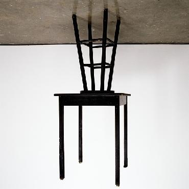
But Wittig’s photographic range extends further than this. In another of his Untitled (2005) works, there’s a table dangling in mid-air, seemingly attached to a stool that’s stuck to the ceiling. It takes a moment to realize that the table is placed upon a stool resting on the floor, and that Witting turned the photo upside-down to display it. The confusion and excitement upon first viewing is quite wonderful: Wow, that’s crazy! I’d like to see that in person! How did he do that?? And Wittig’s inversion holds up to scrutiny: the stalactite formation foregrounds the firm lines of the stool and table legs, allowing us to see how well they match the firmly tri-shaded photograph (the table and stool are a stark black, the background a stark white, and the floor a solid and uniform gray).
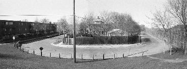
However, Wittig’s most impressive work has a different aesthetic entirely. It’s yet another Untitled (2006) in which we see a section of neighborhood. On the left is an out-dated apartment building, in the center is an old house behind a tall fence, and on the right is a sound barrier to block the noise of the interstate. The photo is slightly grainy and what most stands out are the telephone pole and wires, the No Parking and other street signs, and the slight degradation of the area – a mediocre American neighborhood we’ve all been to, passed through, or perhaps even lived in. It’s a dead-on honest picture that subtly employs a metaphor: the road that runs through the area appears to be a loop, like a racetrack at a high school. Perhaps, Wittig is saying, we’ll always repeat and return to this, our mediocre home. A depressing, yet tantalizing thought: the neighborhood doesn’t seem dangerous or unpleasant. Just bland, lower-middle class, and, in an odd way, comforting – maybe one’s own home. And so Wittig combines nostalgia, scorn, and speculation into one well-proportioned photograph.
In a completely divergent direction (and this, like I say, is the joy of the show: the variety is such that one feels comfortable changing emotional and aesthetic gears from minute to minute) is the work of Max Schollett. One of his pieces, Lemon (2004), is placed on a pedestal, underneath a glass case. The artwork? A styrofoam cup with oodles of tiny pin-pricks covering the entire surface: Schollett, through his meticulous poking, has changed the very texture and look of the cup, besides, of course, making a pretty dang funny (and yet lovably idiotic) piece of art.
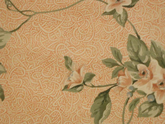
Schollett’s other work is wallpaper. He mounts and frames a square of wallpaper and then draws on it with a ballpoint pen. The patterns he adds are so integrated with the original that it’s initially difficult to distinguish between the two. In Hamlows Best Ever, spaghetti-ish lines of red ink form a background for the original flowers, which are visually connected to each other via green vines. In Amudur, a series of navy blue curves and hatch marks augment the sepia-toned flowers of the original pattern. Whether one finds such work to be daring, childish, or just plain stupid, Schollett’s hybrids look great, and the patience and repetition he employs in creating them, along with the reference to nature (all the original patterns feature plants) remind us that many beautiful natural phenomena (a field of grass, a sandy beach) are built by a patient and steady accumulation of individually uninteresting objects.
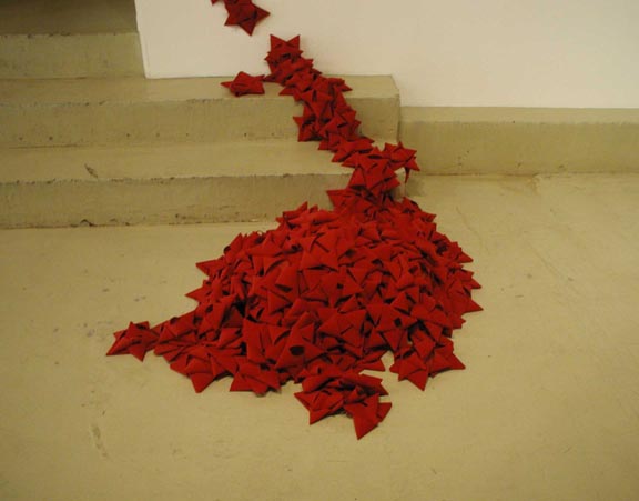
Molly Roth, in her installation How I Learned to Stop Worrying, also uses an accumulation of objects, though in a way entirely different from Schollett. A pile of hand-sewn, star-shaped red-velvet ribbons sit on the floor and connect to some star-ribbons crawling up some stairs, while several more climb up the wall, and finally a few are affixed to an exposed heating pipe in the ceiling. It makes a casual, artful arc and has a very festive, Christmas-y feel: it’s bright, reminds one of a wrapped gift, and is quite conventional in its aesthetic. That Roth brings a mall-like glean to the show (her piece really does look like a holiday adornment), is much to her credit, and once again demonstrates “Untitled V’s” diversity.
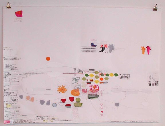
In contrast, Diana Behl (further demonstrating the show’s range) has an aesthetic inimical to that of Roth. Behl’s work, knotted red threads (2003), is a blank white paper with 1’’ by 1’’ bits of colorful, child-like images of fruit, bowls, or abstractions placed on it. The images have been drawn on a separate piece of white paper and then cut out and glued on the background paper. There are also bits of typewritten text (again typed on a separate piece of paper and glued on the background) and a few scribbles from a pencil. One hesitates to call the resulting artwork a collage: seldom do these cut-out squares overlap and the images are so sparse that much ofknotted red threads is plain white paper.
It’s gappy enough that each little element seems to be standing on its own – not at all successful, considering how mundane each element is. One wonders if Behl is consciously avoiding anything that’s artistically conventional: there’s not enough white space to be eye-catching, and yet the piece, upon inspection, is empty enough that one can’t help but notice the amount of white space; the intentionally childish drawings that compose the piece aren’t fascinating by themselves, and yet… they don’t combine with each other to make something greater; furthermore, the piece neither transcends nor utilizes its low-budget origins, so it comes off as, well, a low-budget piece of crap.
What’s fascinating is how studious and complete a failure Behl’s work is – it has to be this bad on purpose! Behl certainly has the talent to make something like Marie Gardeski’s But I Love You (2005) (That piece isn’t actually in the show, but displayed in the Soo VAC handicapped restroom), a drawing in which two childishly drawn little boys are standing at either end of a squat, long canvas. One boy is scowling and the other petulantly gestures across the canvas and says, “But I love you.” And that’s it, the entire piece: no background, no color – nothing else. But the lo-fi nature of the Gardeski’s work enhances the meaning: the boys are children, so the drawing of them is childish; the message is simple, and so is the piece – the piece matches the character of the two boys. It’s well-done, though fairly simple on Gardeski’s part. Behl could easily do something similar – in addition to the inclination for simple images and words in her pieces, she has the chops to draw as well as Gardeski. And yet Behl gives us something that’s so divergent from anything we’re used to that it’s hard to know how to react to it: Is it good? Is it bad? …What is it?
Well, it looks like a piece that’s barely been begun (maybe one-fourth completed), has little visual interest, no coherent message, and no overt challenge to any particular form. However, it’s uniquely bad – it cockily manages to fit between all categories. It’s an achievement that makes this reviewer curious if sometime in the future Behl won’t come up with a piece that’s uniquely brilliant. Moreover, Behl’s conscientious failure speaks to the strength of the “Untitled V” show as a whole; all the pieces are original and challenging, and even the lesser pieces (Behl’s included) are vibrant, assured, and confident in their worth. In the end, then, “Untitled V” establishes (if it still needed establishing) that Minneapolis is filled with talented, risk-taking artists capable of putting on an excellent exhibition, even if not every piece is a five-star success.