Visible Fringe F-Stops: Money, Money!
Thomas O'Sullivan reviews Mickey Smith's installation at the Old Federal Reserve Building; this is part of the "F-Stop" series of visual arts events of the Fringe Festival, the Visual Fringe.

Mickey Smith: “Collocation No. 1”
F-stops at Visible Fringe
Old Federal Reserve Building (Marquette Plaza)
250 Marquette Avenue, Minneapolis
July 25 to August 14, 2005
“Money, money, money, money” sang the O’Jays back in 1973 when the Federal Reserve Building was downtown Minneapolis’s newest architectural marvel. Times have changed. Gunnar Birkerts’ daring arched structural system and plaza full of abstract sculpture have been remodeled into mediocrity as the Fed moved to flashier digs on the riverfront. A changing realty market has made the obsolete storehouse of our region’s currency an affordable option for the Minneapolis Public Library’s temporary home. And for a few weeks this summer, an alternative art venue has appeared in the belly of the old financial beast.
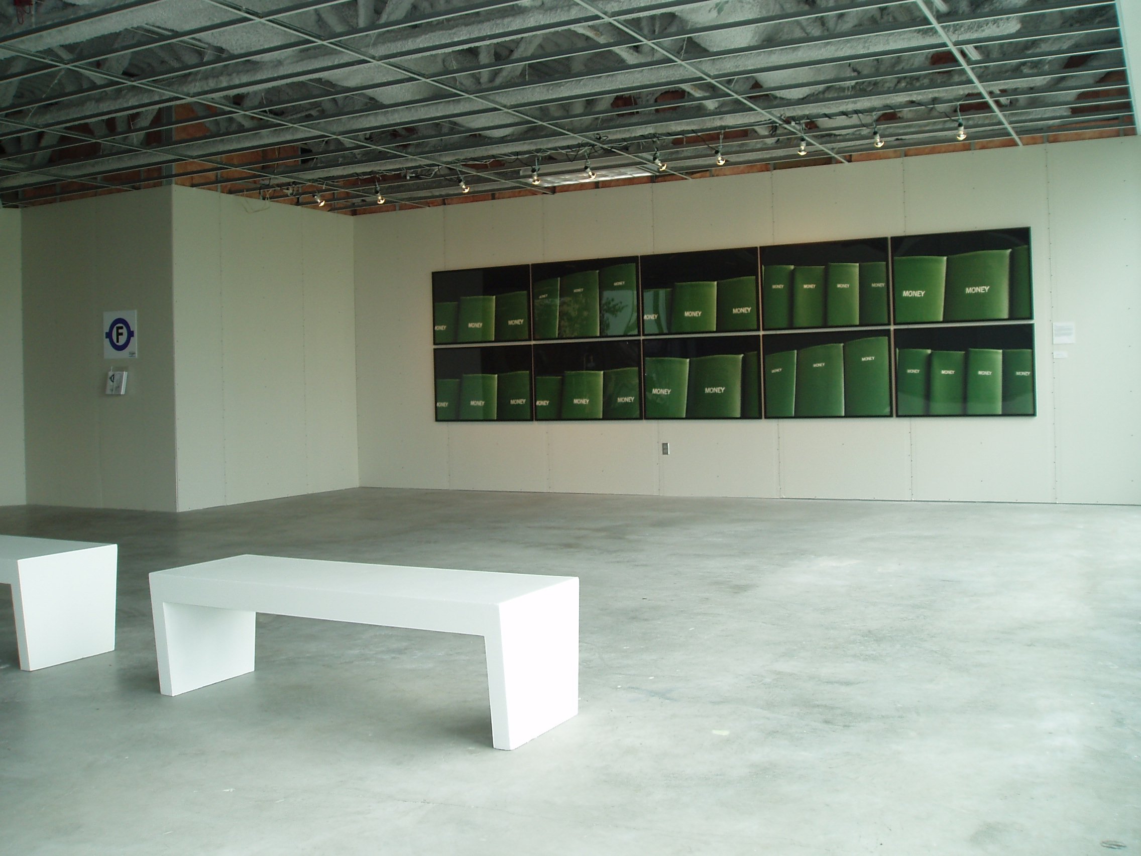
Photographer Mickey Smith has taken over a small vacant office on the lobby level for an installation called “Collocation No. 1” as part of the Minnesota Fringe Festival’s visual-arts component, F-Stops. The installation is simple and reversible enough to satisfy any landlord: ten framed photographs hung tightly together to form one mural-sized work. Her giclée prints depict the spines of a set of magazines that have been bound in green book cloth and stored in library stacks. The magazine? MONEY— its title repeated over and over, thirty times in the twenty-foot-wide work.
Smith brings to the project an admirable restraint, leaving the walls of the office otherwise bare. She lets the crisp photographs pull their own weight, playing off the materials and associations of an anonymous corporate interior. Like a realtor’s parody of the white-box gallery aesthetic, the space is nearly neutral, awaiting a new tenant. Fresh sheetrock and unfinished concrete present virgin surfaces; missing ceiling tiles reveal insulated ductwork overhead. Two benches, chaste and angular modernist pews, occupy the center of the room in a sly echo of the Rothko Chapel’s reverent minimalism. Smith’s bank of photographs claim full attention.
Smith, no stranger to bureaucracy after years’ experience as an arts administrator, has photographed in stacks and basements at the Minnesota History Center, St. Paul Public Library, and Library of Congress for a series she calls “Volume.” Her shrewdly cropped pictures are sensuously lit to bring out the colors and textures of timeworn publications, bound and shelved generations before “print media” was a necessary phrase. Only a few might stand on their own as compelling images, but Smith has made the most of exhibit opportunities: she lets the context of each venue modulate the viewer’s encounter with her work. The exhibit of her “Volume” project in St. Paul this summer affords an instructive contrast to “Collocation No. 1.” At the Minnesota History Center library, a formal and lavish setting of stone and oak reinforces the dignity of her icons of archived data, while the unfinished Minneapolis office suggests a use-it-or-lose-it ethos.
Is Smith’s placement of the MONEY magazine prints here an elaborate pun, or a penetrating critique? Her light touch in this conceptually loaded setting leaves the question open to debate and allows her to have it both ways. Maybe in the end it’s like an O’Jays hit: quick and clever, with a message beneath the beat: “Don’t let money fool ya.”