Transfigured Dreck: Liz Miller
Liz Millers show at Augsburg, "Failure of an Eloquent Defense," caught Michael Fallons eye, and he describes it here. The show is up through July 11, and you can see more of Liz Millers work at Soo VAC in Untitled 3.
Liz Miller at the Christensen Center gallery
Augsburg University
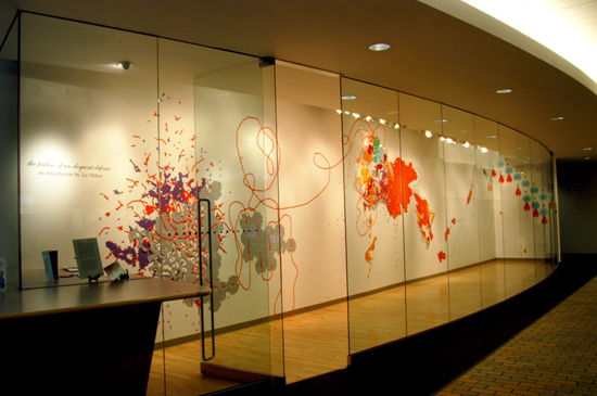
“The Failure of an Eloquent Defense”
The inaugural exhibition in an emerging artist series
Through July 11
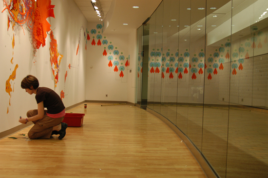
Liz Miller’s installation at the Christensen Center Gallery at Augsburg University was marvelously paradoxical. In the artist’s hands, mundane and humble materials are transformed. By working such magic, Miller taps into a universal wish to surmount everyday conditions–a wish that is evident in religious ideas of the “miraculous,” in which the known or ordinary is transcended via unnatural powers or through magic.
Because of the tendency of Miller’s work to transcend expectations, to rise above its own basic conditions, describing its gestalt flat-footedly almost defeats the purpose. Still, for the sake of clarity we must start with exactly this. In the narrow gallery space of the Christensen Center–which has one wall, opposed by a long, curving, fishbowl-like row of window panels–Miller has pinned, glued, and tacked to the wall cheap felt, vinyl, plastic, and foam rubber bits of the sort found in craft stores. The size of said items ranges from that of the nail of a typical pinky toe to about the size of a typical human torso, and perhaps a bit bigger. For the most part, these items lie flat against the wall’s surface, looking something like a grade-school wall mural gone amok–though at times the objects become more heavily layered and rise into low relief.
Miller’s many tiny shapes conglomerate themselves into three masses of varying qualities. One conglomeration, located on the right-hand end of the gallery, is hyperorganized to the point of being somewhat blasé. The look of these pieces is akin to computer icons arranging themselves in some sort of flow-chart, or sky-blue and white video-game alien spaceships on a radar screen. Of the three masses, this is by far the least appealing–in its order and formal neatness and very inorganicness it is repellent.
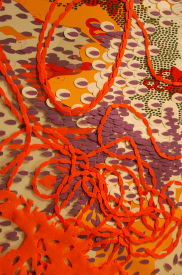
The middle conglomeration, which seems to take the middle ground between organization and disarray, is more lively and attractive. This looks somewhat like a topographical map that reveals the ebb and flow of a continent’s working economy. Larger felt shapes in orange and yellow take on the look of counties or countries; smaller white ovals, purple and orange ship shapes, and so on seem to represent smaller integrative parts of a whole. There’s also a clear acetate ocean, and so on.
The third conglomeration, on the left-hand side of the gallery, meanwhile, is a chaotic mess of shapes that are struggling, disintegrating, and rapidly decomposing. This mass of forms is scary, yet also very beautiful, like an overgrown garden with flowering plants quickly decaying and losing their petals in the wind.
One could likely conclude that this is a meaningful progression of imagery, particularly since the three conglomerations are linked with vine-like and twisty lines of orange ship shapes and green dotted lines. One person in the gallery notebook recorded a thought, perhaps spurred by the title and the fact that many of the smaller shapes in purple and orange look like battleships or stealth bombers, that the imagery must refer to the current-day Iraqi snafu. Installation work–which is put up in situ and lives a brief life–lends itself to an immediacy of interpretation, and even if you don’t want to be that literal: the progression from order to chaos plays out as a kind of narrative. That is, the orderly structure of the right-hand shapes seems to feed into the dynamic composition of the middle conglomeration, which then in turn leads to a complete falling apart in the left-hand mass of shapes.
One could conclude the artist simply intended to examine the progression of order to chaos (a la the second law of thermodynamics, or some such), yet there are contradictions that make this a more interesting installation than that. For instance, the normal reading order–in Western culture, from left to right–is subverted here, so that one could just as easily apply the opposite reading: that from struggle and conflict on the left occurs the order of the right—i.e., that out of struggle comes peace. At the same time, paradoxically again, the direction of the “ship” shapes that lead us between the conglomerations is against the tide of our reading—that is, the pointy parts of the ships lead us from right to left. In the end, all one can conclude is that there is a play here, back-and-forth, between what we expect and what is visible.
It would be foolish to assume, with such blank materials, abstracted forms, and purely visual language, that anything is intended in any literal way. In fact, what I have read into the feel of each conglomeration—computer graphics on the right, topography in the middle, organic disintegration on the left—is based on my own personal associations, and the artist may have completely different ideas in mind.
And more interestingly, even my own visual associations to this work fall apart when the installation is examined up close. That is, the materials that Miller uses, when seen at arm’s length, are so tactile and resonant with middle-American meaning that pictorial associations fall away; these objects become a mass of what they are—shapes cut from material that is post-industrial, ugly, tacky. Indeed, it’s something of a conjurer’s trick that the artist is able to create a universe of potential meaning, as well as intriguingly beautiful visuals, from these strange craft-store materials.
In the end, the miraculous transformation of these mundane materials into beautiful and thought-provoking art leads one to speculate on the way we perceive and order the world. That we can see so much in such humble materials is wondrous. It is clear that the artist has great magic at her fingertips–in her mastery over composition, over the push-pull between shapes, over color and value, and in her supreme sense of play. That there is beauty and meaning to be found in the most tacky stuff of our culture–craft-store felt and so on–is at the heart of this work’s appeal.
Photos by Stephen Geffre