The Hive: “Cities” at the Nash
Glenn Gordon gives a full accounting of the work of some of the cities' best mid-career artists in the show Rochelle Woldorski curated for the Nash Gallery: "Cities."
The city is the human hive, a complex, four-dimensional hub of commerce and culture many layers high and many deep. Its inhabitants are strivers and restless. Impatiently making way for the future, they demolish whole sectors of a past accreted brick by brick. The only way to remember what once stood there is through the images people piece together from a rubble of metaphors–paintings, drawings, photographs, architectural models.
“Cities” is the name of the show currently up and running through February 17 at the Katherine E. Nash Gallery at the University of Minnesota-Minneapolis. Rochelle Woldorsky, the multimedia artist who proposed and curated the show, invited ten artists, most of whose work she’s followed for many years, to present works on the theme of cities … real or imaginary. Some of the work goes back as far as 1960; some was created expressly for the occasion. Taken together, it forms a bulwark against architectural oblivion, constructed, variously, of stoneware, Styrofoam, grains of silver, dye clouds, ink, paper, watercolor, gouache, oil, and a mysterious form of gypsum.
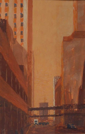
The artists look at the city from all angles: from ground level to bird’s-eye views from above to, in one case, a bird’s eye view from below, from the vantage point of pigeons on the ground (in a mural by photographer Stuart Klipper). Four of the artists render the city as fantasy, confecting places entirely imaginary; others fix it with a level gaze, seeing only what’s there. One artist shows it in ruins. The strangest thing about the show is the nearly total absence of the human figure … the built city acts as a stand-in for the people who populate it. About the only people visible in the work are in Eric Erickson’s paintings of skyways in downtown Minneapolis, and there the people are distant silhouettes–ciphers. The only other figure I could find is a ghostly afterimage in one of Carolyn Swiszcz’s paintings.
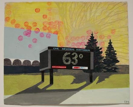
Stimulated by a survey that determined Fargo, ND, to be “the least photogenic city in the USA,” Swiszcz went up there to see for herself, producing from the sights seven deliberately banal cityscapes, mostly acrylics on paper, all but one presented here unframed. The paintings are done in faux-naïf style, in the manner of a fifth-grader concentrating hard. Swiszcz avoids anything that might smack of too much skill or finish, as if finish would rob the work of its primitive honesty. It’s a kind of slacker-style painting that strains credulity, but if you can find a way to take the works on their own terms the best are BNSF, an orange locomotive outlined with hesitant care in black ink and set against a turquoise sky with some interesting splatter, and Civic Memorial Auditorium, Fargo, featuring a time-and-temperature Pepsi sign and a sickly pale chartreuse sky.
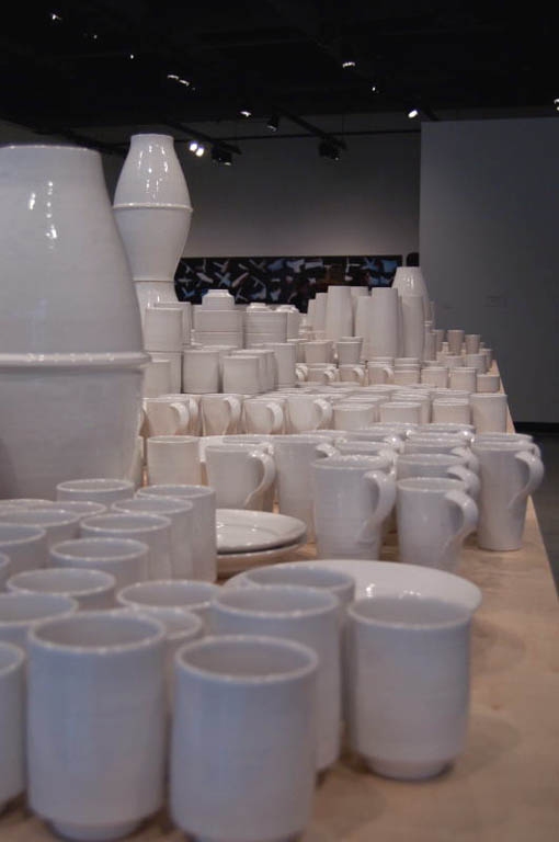
In the space opposite Swiszcz’s studies of Fargo is Everyday City, by the ceramist Tetsuya Yamada. The work consists of hundreds of pieces of hand-thrown white-glazed stoneware, quotidian sets of tea and coffee cups, bowls, vases, and other vessels massed and stacked in tight formation on a 24-foot trestle of plywood set on sawhorses. The effect lies somewhere between a functional ceramic version of le Corbusier’s Radiant City and a production potter’s studio sale. The empty cups and bowls gape open like hundreds of mouths. If it’s a city, it’s a city full of emptiness, a Utopian monotony created from very skillfully thrown utilitarian pottery.
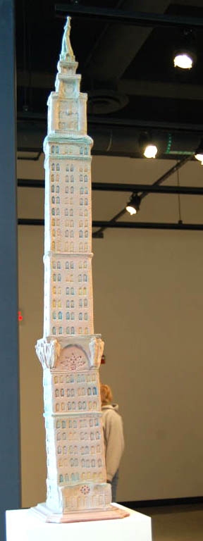
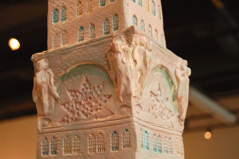
Clay is old as the hills, and this gets us to the imaginary ancient terra cotta towns and cities of Aldo Moroni, an artist whose affectionate scale models of actual local buildings, cast in bronze, are literally part of the fabric of the city outside, where they sit on pedestals along Sixth Avenue between University Ave and Main Street in Minneapolis’ Marcy-Holmes neighborhood, near the Soap Factory. For this show at the Nash, however, Moroni has kneaded and stamped his clay into archaeological fantasies, among them an Italian hill town set on a chunk of rock, and a Chronicle, a series of clay tablets beginning in Eden, progressing to the ancient city of Ur, then on to Babylon, where Moroni renders the Tower of Babel as it appears in the famous painting by Bruegel the Elder. The Chronicle is brought almost up to date with Babylon’s Tallest Building, a slightly wobbly nineteen-twenties-style skyscraper. The edifice is ornamented with lumpy mythological figures and crowned with an absurdly triumphal statue at the top.
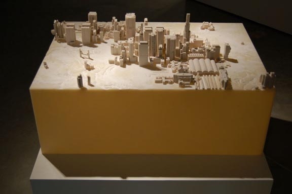
Just around the corner, in contrast to Moroni’s loose treatment of the ancient world, is a tight architectural model of a future one, an imaginary city meticulously rendered by the artist Dan Tesene with the aid of 3-D software and a piece of equipment called a dimensional gypsum printer. The machine incises the intricate details of the buildings with an unwavering precision that would be daunting to anyone trying to do the same thing by hand. The yellowish-white flour-like gypsum dust on the bleached-out, arid-looking, topologically modeled terrain makes the model look like a city planted on the desert, like a parcel in the delirium of surreal development that has overtaken the Arab emirate of Dubai, where you can now ski indoors, on slopes a hundred degrees cooler than the desert outside.
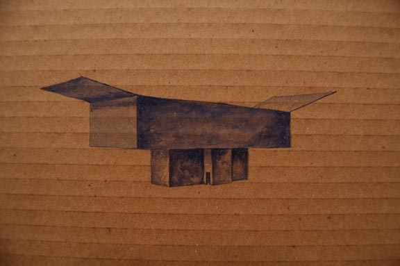
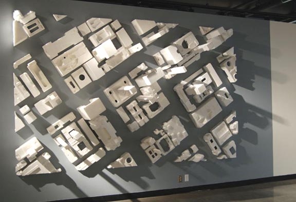
David Lefkowitz is showing pieces from three different recent groups of his work, all marked by the play of a wit bemused by the utter peculiarity of what it pleases us to call reality. One of these, in the shrewd and funny re-use it makes of discarded mundane packing materials, gives new meaning to the expression, “keeping your overhead down.” A big work glued to the wall, Plan B, is Lefkowitz’s fourth in a series of bird’s-eye views of imaginary urban grids made out of those molded Styrofoam blocks and spacers used to protect computers and other electronics in their shipping cartons. The view of the grid is skewed, as though seen (as I put it in a previous review) from a helicopter banking overhead. It parodies the models used for big, optimistic city planning presentations, the Styrofoam forms all a promising Utopian white. Among the other works Lefkowitz is exhibiting are 40 Improvised Structures, a straight-faced group of watercolor sketches on corrugated cardboard, done in the style of “architect’s conceptions,” which they could be, or they could just be wry portraits of cardboard cartons with flaps—or they could be both.
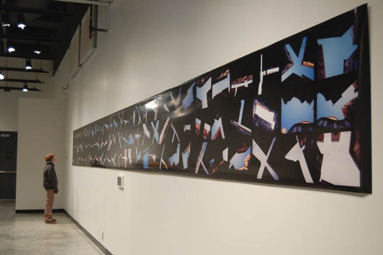
Lefkowitz, along with Moroni, Yamada, and Tesene, looks at the city from above. Stuart Klipper looks at it from below. Genoa, a photomural more than thirty feet long, is a montage constructed of color prints of images Klipper made during a trip to Genoa, Italy. Wandering in a medieval district of buildings four to seven stories high, through streets so narrow that he says in some of them you could touch opposing walls with outstretched arms, Klipper kept pointing his lens “straight upwards, photographically ‘cataloguing’ all variety of articulated slots, slits, and celestial ‘incisions’”. He then composed the images–narrow gaps of blue sky, with light reaching just the rims, upper stories, and cornices of the buildings–into a mural where the photos’ predominantly black zones have been seamlessly stitched together to become a continuous black background, filled with what look from a distance like notched and jagged “X,” “T,” “Y,” “L,” and “Z” shaped cutouts. The shapes tumble along the length of the mural like a drunken, pinwheeling alphabet. People in the gallery have been reading the shapes as everything from guns, battleships and plumber’s helpers to church domes and spires. The mural has a lot of graphic punch but its manipulations distract from the individual strength and content of each photo.
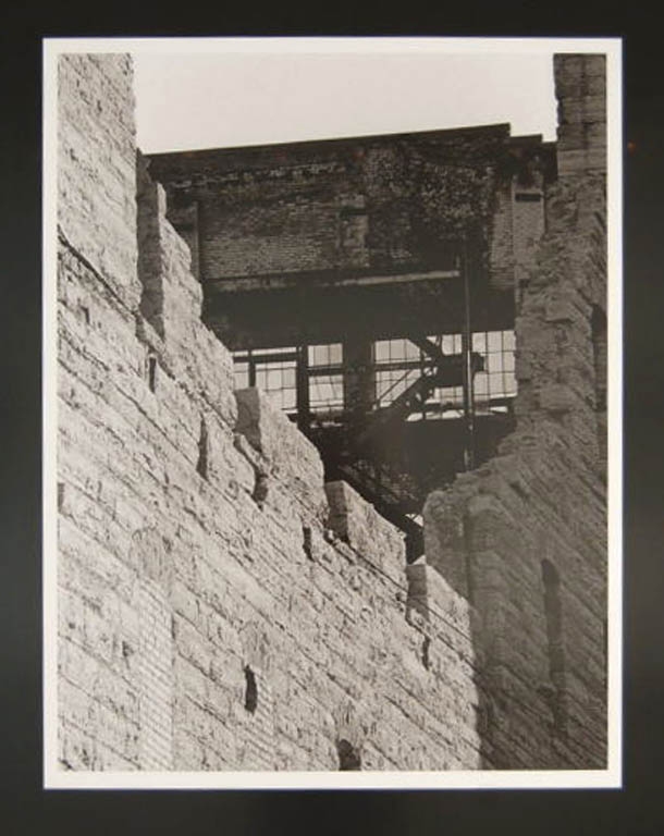
The photographer Paulette Myers-Rich has been documenting destruction of the urban landscape of Minneapolis and St. Paul since the early 1980’s. Her contribution of seventeen black-and-white inkjet prints to the “Cities” exhibit is a retrospective of her long attention to the Twin Cities’ creation of industrial ruins. Among her images are pictures of half-demolished grain elevators, the aging Selby Avenue Bridge in St. Paul (which as far as I know is still standing), the ruins of Minneapolis’s historic Washburn A Mill after the fire that destroyed it in early nineties (the Mill City Museum now stands on the site), and charred heaps of rubble, all that remained in the aftermath of a fire that consumed a row of storefronts on Dale Street. The prints, however, at roughly 20” x 30”, are too large. Blowing them up that big has cost the images something in resolution and range of tonality, and made the grain too conspicuous for photos that are meant to be historical documents. To my eye, the best group is actually the one least concerned with straight documentation, a series of details of the mill ruins, whose stark blacks and whites evoke the powerful abstractions of Franz Kline.
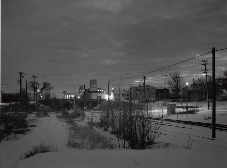
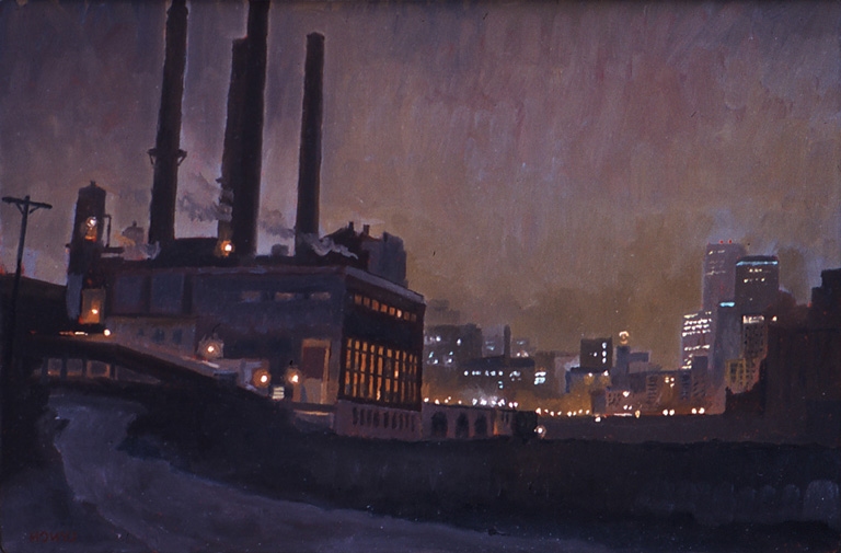
On opposite walls of a long space at the far end of the gallery, facing each other in a deep conversation about the nature of darkness and light, are images of the city at night by the photographer Mike Melman and the painter Mike Lynch, two artists whose nocturnes haunt the mind long after you’ve moved on to look at other things. The two are masters at evoking the moods of the urban night, the slow breathing of the city asleep. A bottomless melancholy
pervades both men’s work. It finds its way into the body and settles into a kind of ache. As far as I know, an artist gets the ability to affect a viewer this way only through devotion to the practice of pure observation. Lynch will sit in his pickup, peering for hours through the windshield into the mists of the night as he works by flashlight, drawing a railroad yard watchman’s shack, a grain elevator, the parking lot of a bar lit by a beer sign. Melman, after much scouting and premeditation, will set out at 4:00 a.m. into the dark of a cold winter morning, a tripod and an old twin-lens reflex in his rucksack, to capture the light he wants on a warehouse, a railroad bridge, a street of worn houses in the hour just before dawn.
Among Lynch’s works in “Cities” are five oils on a short side wall of the space. One of them is a painting of a truck. The gleam of the streetlights reflected off its side is picked out with quietly perfect eloquence in streaks of turquoise. In the same row of paintings is a view of the Pillsbury A Mill elevator, a panel (the artist’s point having been made) left “unfinished,” the mill’s red neon sign staining the damp mist with a paradoxically blurry exactitude.
Another of Lynch’s paintings of the Pillsbury mill links to a photograph by Mike Melman just across the way, a night view of the same subject from almost the same vantage point. Whether or not it inspired Lynch to his own version of the scene, it shows the two to be brothers in perception. Melman’s sad, elegiacal views of Minnesota’s disappearing industrial past continue the tradition of the photographer whose work he most reveres, Eugene Atget. Most of the images Melman is exhibiting in “Cities” are from his book The Quiet Hours, published in 2003. A few of them–
East Seventh Street Between Wall and Wacouta Street; Grain Belt Brewery, Thirteenth Avenue Northeast; Broadway Avenue Northeast; and Selby Avenue Bridge–will find their way into your dreams.
In conjunction with the exhibition, there will be a panel discussion titled
“What is the City?” on Thursday, February 9, at 7 pm in the In-Flux room
adjoining the gallery. Professor Ann Forsyth, Dayton Hudson Chair of Urban
Design and Director of the Metropolitan Design Center will moderate the
panel.
The Nash Gallery is located at 405 21st Avenue S., in Minneapolis inside the Regis Center for Art on the
West Bank campus of the University of Minnesota.