Summertime Blues, and Mauves, and a Little Gold Leaf
Mason Riddle reviews Summer Invitational at Thomas Barry Fine Arts, 530 North Third Street in Minneapolis. Hurry to see this cool and refreshing exhibition, hovering between image and design; it closes August 10.
There are good summer shows and bad ones. Thomas Barry Fine Art’s Summer Invitational is one of the best. Rather than a scattershot laundry list, the eighteen works by twelve idiosyncratic artists have cohered under Barry’s honed eye into visual sense. The show proffers no thematic, conceptual, or stylistic point of view but favors ideas of design and the abstracted image. Making up the mix are photographs; paintings on paper, panel, and canvas; drawings; mixed media works; and a small installation in Barry’s niche of an office. All but two of the artists live in the Twin Cities area.
Mary Berg’s in-situ work Correspondence was inspired by what she found in Barry’s compact office – a desk and chair, paperwork and writing materials, files and the parquet floor. An array of seemingly unrelated objects, whose exact identity and function is elusive, flows across several walls and the floor. Salad molds, scrubby things, cotton balls, netting, pieces of wood and washers appear functional but aren’t. For example, on the floor in a corner is a file box full of pencils, not indexing cards; and a metal saltshaker top has no bottom container. What could look cluttered and self-conscious is effectively installed, making Correspondence a clever cognitive exercise wrapped in a smart visual package.
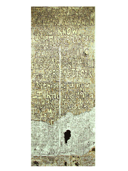
David Bartley’s mixed-media-on-paper work, Dread and Dead in a D.C. Park (2006) is a long narrow piece of paper on which has been printed a satellite image of South Minneapolis, bordering either side of I-35W, and a long rambling text that is nearly impossible to read. Although visually striking with its palette of shimmering gold, black, and white, the work thwarts any attempt to discern the connection between map and text. In the end, because of its visual strength, it seems not to matter.
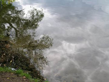
By contrast, John Kohring’s two straightforward digital photographs are models of visual clarity. Studies of the commonplace, one work captures a backyard gate and fall foliage, and the other reflections in a lake on a gray day. A new venture for this otherwise abstract painter, the two images have a serene, quiet presence that elevates them above the ordinary.
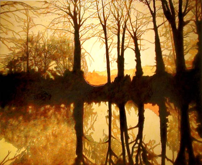
Richard Barlow’s mixed-media-on-panel painting Silver Bromide (2007) recalls in spirit a stylized landscape painting by the Arts & Crafts painter Arthur Wesley Dow. In fact, it is closely based on a black-and-white landscape photograph by the nineteenth-century English photographer Henry Fox Talbot. Bathed in a luminous golden glow, the painting depicts a row of dark shadowy trees whose reflections are seen in the glassy surface of a lake. Photographers of Talbot’s era frequently worked in a dreamy, pictorial mode to emulate the qualities of painting. Barlow’s Silver Bromide has taken the conceit one step further by creating in paint what was originally a moody, romantic photograph. That the work is named for the emulsion coating photographic print paper is a witty touché. An image of Talbot’s original photograph would have made for a nice context.
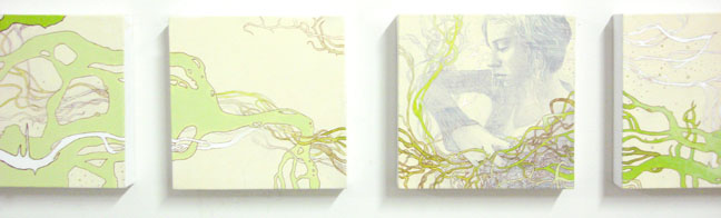
Also romantic, even a bit surreal, is Bethany Kalk’s Underestimated Weakness (2007). The work comprises eight individual 8-inch-square canvases whose linear installation gives the work a tangible narrative quality–as if one was looking at successive film stills. Flat, abstract, pale green, tendrilous forms flow across all eight panels, creating a continuous image. In one the green, plantlike forms envelop a highly realistic grisaille image of a young woman seemingly deep in thought. Underestimated Weakness is a wistful, lyrical work informed by a graphic linear quality that recalls the stylized élan of art nouveau paintings.
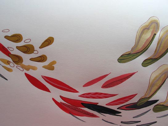
Equally stylized is Erika Olson’s Untitled (2007) gouache on paper depicting an array of pine cones dropping their seeds, small red leaves and maple tree pods that travel in the breeze like helicopters. Suggesting an anime drawing of flora on a stark white ground, the sophisticated work is an impressive coalescence of reductive image, composition, and design.
Aaron Van Dyke’s Untitled (2007) work is from his series of paintings on printed fabric where he paints stripes on the fabric and then cuts away the printed image creating an odd positive-negative image relationship. Here, the eviscerated fabric is a man’s blue shirt whose floral pattern image is now the white gallery wall on which the work is hung. This relationship between image and ground is further complicated by the overlay of intermittent vertical stripes, which give the work a quirky spatial depth. Conceptual but decorative, Van Dyke’s work keeps in tenuous balance the forces of representation and abstraction.
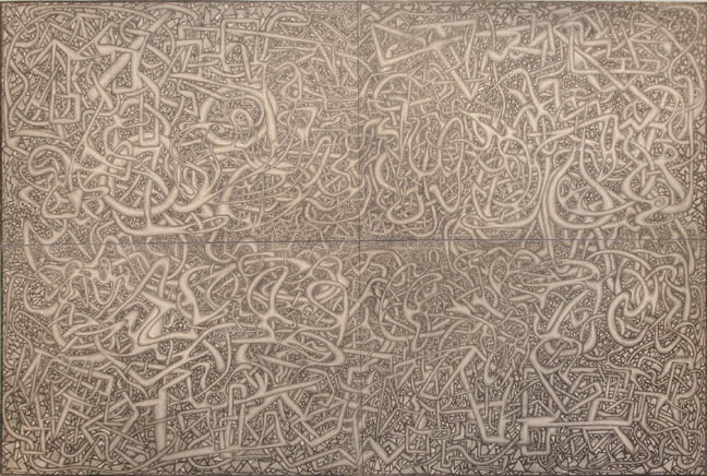
James Hall is a self-taught artist in the outsider tradition who lives and works in Chicago. His graphite-on-board four-panel drawing, titled A Bucket of Worms Falling Into the Ocean Clear Down to the Bottom (2007), is a labyrinth of looping forms that are knotted and turn back on themselves like a tangled ball of yarn – or, well, worms in a bucket. The work’s obsessiveness links it to the output of many self-taught artists but its edge-to-edge curtain of nonrepresentational markings also connects it to Abstract Expressionist practices.
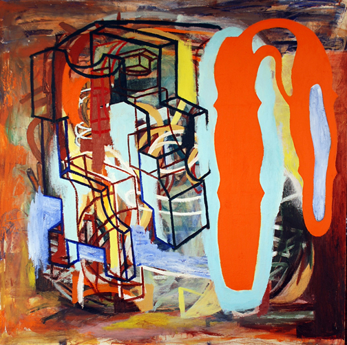
Lance Kiland’s Untitled (2006) oil-on-canvas painting is classic Kiland in an unusually high-keyed palette of oranges, yellows and blues. Here, on an abstract ground, Kiland has created with a sturdy black line geometric forms that allude to unidentifiable architectural structures or industrial machines. The work is bold and associative, and the flat passages of color further add to the shifting spatial depth of the work.
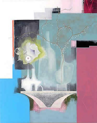
By comparison, Rosalyn Schwartz’s abstract Zen Moderne (2006) seems psychologically light and delicate in its palette of white, varying shades of pink, and turquoise blue. The ground, methodically constructed from flat, geometric passages of saturated color, suggests an undefined interior architectural space. At the center of the oil-on-canvas work emerge images of vessels and flowers on a table. This ghostly still life of transparent objects seems to make the painting more about memory than the physicality of actual objects. Decorative and stylish, Zen Moderne has a compositional rigor that keeps it from being just a visually lush painting.
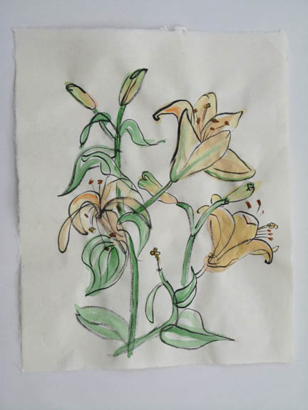
Mary Esch’s four gestural drawings of lilies suggest quick expressive sketches. Using watercolor and ink on rice paper, the works are like portraits, capturing the essence of the subject in a minimal amount of line and color.
Steve Accola’s three figurative acrylic-on-panel paintings, although small, project a psychological uneasiness. Bearing titles like Mirage (2007) and Active by Dark(2006), the work is mysterious and obliquely narrative even though the actions of its gestural, loosely conceived figures played out on empty, abstract grounds are undecipherable. Accola’s paintings are also about the act of painting. Using broad strokes of off-key color, Accola demonstrates a facility for unleashing the expressive potential of paint with the minimal amount of detail.
Thomas Barry Fine Art’s Summer Invitational is relatively easy to digest but still provocative. To see, together, the work of such a diverse group of artists creates some unexpected visual relationships and raises questions about the power and impact of image and abstraction, process and design.
Summer hours for Thomas Barry Fine Arts are Tuesday – Friday, 11-5, or call
612.338.3656.