Speaking Paintings into Being with Caroline Kent
Gold triangles, translucent evergreen shapes, martian pink accents, deep blue drops, and ambiguous loops form a vivid vocabulary opening abstraction to infinite possibility
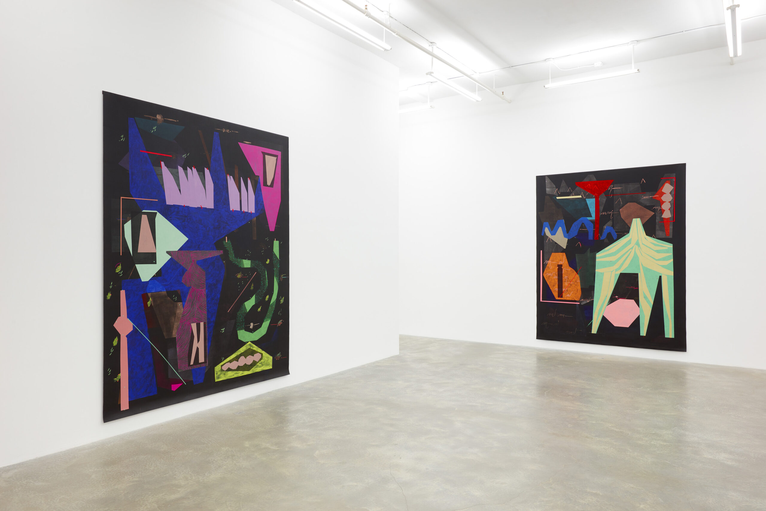
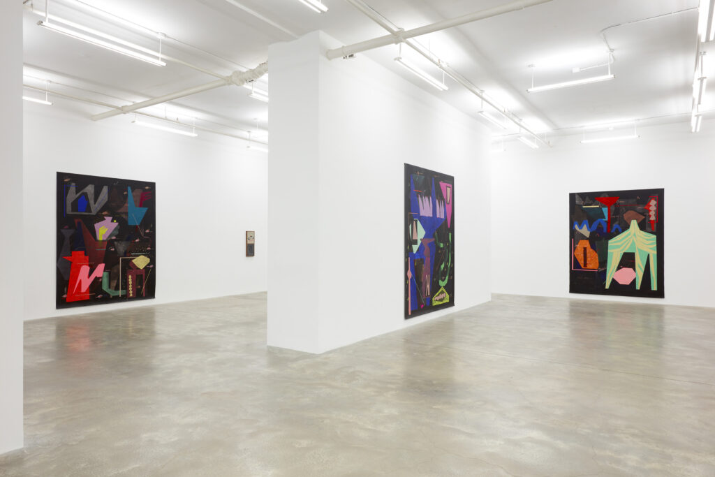
What does it mean to paint the unknown? Caroline Kent attempts to articulate this mysterious space in larger-than-life compositions in mirthful colors on vast fields of black. The forms in her work are unfamiliar and ambiguous, yet feel reminiscent of something. Each painting is a vignette of multi-layered textures, flat shapes, and wild colors which conjure up notions of otherworldliness against an omnipresent black background. Vivid colors like electric, minty green brushstrokes against a dusty rose form, fade into, emerge from, and float within what Kent calls a “black ground.”
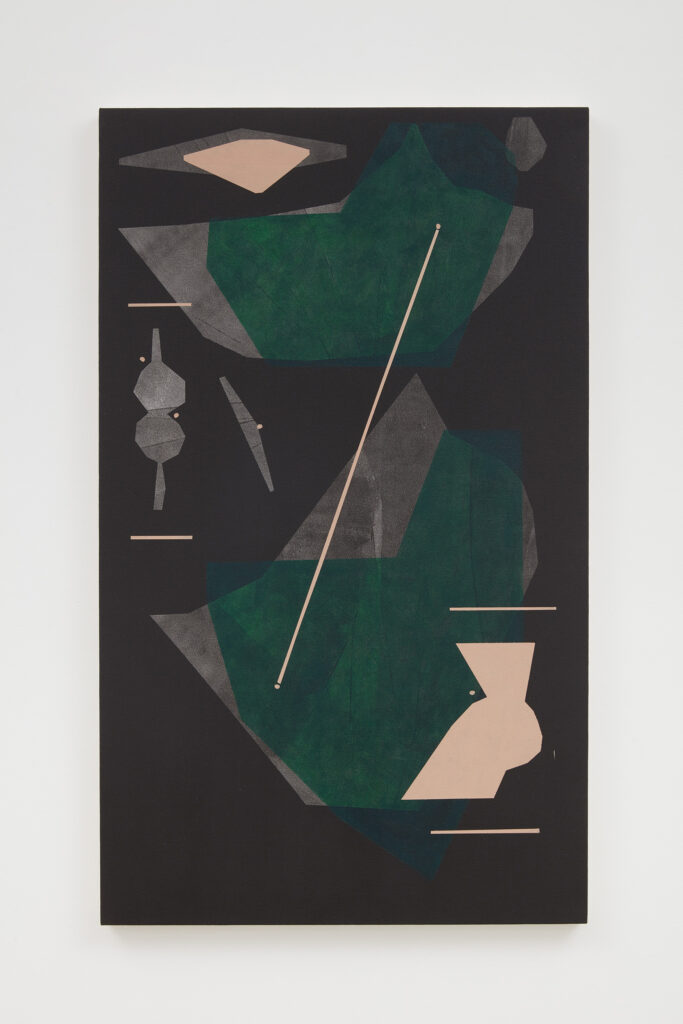
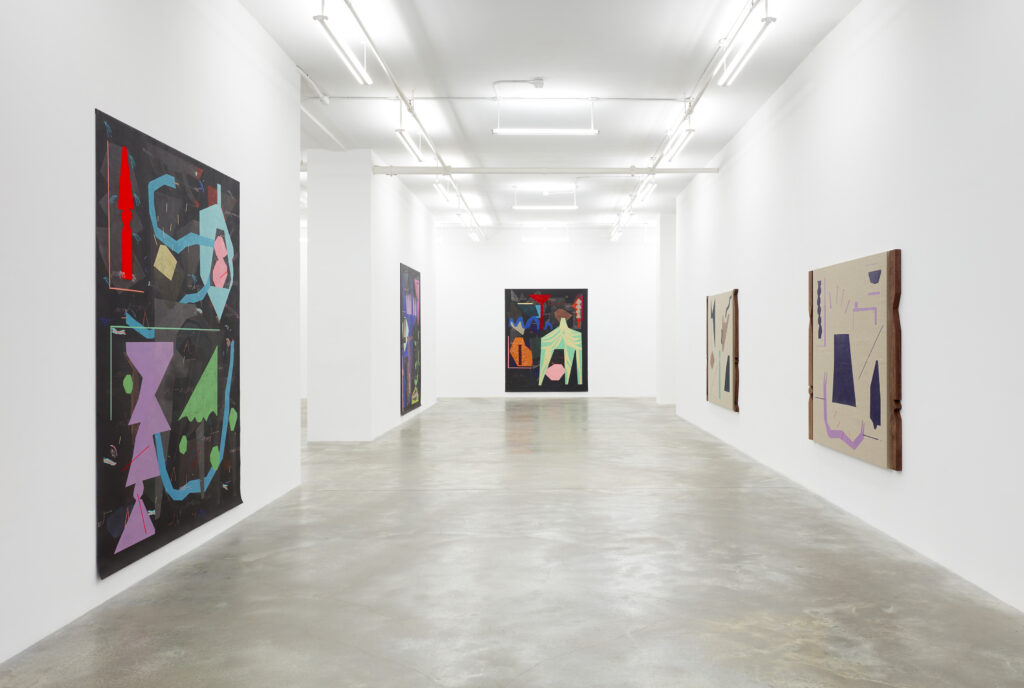
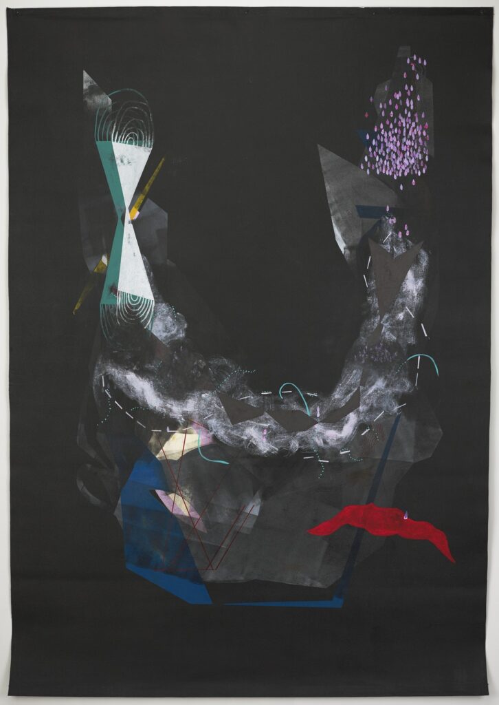
Viewing Proclamations from the Deep, Kent’s first solo exhibition in New York City at Casey Kaplan, I was easily swept away into the alternate reality her paintings inhabit. Punctuating her usual large compositions on black—the centerpieces of the show—are wooden sculptures, an impression in cement, works on Belgian linen, and some smaller-scale paintings. Of varying degrees is a pared-down painting in the show which makes use of patchy gray forms, translucent evergreen shapes, and martian pink accents. Several gray forms lie on the backmost layer of the painting, above a black field. Two green shapes hover above these gray shapes with similar, though not identical, forms. The pink accents are the final layer: dotted blips, lines which connect and dissect, and two distant shapes that also overlap and imitate other forms in the work. She describes this painting as expressing change over time. Each of the slight variations in form reference, mimic, and rest atop one another, like still frames of a moment in time.
Kent’s brilliance is most apparent in her skillful use of color and keen understanding of composition. In order to create her particular palette of opaque colors and vivid tones which dance in step with the black background, she mixes her hues with a warm-toned white. This creates colors that feel lively, inviting, and which attenuate the subsuming black surfaces on which she paints. Likewise, she uses black paint to temper, sculpt, and cut back as needed. This “black ground” is a space of infinite possibility which represents the bounds of human perception. “Blackness in this world is tethered to these places far out in the cosmos or deep in the sea. You go in either direction and you are met with blackness,” she explains. “I like to think of blackness as a repository of the unknown and consider what might be conjured up in that space.”
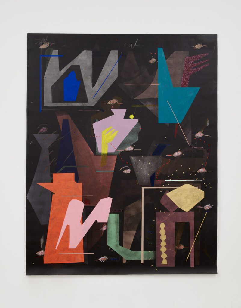
The paintings are like thoughtforms, yet unexpressed in speech but tied to language just the same. Kent is enchanted with language, which she explores through painting, as well as linguistic symbols like punctuation and script. Her curiosities about language emerged, she told me, from watching foreign films, encountering foreign languages in her time spent abroad, and mulling over language’s capacity to create in-groups and out-groups. Kent has also created several text-based works and gives her paintings fictive, prose-like titles. Ideas about language drive her creative work and can be found in her practice almost everywhere you look.
Kent met with me virtually from her studio in Chicago to discuss the show, her practice, and her journey to this moment in her career. Behind her rests a painting depicting her characteristic forms in gray shadows and violet on black. Her decision to work in a large-scale format and use a stark black backdrop poses a welcome challenge for her. In her practice, she wonders how to articulate her paintings in order to “push against conventions of abstract painting, defined mainly by white men, who made very bold gestures in their paintings, who wanted to command space and command the room.” She is curious how to make these grand paintings feel as though they aren’t simply “taking up space just because they can.” She aims for a painting practice that is “a little more self-conscious,” and asks, “How do you get a painting that is all black and nine feet tall to feel soft?”
Abstract Expressionism has a long lineage of painters who work on large canvases in considered colors. There is Jackson Pollack and his chaotic, flung paint, Mark Rothko and his bold color studies, and Willem deKooning and his cacophonous brushwork. And when I think of the prominent male figures in Abstract Expressionism who displayed authoritative—sometimes confrontational—ideas through painting, Barnett Newman comes to mind. Newman’s notorious 1969 painting, Who’s Afraid of Red, Yellow, and Blue III, is an 18-foot-wide, eight-foot-tall painting in monolithic red, flanked by a thin, vertical, blue stripe and an even smaller yellow one. Since its acquisition, this painting has received intense reactions from the public. It was so evocative, so outrageous, in fact, that it was stabbed with a box cutter while on display at Amsterdam’s Stedelijk Museum. Suffice it to say, this is not the type of presence Kent is going for. Her paintings neither provoke nor offend. Rather, they invite close reading. More like a text. The work possesses what Kent calls “a feminine mystique.” Whereas many of the men associated with Abstract Expressionism used their painting practice to express essentialist ideas about “pure” feeling, “true” form, or other “objective” positions on creative expression or the nature of reality, Kent’s more self-conscious approach is one based on inquiry. Her practice is energized by her curiosity to explore the questions which underlie her work, not to provide a definitive, absolute answer to them.
A peer of Newman’s, and an influence on Kent’s practice, was Carmen Herrera. Throughout her lifetime, 106-year-old Herrera explored every boundary of what her geometric abstract paintings could do: from drawings to op-art to sculpture. Like Kent, Herrera had an eye for color and explored ideas about form in her work, drawn from the built environment, and a special appreciation for straight lines. Her 1949 painting Shocking Pink depicts hard-edge blocks and triangles in bold violet, black, and white. Assembled like pieces of a puzzle, these forms come together on a single plane to create illusions of foreground, background, and assemblage. A labyrinthian stripe of “shocking” pink carves through the image.
Colors like violet and pink were not part of the geometric abstraction canon, and conjure up associations with femininity. The fact that Herrera was a Latin American woman in the art world would pose challenges for her throughout her career. She was excluded from galleries for being a woman and was often limited to showing in art spaces dedicated to Latin American art. But that never stopped her from making work for upwards of 90 years, since she began her practice in the 1920s. In an interview with Frieze, Herrera stated “I don’t want to be considered a Latin American painter or a woman painter or an old painter. I’m a painter.” Kent, who is of Black and Mexican descent, echoed a similar sentiment when she told me, “I don’t want the work to be consumed as a trend or a moment. I have a long-built art practice. [Carmen Herrera was] making for a lifetime, and that’s where I want to be.”
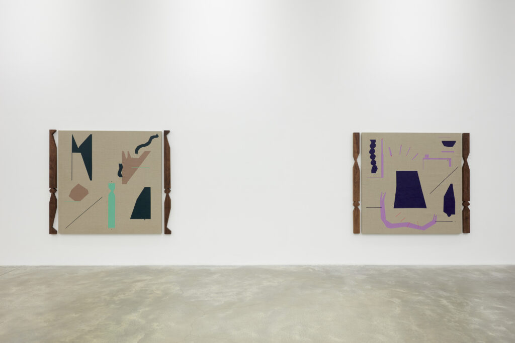
In a talk with The Brooklyn Rail, editor Amanda Gluibizzi also inquired about of varying degrees. In considering why this piece in particular is so captivating, Kent speculated that it may be that its simple, reduced forms are especially strong and evocative when viewed alongside her more wild compositions. She thinks this painting feels more singular, with less visual commotion, and poignant in its simplicity. It seems that Kent, too, is attracted to the unique qualities of this piece. She showed me a few more paintings in her studio of a similar style, which use a limited palette of colors. Her studio is a large, long, sunlit room with exposed brick and high ceilings. Five of her large paintings are draped on one side of the room, spanning the entire wall. An orange scaffold sits in front of one, indicating these are works in progress. Scattered about the studio are ephemera from previous exhibitions: a wooden pedestal and fake plants. Near the doors stands a large table covered in papers, tools, and the controlled chaos of a creative at work. The smaller works hang on the adjacent wall. “These paintings satisfy a desire to make more minimal work,” she says. “I don’t necessarily use the word ‘minimal’ when I am describing it, because I think the word ‘abbreviation’ fits better.”
Kent’s instinct is to always turn to language, to use metaphors of speech and communication to explain how her paintings function. When discussing her paintings, she speaks of “didactic” lines and gestures, of “enunciated” forms. She is curious about what her paintings “tell” us and what they have to “say.” In her painting practice, speech is the muse she looks to for inspiration. “I was interested in creating a visual, abstract language where everyone had the same capability for access. Just because I am the ‘inventor’ of it doesn’t mean that I alone hold the keys to its translation.” Kent’s body of work is an ever-expanding and shifting lexicon.
“It feels like artists are often put into a position of being the authority on their work. Up to a certain degree, I can be. But there is still a lot that is unknown about my paintings, even to me,” she says. Caroline Kent does not believe herself to be the sole arbiter of what her work means, and she whole-heartedly believes the work is finding expression through and with her—almost as if she is channeling an artistic force. “I am working intuitively and it’s not until I’m done that I step back and consider what I did,” she says with a laugh. Kent speaks in the present participle, and speaks of her paintings as if they are happening right now. She describes the artwork and symbols within as in flux and in a state of change. Kent sees her practice, her paintings, and the forms within them as becoming, as unfolding, as always in the act of.
To me, Kent’s work feels spiritual, like it belongs to the same tradition as visionary abstract painters like Hilma af Klint—especially when Kent says her paintings are “a depiction of a reality that we can’t see.” While living abroad in Romania, Kent worked near a school for icon painting. She drew influence from the practices for painting holy figures, in which artists are instructed to paint a reality outside of and beyond this one in order to avoid sacrilege. “There is such a specificity to the way an icon is painted. It should resemble not this life, but an alternate reality.” Like the unutterable name of a supreme being, the image points to something that cannot fully be represented.
Hilma af Klint, too, painted large-scale works in soft pastels, but unlike Kent’s paintings, they feature much less black paint and more organic shapes. The forms in af Klint’s paintings are reminiscent of the natural sciences. In her work I see motifs which remind me of daisy petals, cardioid polar patterns, electron valences, and mitosis. Af Klint’s painting Untitled #1 is one of her most cosmic and saintly looking. The top half of the painting depicts a luminous sun and its beams, encircled in rings of soft green and pink—the colors most associated with the heart in metaphysical thought. A triangular prism in a grid of rainbow colors extends to the bottom of the painting, either omitted from or receding into the sun (it’s hard to tell which.) These figures are against a black backdrop flecked with pale paint, resembling the night sky.
Countless early abstract painters, from Hilma af Klint to Vasily Kandinsky—some of the eldest painters in the genre—were influenced by New Age spirituality and occult ideas. Af Klint was a mystic and medium and drew influence for her artistic practice directly from her spiritual experiences. It follows that contemporary abstract painters like Kent also take an interest in this subject matter. Ideas about the immaterial world, and about spiritual life, feel inseparable from the essence of abstract painting. The specific tradition of abstraction to which af Klint, Kandinsky, and Kent belong is a tradition which gives expression to immaterial and extra-physical things: language, feeling, music, memory, and spirit. In Kent’s work, the black background serves as the visual metaphor for this: It signifies that what you see here is not necessarily of this world.
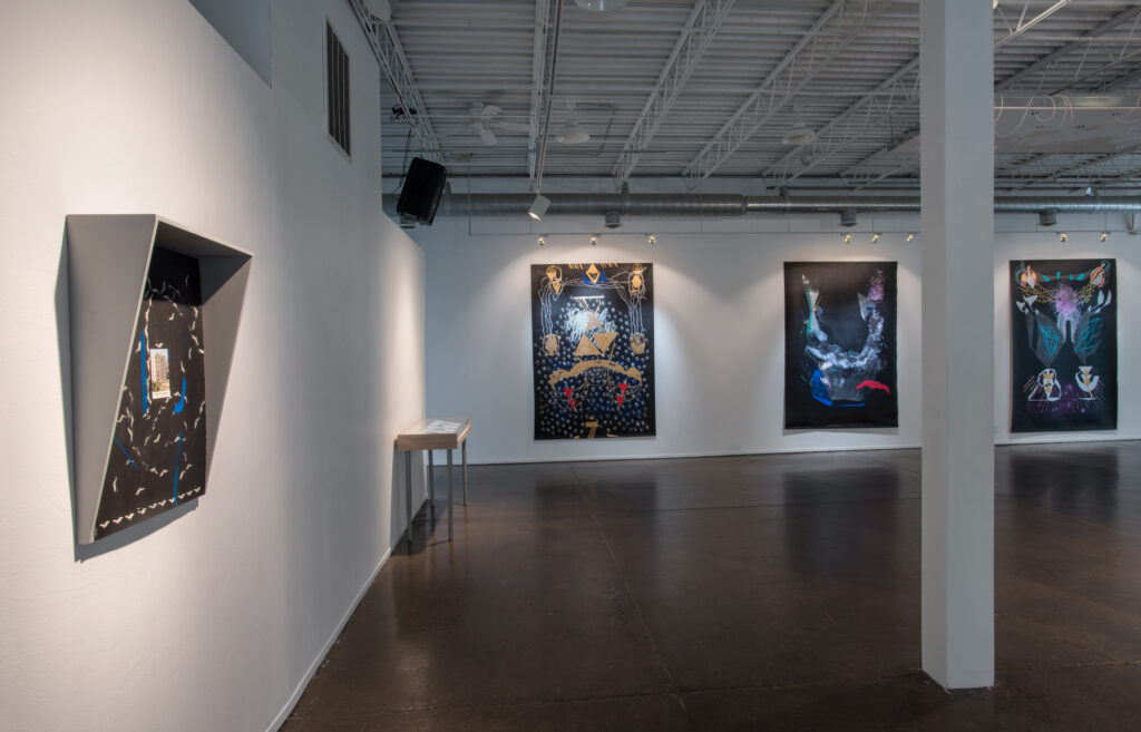
Caroline Kent, Joyful Is the Dark. Courtesy Public Functionary. Photo: Rik Sferra. 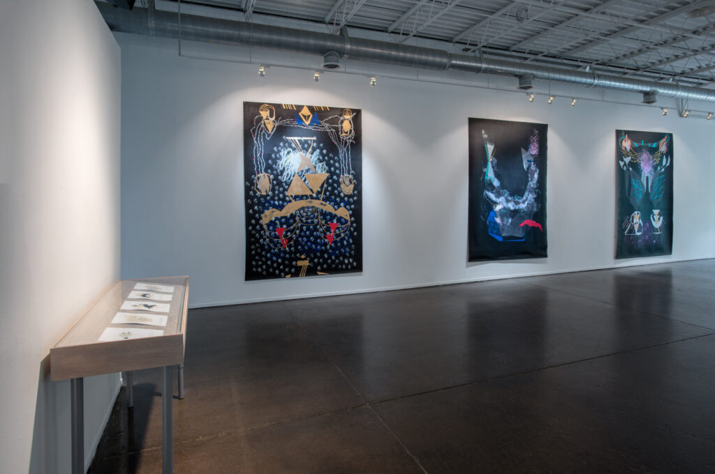
Caroline Kent, Joyful Is the Dark. Courtesy Public Functionary. Photo: Rik Sferra. 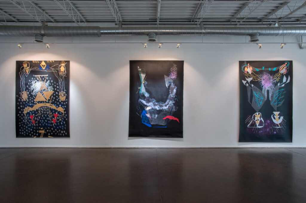
Caroline Kent, Joyful Is the Dark. Courtesy Public Functionary. Photo: Rik Sferra.
The first painting Kent produced on an all-black background was It’s Like Magic. The piece was featured in her 2015 show Joyful is the Dark at Public Functionary in Minneapolis, where I first encountered her work. This painting predominantly features gold shapes and blue accents, no doubt an homage to the influence of icon paintings in her practice. Gold triangles and ambiguous loops and arcs hover above and around each other, over a plane of dusty, repetitive markings and deep blue drops like rain. From this show former executive director of the Walker Art Center, Olga Viso, chose Further and Farther than One Expects for the museum’s permanent collection. “It was very significant for the Walker to endorse the work and support it early on,” Kent reflects. From this acquisition came greater exposure for Kent, and it ultimately led to her representation at Casey Kaplan.
Kent told me that while working on the paintings for her first solo show—the first to prominently feature the black background—she listened to the motivational speeches of Earl Nightingale, one of the progenitors of self-help literature and an early advocate for the philosophy of positive thinking. In his most famous record, The Strangest Secret, he details the importance of controlling the mind and harnessing the will in order to manifest your desires. All it takes is a clear goal, steadily pursued, and a fearless mindset. She says that Nightingale’s talks “really spoke” to her, and that she applied his ideas to her art-making practice. This helped her to embody her hunch that she had a unique contribution to make to the field of abstract painting.
These experimentations on a black background were when, she told me, she began to really understand that she and her paintings had something to say. These early paintings are distinct from the work in her 2021 show at Casey Kaplan, but retain many of the elements seen in the work she makes today: the collage-like forms, markings which vary in texture and size, a bold mix of colors, and plays on layering and depth. Kent says that Joyful Is the Dark was experimental in nature, her first show featuring the large-scale paintings on black, and each work varied greatly from the next. Today Kent seems to feel comfortable and assured in her voice and style, producing more bold and cohesive work, building fluently from this foundation to produce her abbreviations, punctuations, and vocabulary as each painting calls for it.
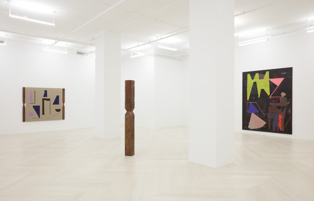
The paintings in Proclamations from the Deep have a dreamlike presence and invite curiosity, like symbolic visions in fields of nothingness. The vivid and unnatural colors signal something otherworldly and unknown. More than an outer space, the paintings draw me inward—to the mind’s inner space, the psyche’s inner workings. Each form in the paintings exists in complete harmony with one another. Nothing is out of place. Everything is in perfect balance, much like the mysterious balance in the fundamental forces of the universe. The work emits a choral hum of unity. Some forms are sharp and loud, with edges. Others whisper from beneath and behind, existing at a deeper layer. Brushstroke glyphs communicate in mathematical waveforms and lyrical murmurs. Swift lines point from one place to another, just before sweeping back into the mystery of it all. The work can be viewed in parts, with a magnifying lens to interesting vignettes, or viewed as one narrative tapestry, taken as a whole. The story Caroline Kent and her paintings are telling has only just begun.