Some Are Fresher Than Others: “Box Fresh” at the Soap
Valerie Valentine thinks about what art school does after seeing the five-college art student show, "Box Fresh," at the Soap Factory. The show runs through October 24.


How does one get inspired in a classroom? Don’t you need real world experience to interpret life through art?
Art schools can make or break an artist. In any art, be it music, creative writing, or visual art, the pedagogical approach can go against the system’s intention. Texts get homogenous as writers learn their instructors’ style and aspire to mimicry. Songwriters get formulaic as they learn what kind of music sells. Visual artists take no risks, sticking to the tried-and-true, trying to master the basics. These are worst-case scenarios, but are uncomfortably familiar to anyone who’s been in an MFA program or witnessed friends’ art training.
The flip side is that instruction programs offer a community of like-minded people, and guidance or mentorship from others passionate enough to teach. School is also a prime opportunity to master aforementioned “basics”: composition, drawing, or painting technique. The system will only succeed, though, if the art pupil can used learned skills with originality. Remarkable creative endeavors require revolutionary thought– and the apprentice’s success depends on his or her understanding of when to start breaking established rules and making new, personalized ones.
Each program of study diverges. Some schools stick firmly to traditional syllabi. Less dogmatic instructors can encourage a critical approach to the art experience, fostering an environment hospitable to experimentation. This investigational method can lead to huge failures and flops, but also to improvement and modernization within the artistic culture.
We cultural consumers subsist on these flashes of brilliance; the thrill of a new experience in an age where everything has been done exhilarates on a personal level, while also revitalizing the scene. Young, groundbreaking artists become the next generation’s giants. The current show in the Soap Factory’s main gallery shows some of the top artists from area colleges’ visual art programs.
Sculpture stands out in this show. Neophytes try new shapes and materials. Due to the distinctiveness of the materials used, it’s frustrating that the media are not listed on the title cards – some objects were obvious, though (twine, rocks), others not (are those earplugs?). Recognizing what the artist used to compose the piece aids interpretation – the guessing game is more of a hindrance to insight than an amusing diversion. (I will forgive No Name Exhibitions this once, as the show’s organization was clearly a large undertaking.)
Here are a few artists to keep an eye on, with works worth considering:
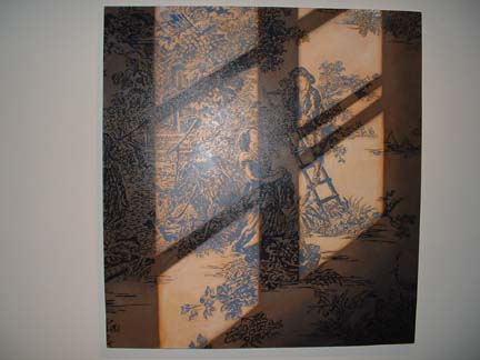
“Sunlight on Tolie” by Michael Banning, Minneapolis College of Art: The large-scale painting looks like a woodcut or print, the lines are so precise. Under scrutiny, though, it looks freehand painted. A shadowed slant across the painting’s surface appears natural; it’s a risky disruption that might have marred the beauty of the scene, but rather enhances it, by involving the viewer as participant looking through a window.
“25 Award Winning Attached Townhomes” by Cheryl Gilge, University of Minnesota: Black-and-white photographs of what appears to be the same house from the exact same angle. Looking closer, you can see small details that make them individual, like a behemoth pickup truck in the driveway or a sapling maple in the yard. Gilge’s photography serves as witness to the homogenization of homes, perhaps pointing to a larger-scale cultural “blanding.” Gilge’s silent observation does not directly cast judgment, but presents evidence to the viewers, who act as jury. So the houses are not beautiful — fine. But their construction creates jobs and satisfies someone’s basic need for housing. What would Karl Marx say? A remarkable variety of perspective spins out from this visually repetitive project — part architectural survey, part testimonial.
“Map – Fortune Tellers Series” by Karen Kasel, College of Visual Arts: Blue graphs, like an ocean peeled off a globe, are folded on the floor, with origami squares strewn across the surface. The origami are those diamond flowers that children can slip their fingers into, and play fortune-telling games. Kasel made them out of maps. What results is a topography of choices, presented as floating islands of geographic possibility.
“From Judith & Holofernes” by Matt LaCosse, College of Visual Arts: They’re still teaching classical realist painting, believe it or not! This piece is technically advanced — virtually flawless. In classic tradition, the artist bases his painting on a story; in this case, a murder from the Old Testament. The story has been memorialized by Michaelangelo, Boticcelli and more. LaCosse’s version is vivid, gruesome and chilling.
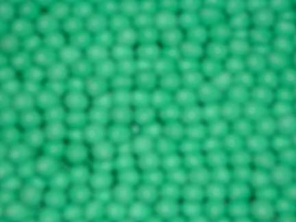
“Plug Rug” by Trevor Nicholas, University of Minnesota: A layer of bright green earplugs achieves a wonderful texture; it’s like a new interpretation of Astroturf. Hung on a wall, as it is in the gallery, the item could be used practically as a colorful soundproofing tool in a musician’s studio.
“Untitled” by David Quady, Minneapolis College of Art: Twigs are attached with tissue paper scrawled with poems, looking roughly like paper lanterns. These effigies could easily be elements of a pagan ritual, about to be set adrift on a river or consumed by flame. Simple, organic materials belie the likelihood of difficult, precise construction.
“Untitled” by Pavel Sepelenko, College of Visual Arts: Within a twine tapestry, the artist has craftily woven the face of a lovely woman. The rope sculpture weighted by stones appears to be the work of a seaman – the materials suggest the story of a sailor at sea, or even someone stranded on an island, longing for his woman. Romantic stuff.