Review: In Search of the Perfectly Realized Image
Michael Fallon's review of the huge Fourth Minnesota National Print Biennial (at Katherine Nash Gallery) laments the loss of joy and the dominance of Importance in artmaking at the moment.
There are, I think, just two ways to approach a big-ass show like the 4th Minnesota National Print Biennial currently running at the Katherine E. Nash Gallery at the University of Minnesota. You can first sift through the bloated roster of works (all 122 of them, by 102 artists) to find signs of emerging trends, interesting new developments, or clues, perhaps, to confirm what you already know or suspect about contemporary art. And you can write a condensed assessment of the show based on those trends–picking a select number of examples to support your claims from the vast field, and necessarily discounting the rest of the stuff that doesn’t fit what you want to say.
Alternatively, you can push through the riptide flood of images for signs of stuff that appeals to you, or that you recognize, or that seems worth commenting on. In a show of this size, it would take a near-book-length tome to avoid writing a scattershot collection of glib one-line assessments that do justice to nothing. (Message to curators: Why so goddam much? I miss the old days, such as when the 2nd Print Biennial included a more reasonable number of artists—i.e., 22.) I prefer the former road: noting the trends and saving myself as much headache as possible.
The most conspicuous aspect of the Print Biennial this year is that the mood of its artists is by and large rather grim. While artists generally tend to feel put-upon, beset by the woes of the world and its inequities and injustices, this tendency seems to be particularly up-trending now. On the whole, this show’s images are dark and/or indignant–both in subject and in composition. Maybe it’s the war, or maybe the economy–and the attendant sense of doubt in the culture now—-but there is no joy in Mudville, er, in Minneapolis, folks.
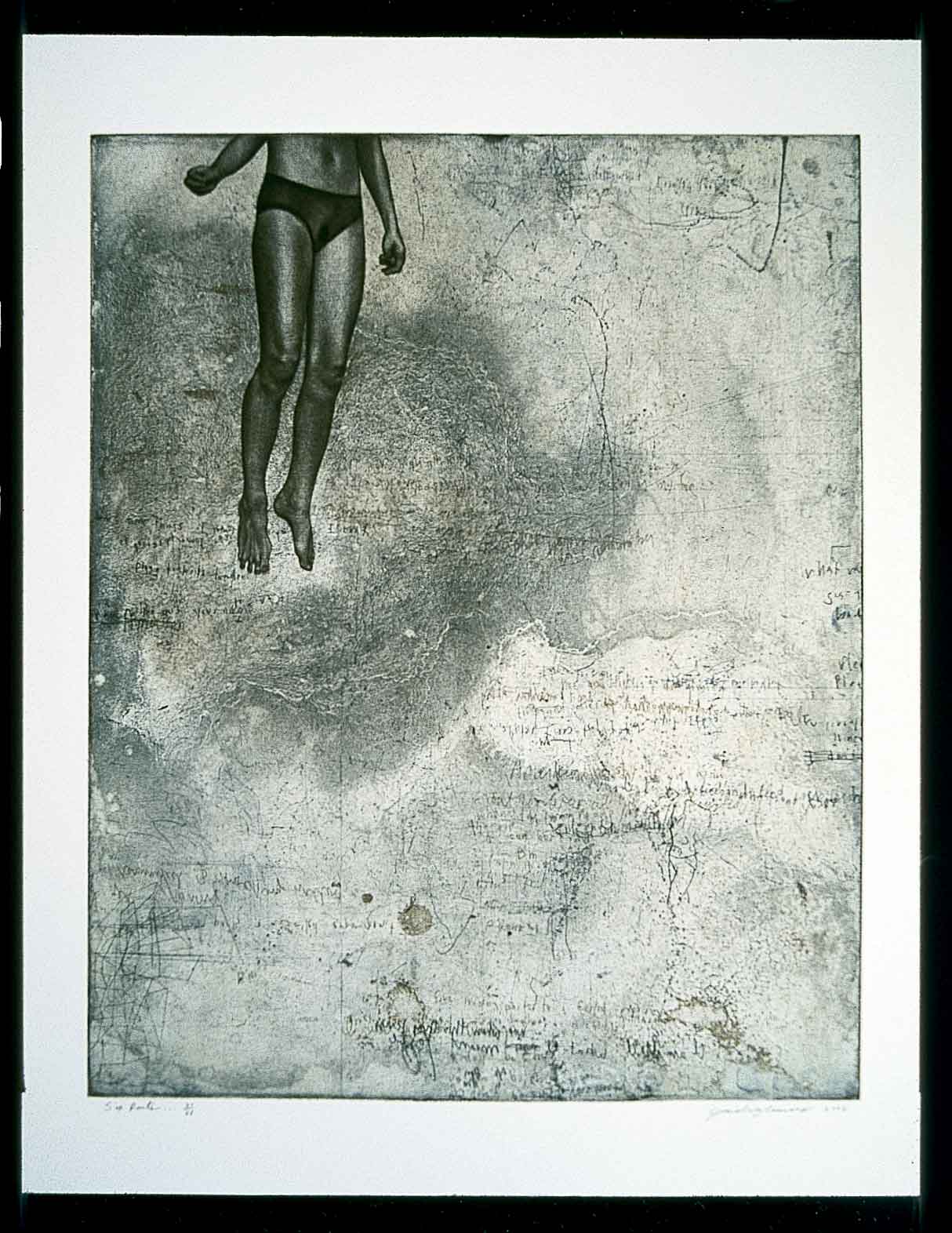
For instance, an entire wall of the show is devoted to not-so-subtle political statements on the subject of war. Sarah Marshall, of Alabama, gives us a small intaglio and chine collé piece, “Toward the Outside,” in which a shadowy plane, drawn in a childlike style, flies over a rough and edgy topographical surface. Small forms that look like brown bombs fill the space around the plane, suggesting perhaps that war is a childish pursuit, or that we are training a nation of child bombardiers with our current warlike zeitgeist. David Brodeur, of North Carolina, meanwhile presents two images from his “Highway of Death” series. Both are computer-generated and inkjet-printed pastiches of war imagery (bullet casings, the GE symbol, plane and machinegun diagrams, grainy satellite-photo background shots). These images, and several more by other indignant artists, exhibit a sense of frustration, resignation, helplessness. Jonathan Thomas’s intaglio image “Six Parts to a Regrettable Dream VI” reveals atmospheric spaces in which bodies float helplessly, their heads cut off by the picture plane, a great sense of moody helplessness and dismay.
But such feelings come from a distance in these works. The printed image is created at one remove from the image-making process, so that prints seldom seem as intimate as, say paintings or drawings, but the strategies of these artists reinforce this distance further. Brodeur’s images, for example, give us no real sense of the effect of war, coming across as an intellectual, computer-generated, and rather artless and obvious critique of war. Crisp and cleanly rendered and overly wrought, his prints evoke the assessment that “War is bad” without really giving us a true reasoning or a visceral impression. These works fall flat in their lack of true emotional content regarding the realities of war.
Another trend apparent in this show is that artists here seem to be grasping for subjects to be incensed about. There seems to be a strong desire to make images that are Important (with a capital I), that evoke the great art movements of the past, that give their artistic practice some sort of Meaning (with a capital M). Perhaps this happens because art today is an increasingly negligible part of the culture, but the result of all this overreaching by artists is a rather joyless batch of art. That is, few works exhibit any pleasure in the practice of being an artist. Perhaps too this is enhanced by the inherent quality of all-too-slick computer-generated images, common in this show. Artists like Brodeur keep their hands clean of passion, and pretend that taking a stand about something Important is akin to making art.
In Californian Patrick Merrill’s etchings, “Kiss Your Flesh Goodbye, #1” and “Kiss Your Flesh Goodbye, #2,” clowns dance in front of neon-colored landscape of nuclear power plants and mushroom cloud explosions and industrial architecture. These images feel terribly out of date, and wholly superfluous. It doesn’t help that the loose style of
represention–blurred imagery, less-than-crisp registration of colors–makes them seem slightly amateurish, in the manner of underground zines (that outdated medium). Minnesotan Jenny Schmid’s lithograph, “Anorexia Girl,” while admittedly masterful in technique, is repellent in its grasping for an issue worthy of the artist’s abilities. Schmid’s works are cliché takes on womanly trials and tribulations (other images include: girls who get knocked up, girls who are the object of the older male gaze, and girls on drugs). The results seem forced. In “Anorexia Girl,” a big-headed figure sitting on a couch is surrounded by a baroque accretion of temptations—-pieces of cake, demons who tell her to be “thinner,” withered skeletons who hold a mirror to her with the word “fattie” on it. What is the point, after all? Is there anyone who is not aware of the issue of anorexia? It’s hard to be sympathetic when so much information is available about such issues, and there are social agencies charged with prevention and treatment of the disease. And besides, when did art become a public service announcement?
In a way it’s poignant how many artists want art to be so helpful-—but who are we fooling? Who will care in the long run if the art is cloying and easily forgotten? Why are artists not more concerned with creating memorable, beautiful, unforgettable images? Why don’t artists get worked up about the issue of art?
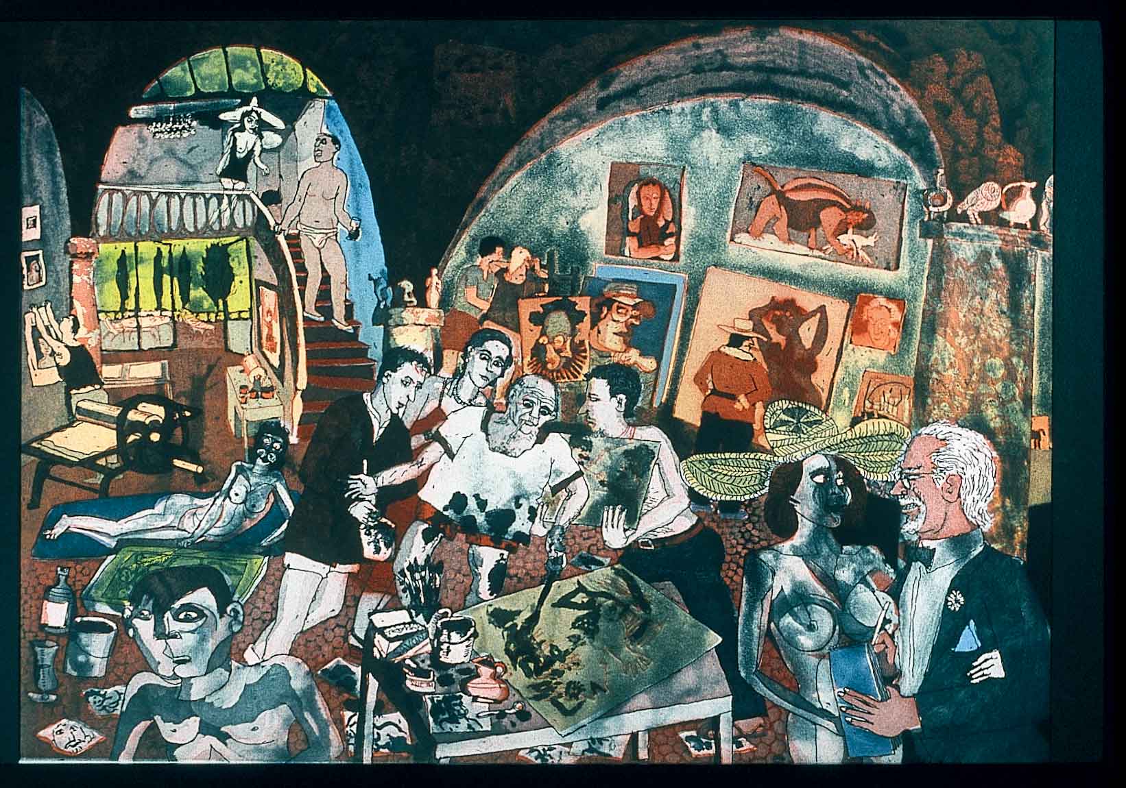
Warrington Colescott (WI) seems to prefer to fall back into a reverie about the better days of the past in his work. His etching “Picasso at Mougins” is a homage to another era in style and subject. Its colors are expressionistic, boldly red and blue and black; its figures are animalistic (fauvistic), fawning over the central titular figure, some half-dressed, some completely nude. Overall, the scene is a fantasy of longing–the studio space is a cathedral, the energy infectious. I see it as a pure desire for a time when artists had a central position in the image, and in the culture.
In other images, the darknesses are more personal, less grasping. (Note: Not all of the work in this show is dark; some is delightful and colorful, but that’s the problem with such huge shows—-the weight of the whole often bears down the particulars.) There are, for instance, a number of woodcuts that come across especially darkly. Perhaps this something inherent in the medium–the grating act of gouging out the wood, perhaps? Mathew Clay-Robison of Washington, D.C., gives us an inexpertly done but passionate multicolor woodcut “Rush Hour, Columbia Heights.” His pastiche of images are predictable for a depiction of the inner city–angry males standing around in groups, drinking, breaking bottles, driving in gangs. Still, it is appealingly expressive and dark in the way of German expressionist prints of nearly a century ago. Texan Michael Stephens’ black-ink woodcut “Camero” gives us a stereotypically imposing central policeman figure, while the rest of the image devolves into a fantasia involving a giant insect ridden by a masked marauder. The insect’s proboscis pierces the roof of a bank and sends dollar bills spiraling into the air. I’m not sure what the exact message is, but the mood is woodblock-print indignant. The same is true of Utahan Stefanie Dykes’ woodblock, a masterful example of the form, “Discharging Her Duties.” This is a four-panel work in black ink that spans a long piece of Japanese paper. It imagines a semi-nightmarish landscape of cell-phone talking cows, agro-industrial complexes, welding-masked and harlequin-dressed people going about their obscure business, and a tangle of putti in the right top corner. I don’t know what it means, but again I get the mood.
There’s more I could say, but I think I’ll end here–you get the point. Still, I’d like to end by mentioning works that exhibit the near-opposite to the main trends listed above-—the phony indignation, the distant and dispassionate gloom, the computer generation. Minnesotan Scott Helmes’s “Incantation for 6 voices” pushes the definition of a print, and as such is unlike the bulk of this show. It comprised of simple typewriting on a smallish piece of Rives paper (the word “incantation” broken up and reproduced over and over in lines that fill space). The words are painted over with dabs of watercolor. For me, this work hearkens back to the pre-postindustrial age. The typed words are poignant in how they bite into the surface of the soft paper. The hand is evident in the neat regular swipes of yellow, red, violet, and blue paint. The image makes me think of time before the codification of art and music, when composers wrote down their compositions in idiosyncratic, and often beautiful, ways. The work speaks to the beauty and magic of the human touch (the double meaning of the word “incantation” helps with this reading), and as such is a comment on all the slick and distant computer-generated stuff that surrounds us.
My second fave is perhaps the smallest, most intimate image in the show. Wisconsonite Gaylord Schanilec’s “Times Square” is a tiny and exacting multi-block wood engraving. A modern master of the technique—and a local treasure—Schanilec is simply in a different class than the rest of these artists. His work, carved carefully by hand, incredibly personal in its exacting details—-people the size of literal ants, the words on advertisments no bigger than pinheads—-is a tiny homage to the city of New York. Nothing of any Import is occurring in the scene, this is just a perfectly realized image of an absolutely mundane moment of life. And as such it is incredibly beautiful. Art doesn’t have to be Important to be poignant.