Quagmire: MCAD/McKnight 2005
Andrew Knighton visited one of the most important shows of the year: "MCAD/ McKnight Artists 2004-5," MCAD Gallery, through August 7: Ana Lois-Borzi, Rollin Marquette, Erika Olson, Joe Smith. What he saw was disappointing.


If you’re one of the many who are uncertain about what constitutes a quagmire these days, the MCAD/McKnight artists show might be instructive. At times sloppily executed and unpleasant to navigate, the show does nevertheless allow some works to acquit themselves. But even the pieces that do deliver on their great promise — as with the reliable beauty of Erika Olson’s paintings, or the methodical grace of Rollin Marquette’s structures — are to some degree handicapped by the sucking action of the show’s low tide.
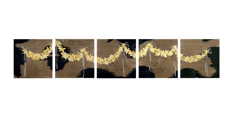
Most immediately redeemable is Olson’s work: there are two painted pieces done in keeping with her usual style, and a small installation (Disingenuous Growth) resembling a biophere, made mostly of felt. The latter is interesting and intricate, but deserves a more appropriate site: it now hides behind a wall in the gallery’s dim back corner. Olson’s paintings, meanwhile, are one of the show’s few stable points. The five plywood panels of A Certain Satisfaction from Unsubstantiated Worry, stretching some thirteen feet across the back wall, are especially striking. Across them runs a continuous floral motif, its various takes on yellow superimposed upon a black background of organic forms; the rich grain of the plywood base glows through in the not-quite-negative spaces. Subtle decorative shapes, often tracking just above the threshold of perception, are woven throughout; their modesty combines with the detailed craft to elevate this work’s ornament above mere prettiness, and to lend depth to its surface sheen.
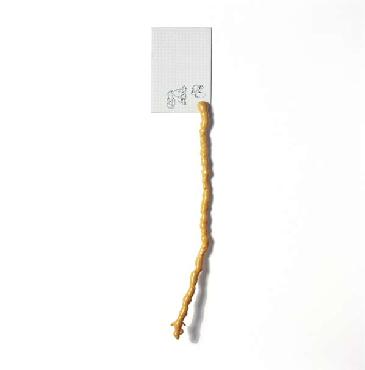
Olson’s deft formal sense brings this robust yield of varied elements together, renewing her reference points in the history of the decorative arts and lending them unity. That careful unity is what is most lacking in Ana Lois-Borzi’s segment of the show. She trafficks in a determined hodgepodge of detritus and micro-historical allusion: cast-offs, found items, things that might have been significant to someone, once. Most of the elements are broken down to a few basic parts and rather unceremoniously attached to the wall, as in Maneuvers, comprising a handful of tiny parts carved from a stuffed animal, or Very, Very Funny, which combines a pencilled smudge, a brown ceramic sphere, and some wadded fabric.
The effort to infuse abandoned trifles with new meaning may be noble — if not particularly novel — but there is something deeply nihilistic about Borzi’s work. The overall effect is one of atomization and randomness, as if the abjection of her various elements can be redeemed only in a world of taxonomic sterility. Her vernacular titles compound this effect with their phatic emptiness. These are the filler phrases we use when we are saying nothing at all: “Very Funny” dismisses that which is unfunny; “Take it from Me” is the annoying prologue of a bullshitter; “I Beg to Differ” a means of dignifying pointless argument with an air of importance. Likewise failing to communicate much, this work’s overall conceit seems to limit its creator to collecting crap instead of crafting art. It makes a distressing case for what is artistically possible these days.
Joe Smith’s work also attempts to forge a bizarre syntax of everyday forms: office cubicle dividers, Mylar frills, ready-made elements. The most prominent referent here is the postmodern corporate office environment, and Smith seems poised to renarrativize it. But beyond hinting at the office’s repressed unconscious, embodied perhaps by the occasional white blobs emerging from the walls, his scraps lack the formal cement necessary for coherence; additionally, the conceptual glue that could potentially serve as a binder is timeworn, stiff, and all out of proportion. In Untitled (Wisp), one of Smith’s more engaging pieces, this latter problem is crystallized. Two Glade air fresheners sit before an irregular panel, which is painted glossy black and propped against the wall. The fresheners’ delicate and intermittent effusions of scented spray — the stuff of the (un)title — are contrasted against the gloss black, and then quietly disappear. Such little delights as this one, like the patterns of light reflected off of the Mylar in another piece nearby, are sadly dwarfed by the boisterous clunkiness of the whole business; pleasure is rendered parenthetical.
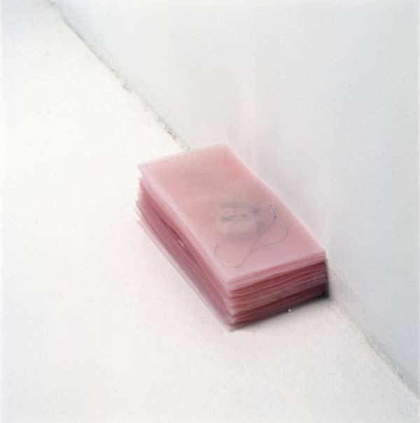
Smith and Borzi suffer from the same variety of aphasia; their constellations are short on the fundamental mediations that would make them legible. (The busy dissonance of these two failed vocabularies is what makes the gallery so hostile — it’s like listening to two shrill AM radio stations at once.) It is to Smith’s further disadvantage that his dismantled cubicle world is drawn into dialogue with Rollin Marquette’s most prominent work, which also refashions a familiar form not far removed from the workplace. Marquette’s Drawing Board, a subtly irregular slab of molded gelatin mounted upon a portable acrylic frame, seems entirely mundane, except that when light penetrates it the effects are dramatic: a mellow infinity of depths and shallownesses are revealed, unfolding in a resonant tale about the complexity of the substance. Unlike Smith’s critique of the structured office environment, which mostly reduces that environment to disorder, Marquette’s quotation from the everyday transcends simple negation and instead amplifies the experience of the entire space.
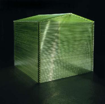
Marquette’s Shed likewise repays patient attention. The piece consists of a six-foot-square structure of acrylic tubes mounted by industrial velcro to a simple internal frame. Each tube is filled with antifreeze, lending to the whole that dense neon green hue so attractive to thirsty pets and children. But the apparent homogeneity of the material is a ruse; the fluid differs from tube to tube, marked by tiny impurities and variations of shade. The structural tensions of the plastic tubing are marshalled into a unity that is almost perfect: look at how the tiny air bubbles are suspended in the tubes, and you realize just how perfectly level the whole works is. The stout stolidity of Shed does not, however, exclude playful paradox: it is a hothouse made of coolant, and though it lacks windows it is nevertheless pleasurably penetrable by the gaze (outdoor light pouring through its green walls invitingly suffuses the interior).
Sometimes it is difficult to be smarter than one’s materials, but Marquette succeeds in these two pieces. His works reinforce the lesson that honest craft is not incompatible with an experimental agenda. The lesson is all the more valuable in the midst of a frustrating and disappointing show that records so many missteps (perhaps it may be said that the exit strategy for this particular quagmire depends on returning to the Drawing Board). In emphasizing the negative aspects of McKnight 2005, I’m likely echoing the experience of many who will visit it, yet it cannot be said that the experimentation of these artists — with new materials, untried strategies, and a renewed intensity for their more familiar approaches — is without value. We are nevertheless cautioned that anywhere the spirit of experimentation thrives, there too lurks the prospect of failure.