Photocentric: The Photography of the Upper Midwest
Alex Starace visits the latest exhibition at the Minnesota Center for Photography and likes what he finds.


“Photocentric: A Photographic Biennial” – a juried exhibition put on by the Minnesota Center for Photography – is open to anyone who resides within 525 miles of Minneapolis. That is, anyone who’s within a day’s drive of the Center. The idea is to display a body of work representative of the Upper Midwest – a region that features open plains, many small towns, a few large cities, northern woods, cold weather, lakes, a flat landscape, hunting aficionados, farmers, loggers, and some of the best photographers in the country. Of these photographers, 126 submitted a total of 411 photographs. The Walker Art Center’s Joan Rothfuss served as juror, narrowing the field to 36 artists and 63 total pieces. The exhibit is comprised of these choices and the results are impressive: not only are all the photographs technically accomplished, but many also demonstrate a highly original aesthetic outlook – no small feat considering how few controllable variables exist for artists working within the medium.
So what does the photography of the Upper Midwest look like? As with any exhibit where the pieces are selected solely on the criterion of quality, there’s not one pervasive theme – a wide variety abounds. However, there are a couple subthemes. By my count, at least nine of the photographs (by five different artists) bear striking resemblance to the work of fellow Upper Midwesterner (and now nationally-famous) Alec Soth: rich colors, perfect focus, sharp images – in portraits the sitter stares slightly off camera, with an odd indifference on her face; in landscapes, a man-made object (such as a billboard) is the visual focus, though the photo gives a sense of loneliness – there are no men to see, just their absence. . . . .That several of the artists have an aesthetic similar to Soth’s is both a testament to Soth’s vision, as well as an intimation of the Upper Midwestern psyche: if one had to categorize the region’s photographs, it would be with these isolated, spare images – with an aesthetic of sorrow, pride, and the lower-middle class – an aesthetic that’s just beginning to be explored.
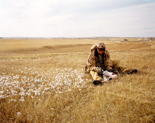
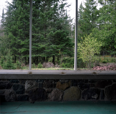
Another subtheme (and one that relates to the first) is that of land – of open, flat, huge land. To the south and west of Minneapolis, there are few trees, few hills, and lots of corn, wheat, and cattle. The result is photographs documenting the hugeness and beauty of horizon-to-horizon skies, such as Brian Lesteberg’s Dad Field Dressing a Goose which shows a man in hunting fatigues in the foreground, dressing a goose, while behind him, one can see seemingly forever – a few dusty roads cross in the far distance and open fields form a patchwork that one could imagine, from the height of an airplane, as a never-ending quilt dotted with silos. In contrast, to the north and east of Minneapolis are forests and lakes. We get images such as Martin Springborg’s Cabin Screen with a view out the cabin into the dark evergreens, or Chris Faust’s Fishing Boat, Genoa, WI, in which the lake, the boat, and weekends-off-from-work are inextricably intertwined.
The north and east, it seems, are where we vacation, whereas to the south and west, it seems, a few of us still live. Of course, though, this is a generality and not an entirely adequate description of the show: there are, among other things, a chronicle of a Chicago man who quits smoking, photographs that were taken from the inside of a washing machine, a vision of what a town would look like if it were covered over by a volcano, and a photograph that could (and should) be the next cover image for Toni Morrison’s early novel, The Bluest Eye.
The quirkiness and spunkiness of many of the works is what makes the show, as a whole, so impressive. One of the best (and strangest) is the work of Celeste Nelms, whose photographs have the faded, grayish tones of decrepit mementos, and are framed in cheap, wooden, thrift-store-purchase frames. The images are surreal – simultaneously modern, old-timey and spooky. In Car Lot, a blurry figure wearing what appears to be a primitive spacesuit walks out of the sales office of a car dealership. The awning above the figure says “MARS.” It is a normal, present-day car lot, a potentially normal image, and yet . . . Why the person in the suit? Why the junky frame? Why does the photograph look (and feel) so old, so much like a precious relic from a bygone era? . . . The result is a piece of art that has an extraordinarily strong emotional pull – Car Lot expresses strangeness, imagination, nostalgia, personal beauty, the creepiness of objects and the weirdness of the everyday, and it does it all at once – it’s absolutely mesmerizing.
Equally strange is Shawn Smith’s Smith 5. It’s a diptych and both panels are the same image: a clearing in the woods. The black-and-white photos are – in and of themselves – fairly boring. The sort of bland images one might find in a 1950s textbook, above a caption reading, “A clearing in the woods.” What’s so compelling is that the two images are the same – or rather, they were developed from the same negative. But they don’t quite look the same. Sometimes the one on the left looks a little bit more overexposed than the one on the right. But then, other times, the one on the right looks a little more overexposed than the one on the left. Sometimes it seems certain trees on one are darker than the corresponding trees on the other. Or maybe not. Are the two truly identical? . . . The game is more engaging than you might think and it implicitly questions the supposedly flawless nature of photographic reproduction.
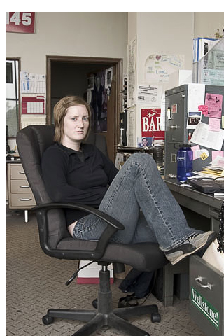
Chris Bohnhoff’s Political Development Director, on the other hand, draws upon the long lineage of portraiture for its power. His photo is of a woman (a political development director, presumably) in an office with piles of papers everywhere and a dreary gray file cabinet to her left. She’s sitting in a common chair (Office-Max-ish, ergonomically designed – the sort typically associated with corporate drones) and her clothes are that of an American in her late twenties. There is, it appears, nothing whatsoever remarkable about her. Except that she looks directly in the camera – her eyes have the striking earnestness that comes from being frozen in the moment.
It’s arresting and strange: photographic portraiture can imbue a subject with nearly overwrought poignancy as long as the subject has the proper expression. The development director looks, with the set of her face and her unblinking eyes, much like many of the portraits done under the auspices of the WPA during the Great Depression: sturdy, resolute, unyielding and yet downtrodden. Hardworking. Tough. Down on her luck, but capable of continuing the fight. . . . . But Political Development Director is modern-day. There’s a “Wellstone!” bumpersticker on her file cabinet and a Nalgene on her desk. It seems doubtful that she’s as resolute as she’s made out to be; she’s one of us, someone living in the twenty-first century, in the era of irony and sarcasm, of soda pop and blaring televisions – she can’t take herself quite that seriously.
But is the photo a sham? Not exactly – it just provides a necessarily narrow look at the subject; it doesn’t (and can’t) tell everything that could be told. But if this is so, who’s to say that the older portraits, the WPA ones, don’t do the same thing? Were people really so serious in the 1930s? Did they all have that sturdy look? Surely, even with the Depression, people must have laughed and fooled around on occasion. And yet there are no popular WPA photos of people having fun – clearly, this wasn’t the image the photographers wanted to capture . . . so they didn’t. Political Development Director hints at this, hints that photography and its political, social, and aesthetic implications are much, much more complicated than commonly thought.
Intentional or not, Bohnhoff’s is a clever image, one that’s aware of its antecedents and yet is original and intelligent. The same can be said of the “Photocentric” show as a whole – it’s original, intelligent, and well worth a visit.