Not the Running Type: Cheryl Wilgren Clyne and Kimberly Tschida Petters
Mason Riddle tried to puzzle out why these two artists were shown together at Rosalux recently. She still can't figure it out.
“Not the Running Type” was an odd pairing of artists. Granted, Rosalux Gallery is an artist collective and artists show their work collectively, but the practices of Cheryl Wilgren Clyne and Kimberly Tschida Petters mine such conceptually, aesthetically, and technically different territory, the question arises, was there no other option?
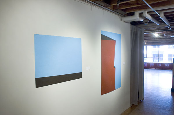
Although Petters’ work was in the upstairs gallery and Clyne’s on the lower level, there seemed to be mental residue between the two bodies of work, and the main floor gallery featured work by both artists, creating a visual non sequitur. The ambiguous exhibition title made the curatorial decision even more perplexing. The press release mentions that Clyne admits to tripping and falling “a lot”. But does Petters? More to the point, is this information important? Or was it to be assumed that neither artist is a marathon runner or a shrinking violet? In any event, the title shed no light on the two artists’ work. (It was culled from a film in the Alfred Hitchcock Presents series on TV.)
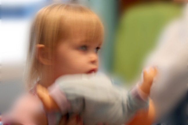
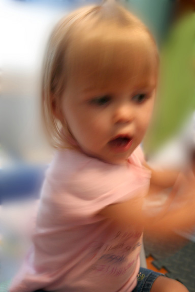
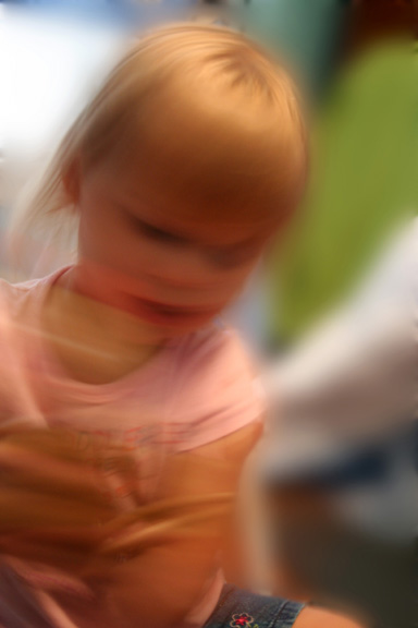
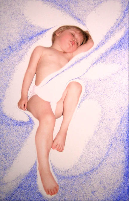
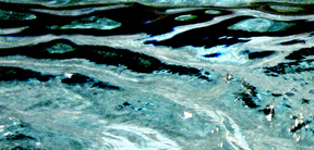
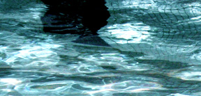
Clyne’s offering included digital videos, “film” stills, photographs, and mixed media works on paper, all of which obsessively portrayed either a cute little girl (a relative?), or a shimmering body of water. Supposedly much of Clyne’s work is inspired by sound–she’s interested in “cultural influences, learning, communication, rules and signs and the act of stirring them all around,” and “play, repetition and experimentation are essential” to her. That covers just about everything but says little about the work on view.
A filmmaker, Clyne’s videos and photographs documenting the child quickly became repetitive, even tedious, and lacked any discernable intent or point of view. Less would have been more. More visually satisfying were her videos and stills of flickering water but these, too, conveyed no reason for their making. That the two bodies of radically different work – one highly personal, almost cloyingly so, and the other abstract and detached – were interspersed made little curatorial sense. Moreover, videos and photographs of water have been done many times over and Clyne’s work added no new or different vision to this documentary “water genre”. (By comparison, Lourdes Cue’s Dias liquidos video installation at Franklin Artworks a few years ago insightfully linked to her other works and the curatorial thesis of the show.)
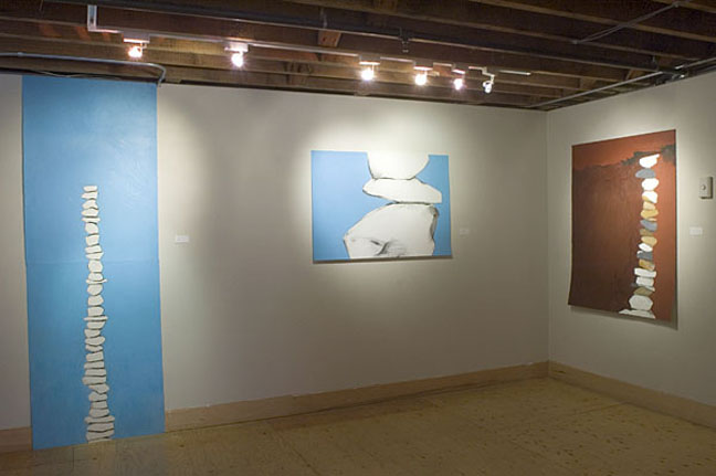
Most resolved are Clyne’s blue ink on paper drawings. Narrow rectangular works, the drawings are abstract yet associative and construct in blue ink oblique spatial relationships that variously suggest architectural structures, the landscape or the human body. That they seem to allude to all three, or to absolutely nothing, is their strength. Facile with a pen, Clyne makes spidery web-like markings that are detailed and controlled. A stray curling mark here or an unattached line there makes these works fine for careful viewing.
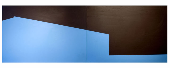
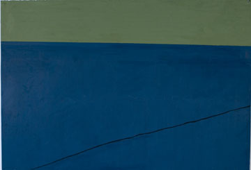
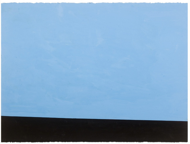
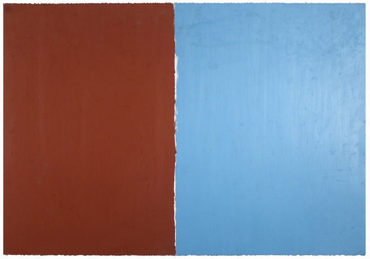
For Petters, “Not the Running Type” was the first major venue for her oil pastel on paper drawings since graduating in 2006 with her BFA from the U of M. With a precisely focused vision, Petters creates flat, abstract landscapes translated from snapshots of the land taken while driving in a car. She neatly distills the detailed photographic image into its most essential level of information, such as blue sky, horizon line, profiles of buildings or a field of grass. Defined by minimal detail, the flat planes of color abruptly butt into one another, creating a palpable tension along their juncture.
Petters has also proved she is a unique colorist. Her limited, unconventional palette, dominated by a vivid turquoise blue, deep rust orange, and muted – almost muddy – blues, browns and greens, amplifies the arbitrary spatial relationships created between land, building, and sky. Space is limitless and vision is uninterrupted. It is only the line, the edge of physical form, that allows us to understand this relationship that, at its core, reads as a metaphor for the tangible and intangible.
Petters’ titles– Horizon, Slope and Silo— underscore the fundamental nature of the work. The earlier, more detailed works depict columns of stacked rocks. In Stacking III, a column of white, ochre and grey rocks stands against a rust orange ground and sky that suggest depth through some mottling of form. By Stacking VII and Stacking VIII, the rocks stand against a flat blue ground. By 2007 most of drawings convey a grand gesture, where the expanse of a landscape – or its essence – is acutely conveyed, uncluttered by detail. In Harvest, two rectangular planes of color, one blue and one, rust orange, are placed side by side on a single sheet of paper, like the transcendental meeting of the sky and a field of squash. In How to Watch the Grass Grow, Petters has covered a sheet of paper edge-to-edge with a muted green. Only narrow cuts in the paper revealing the white ground beneath define the work. In Slope, an expansive blue sky meets either a dark brown roof or ground at the most minimum of angles. The most elaborate is Petters’ mural-size work, Horizon X-XV, constructed from six sheets of paper. Not only does this more closely approximate her abstract vision of the landscape, but it also inflects the work with a subtle narrative quality.
Only the tactile surfaces counter the drawings’ conceptual starkness. By laboriously rubbing the oil pastel into the paper, Petters creates saturated surfaces of color that convey a slight spatial depth and richness, almost as if they were made of Venetian plaster. Unexpectedly, this process manages to quietly animate her flat, reductive forms.
In the end, these are strong, curious works that create an impressive first showing. While their bold, atypical palette and atmosphere of emptiness may not engage everyone, the drawings convey a very singular, almost metaphysical vision that connects them less to the flat forms of ‘60s abstract art and makes them more the distant heir to the work of 19th century Northern Romantic painters such as Kaspar David Friedrich or the American Sublime painters of the Hudson River School.