Not Meeting Expectations: MCAD McKnight Fellowship Show
Michael Fallon exerts tough love for the MCAD McKnight Fellows.
My high school math teacher, Al Mistri (see link below), often repeated the following words of wisdom: “To whom much is given, much is expected.” It was his way, I think, of encouraging the smarter students not to get dragged down by the mediocrity of the masses. I liked to imagine he had the expression ground into his head as a boy either by an old-school priest or a martinet soccer coach from the town in Italy where he grew up. But no matter, the fact is I couldn’t help think of Mr. Mistri upon recently viewing the “State of the State” exhibition for the MCAD/McKnight Foundation Fellowship for Visual Artists at the Minneapolis College of Art and Design. To be more exact, what kept popping into my head as I viewed the show was, “To whom $25,000 worth of fellowship money is given, from that person much is expected.”
I guess all this goes to explaining why the following review might seem a little harsher than, say, a review of the street-fair-like exhibition (of MCAD grads from fifty years ago) just upstairs from this show. Mr. Mistri’s basic contention is that different standards apply to different situations, and applying the standard grading curve to this $125,000 show just won’t fly. That’s not to say some of the work isn’t interesting here, or fairly smartly made, or momentarily pleasing to look at. It’s just that–come on–these people had a full year, a pocketful of cash, and the major head-rush of being told they’re the crème de la crème among local artists, and yet this is the best they came up with! I’m sorry, but I can’t help but wonder what the artists did with their awards: Did they lounge under a Belize palapas for six months? Add a new wing onto their studio? Pay for plastic surgery? All I know is, as a rule, they sure as hell didn’t put the money into their art.
Take Alexa Horochowski’s work, for instance. If any artist in the Twin Cities can be said to be more technically gifted than Horochowski, then I’d like to see the person’s work. Everything she makes–photographs, wall drawings, sculptures, installations, and now paintings–is skillful. Yet, at the same time, for all its skill her work most often strikes me as about as empty as the Emperor’s wardrobe. Perhaps part of it is how thin Horochowski spreads herself–if you’re photographing, installating, drawing, painting, conceptualizing, and all the rest, then exactly how can you do any of it well?
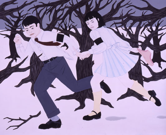
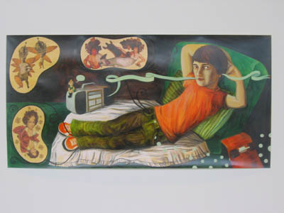
Another related problem is Horochowski’s work tends to feels tossed off–strategically positioned for specific opportunities, meaning, a particular grant application, or resume line, or whatever. This was true of her Cindy-Shermanesque photos she did when she first came to town. It is true of the quick and chintzy wall images she puts up for whatever conceptual show she’s helped organize. And it’s true of the new work that she’s applied her big McKnight paycheck to–cartoony images of boys and girls in the midst of strange sexual fantasyscapes (one a snowy woods, the other in a Wonderland of giant toadstools). These two acrylic paintings by Horochowski are momentarily nice to look; they give a sense of adolescent sexual mischief and are illustrated in a pleasantly retro pseudo-Victorian style (a la Kay Nielsen and Jessie Wilcox Smith perhaps).
But on second glance, what seems a nice conceit unfortunately becomes just another winking faux fairytale of knowing post-feminist sexuality that doesn’t amount to much in meaning, and it’s not particularly original in its approach or execution. Amy Cutler, who happened, tellingly, to have a show in town at the Walker just a year ago, does it with much more pointed political panache (see link below), and Laura Owens, who showed in Milwaukee in the fall (see link below), does it with much more intriguingly mysterious fantasyscapes. And while I’d be willing to run with Horochowski’s penchant for flavor-of-the-month styles and mediums if this were a run-of-the-mill show at some local hole in the wall, for the Big Mac I’m not as forgiving. Final grade: C-.
Meanwhile, while I’m glad to see that Jenny Schmid has moved on from series of programmatic dogmatic images detailing such social ills as anorexia and teen pregnancy. Unfortunately, she hasn’t replaced those images with much of anything of substance. At the same time she’s sacrificed the flair of her caricatury and cartoony big-head, small-body figures for something much more namby-pamby and laden with clip-art Greatest Hits from Art History. Like Horochowski, she gives us two images–“The Naked Maja” and “The Clothed Maja.” While the title refers to Francisco Goya’s paintings of the same names (perhaps why all the frou-frou baroque decoration she drops into her painting as filler), the central figure in each reveals a consciousness stuck, for whatever reason, on the Teen Beat demographic (see Bloom link below). These two images of beautiful boys, one au naturel and posed with perky penis pointedly prominent, and the other clothed and dressed in oh-so-sk8er-boy chic, are maddeningly banal. Oh, Mr. Mistri, I ask you, to what end all this effort? Also, why is illustration so popular among artists these days? Final grade: D.
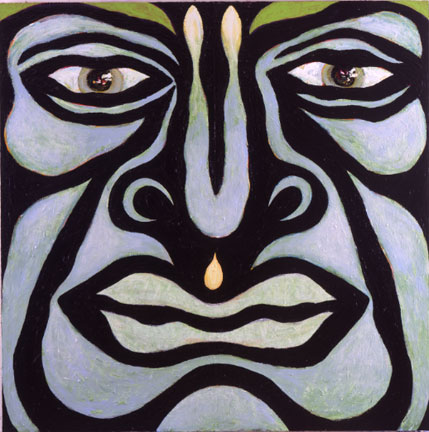
Robert Patrick’s work has appeal in size and scope, but that’s about all. The subject matter is a bit drippy—big, 10 by 15-foot stylized abstract faces that have the look of bad tourist-trap tiki idols, or perhaps of bad psychedelic cover art for early 70s bands like King Crimson and Procol Harum. And the delivery, meaning the rather flat and awkwardly deadpan painting, doesn’t amount to much. This is something you might find interesting were it in an exhibition of undergraduate artists, but it’s not for an artist with $25K at his command. (Grade: D-)
Meanwhile, Bruce Charlesworth’s installation, “Airlock,” is slightly clever, and definitely it bucks the trend of artists trying to do as little as possible so they can protect their fellowships as much as possible. But for all its ambition, the work is nothing new for a generation raised on Bruce Connor and Paul McCarthy, et al. The gimmick of having a video monitor showing the inside of a room, while in the inside room a video monitor shows the outside of the room, is partially intriguing, but the frumpy figure who slumps through the video projections is a bit too B-grade for me (a la Bruce Connor). One might also be able to dig out some sort of comment in this work to the surveillance nation we’ve become in the era of homeland security–after all, the inner room of this installation is dark and sterile and severe with dripping water sounds and so on–but unfortunately by the time I get there I’m already too bored to take that much of a leap. Grade: C.
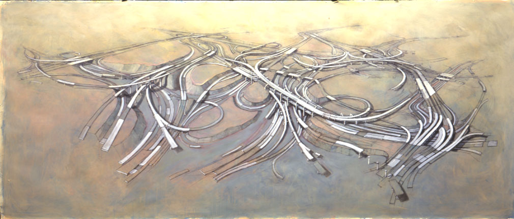
My favorite work in the show is by Christopher Santer, who paints surreal tangles of freeways while adding other light touches–like Sesame Street-like letters spilling over spillways and so on. The ecological message of such paintings as “Instant Harmony” is not new, but the sense of fun in the work (as opposed to the righteous indignation in most eco-artist’s work) is fresh and gives the work a bit of an ironic edge. The artist seems to be saying, reasonably, that since freeways are not about to go away why not just learn to love their own intrinsic beauty? Plus, these images are appealing just as compositions–the loopy lines of roads that overlap and break off at random end up striking the eye like so many Lee Krasner compositions. As a painter, Santer’s touch with a brush is light and loose and makes masterful use of a muted primary-color palette, and this makes me happy.
Definitely Santer is the star student in this show (grade: A-), and while I admit that each class of McKnight artists are at a disadvantage—as such shows always tend toward the mishmashy and scattered, and no one artist is ever allowed to shine–this year’s show seems particularly maddeningly beneath its sticker price. Sorry to be such a hard grader; I only do it because I, like dear old Al, care enough to encourage the best artists to live up to expectations.