Looking through Binoculars
Andy Sturdevant weighs in on the Walker's salon-style show, "Benches and Binoculars," with an incisive essay about both the frustrations and pleasures of this splashy, wide-ranging exhibition of paintings from the museum's permanent collection.


THIS PAST SUMMER, I GOT A CALL from the coordinator of a national adult educational travel organization, inviting me to give a lecture to a group of retirees on the cultural history of the Twin Cities. They’d gotten my name from someone at the Walker, and of course I agreed immediately; like anyone, I could use whatever extra income comes my way. So, on a warm night in July, I arrived at a hotel conference room on Nicollet Mall with a flash drive full of PowerPoint slides, and over the course of an hour I lectured the retirees on Tyrone Guthrie, James J. Hill and Hüsker Dü.
Of course, a full cultural history of the Twin Cities isn’t complete without an overview of the organization that had referred me in the first place, so I spent five minutes describing the Walker Art Center’s origins as the private collection of the lumber baron Thomas Barlow Walker, its transformation through the auspices of the Works Progress Administration (WPA) into a modern art gallery, and its gradual shift into the sort of respected, high-visibility contemporary art venue that would be graced by the likes of Joseph Beuys and Merce Cunningham. Honestly, I skimped a little on the Thomas B. Walker part of the story in the interest of getting to the WPA and then to Beuys, et al; after all, T.B. Walker was — with all due respect — just another rich, dead, white, Gilded Age plutocrat with a good art collection. Nothing worth getting excited about when we could be talking about Joseph Beuys, right?
Well, maybe not. Of course, my modest historical revisionism was called out by the tour group immediately. OK, smart guy, asked one particularly feisty retiree, what happened to all that nice old art that Walker owned when those FDR-crazed lefty pinkos got their hands on it?[1]
And I froze — because, honestly, I had no idea.
The Walker became a public gallery in the early 1940s, with a mission to show contemporary art which, at that time, referred both to social-realist painting and to explorations into abstraction. All of the European Masters-themed work that Walker had owned disappeared from the collection. I fumbled an answer to the woman’s question, speculating that a lot of it had likely been sold to private collectors. Actually, it turns out that much of it was sold to the Minneapolis Institute of Arts (MIA).
After the lecture was over, I was bothered by the fact that I hadn’t known the answer to the woman’s question. The Walker was established in its first iteration as a private gallery in 1879, predating even the MIA. And yet, a trip to the Walker today suggests none of this pre-history. The earliest work on display is from the immediate post-war era. There’s no suggestion anywhere among the work usually on view that, in the first fifty years of the museum’s existence, the Walker was a completely different sort of institution. There’s not even much reference to the museum’s holdings from the time between the Great Depression and the abstract expressionist era, that fertile period between Jack Levine and Franz Kline.
Under those circumstances, it’s refreshing to see that underreported heritage explicitly referred to in the Walker’s newest show, Benches and Binoculars. Curator Darsie Alexander has dug deep into the Walker’s holdings and pulled out a lot of great work that predates World War II, much of which hasn’t been exhibited for decades; then, the curators put it all together in a salon-style arrangement, a cozy, floor-to-ceiling style of display that was typical for the era when Thomas B. Walker was having his Vermeers shipped over from Europe, before stark white walls and generous negative spaces were prerequisites for painting exhibitions. This gesture gives a nod to the hidden pre-history of the museum, and creates an opportunity for some of the marquee works in the permanent collection to see the light of day, even if they no longer fit the Walker’s current, contemporary curatorial mission.
What’s more, this mode of exhibition allows the formidable holdings of the archives to sit side-by-side with newer work, creating interesting juxtapositions and opportunities for discussion. Better yet, the gallery floor is covered with decadent purple carpeting that seems very much in line with the overstuffed, robber-baron aesthetic. As the show’s title suggests, benches are provided for visitors to sit back and take in the spectacle, and binoculars are also supplied to give museum-goers a way to examine these works up close. Unlike anything else I’ve ever seen at the Walker, the show strives to create a continuum between the institution’s distant past and its present.
Why then does it all feel, at best, like a missed opportunity and, at worst, a big put-on?
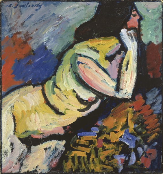
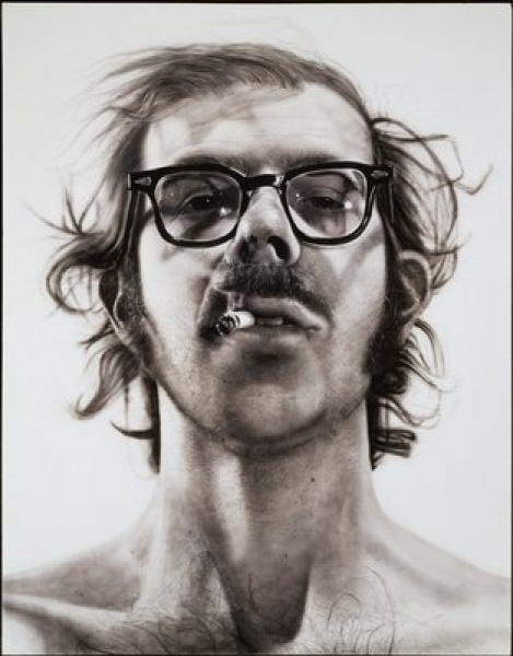
There are a number of problems in Benches and Binoculars that are hard to come to terms with. First of all is the troublesome scale of the show. Looking at photographs of T.B. Walker’s original galleries, one can see that, although they’re located in a classic, robber-baron mansion with imposing walls and very high ceilings, the displays still work on a human scale. Paintings stacked three high are one thing: you can still take them all in and interact with the work by standing just under it. However, the work in Benches and Binoculars is displayed on a fairly typical Walker Art Center wall, one that soars 22 feet into the air, which means some of the paintings are stacked five or six high; at that height, the uppermost works are really just too far above the viewer to allow for any meaningful interaction. Pity the long-dead Blue Rider group Russian painter Alexej Jawlensky, whose tiny 1912 Akt (Nude) is stranded up in the stratosphere, just an attractive blob of white and pale blue when seen from below, on the purple carpeting. Chuck Close’s massive 1967-68 Self-Portrait, the one where he’s smoking the cigarette and smirking at the viewer, hangs just to Jawleknsky’s left. It’s an intriguing juxtaposition, but whatever you might learn about Jawlensky and Close by seeing their work together is lost, because you can’t really…well, you can’t really see them. ______________________________________________________
Stacking the work all the way to the ceiling on the Walker’s towering white walls is like showing a Méliès film retrospective on an IMAX screen — the larger-than-life mode of display overwhelms any possibilities for exploring the nuances of each work.
______________________________________________________
Or, more specifically, you can’t see them in the way that you might like to because they’re so far away. Hanging such work in this classical format, stacked all the way to the ceiling on the Walker’s towering white walls, is more or less like showing a Méliès film retrospective on an IMAX screen — the larger-than-life mode of display overwhelms any possibilities for exploring the nuances of each work. The binoculars are an attempt to mitigate that distance, to refer to the “act of searching,” as the show’s statement indicates. That may be, but calling it “searching” or not, there’s something wholly unsatisfying about staring up at Jawlensky through binoculars wired to a bench, like a hotel remote control, while trying to adjust the focusing mechanism. The binoculars feel less like a novel way of interacting with art or creating new ways of seeing, and more like an inconvenience, an ineffectual gimmick or – worst of all – a joke at the expense of the viewer.
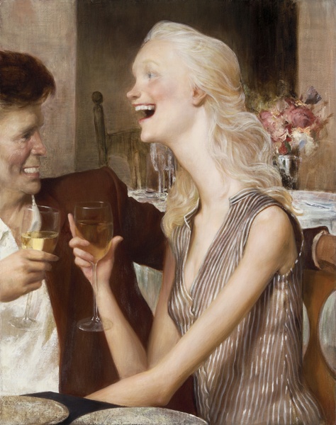
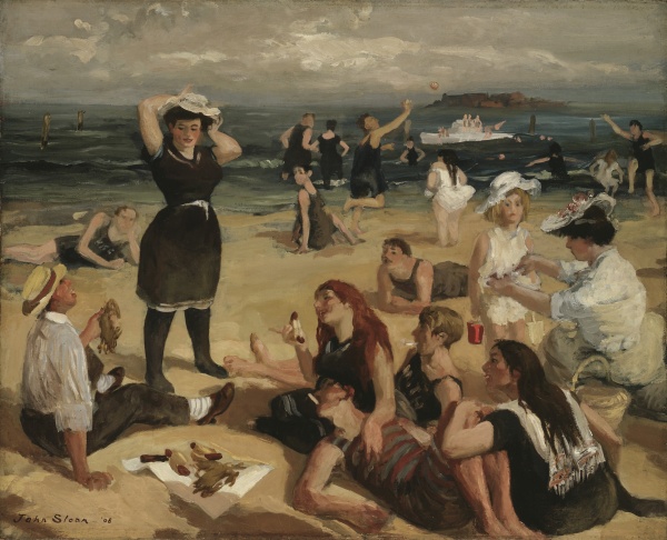
The second problem with the exhibition is the strange segregation of the high abstract work from most of the non-abstract work. The show’s south wall is a collection of the heavy-hitters of abstraction, from both the AbEx and Minimalist movements: Kline, Rothko, Nolan, Stella, Reinhardt, early Guston. Mixed in is some newer work – Howard Hodgkin, Mark Grotjahn, Donald Moffett. This display faces the north wall, which includes the rest of the show, a full range of painters from John Sloan and Robert Henri through Jim Dine and John Currin. This seems to me to be the most serious missed opportunity of all. In the 18th and 19th centuries, paintings (especially history paintings) were hung salon-style to encourage the viewer to tease out a narrative between the disparate subjects and events depicted. There’s an exciting, easily discernible narrative already built right into 20th century art: a tale of artists’ evolving experimentations with abstraction, leading to the form’s almost total dominance by mid-century. Placing these works in the continuum of contemporary art history — between the WPA-style paintings that most AbEx-ers were trained to make in the 1930s and the image-driven work that was created as a reaction against AbEx hegemony through the 1960s, ’70s and ’80s — could have made for some interesting viewings. Setting it apart, as the show does, the museum misses a chance to illuminate common ground in work by artists as disparate as Henri and Kline, or Hartley and Hofman, or Stellas Joseph and Frank. It makes the abstract art seem like an exception, or an aberration, rather than an interconnected part of the whole story.
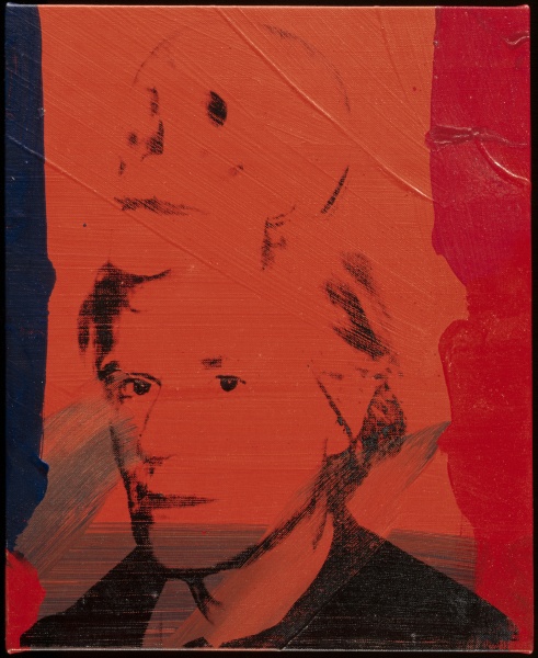
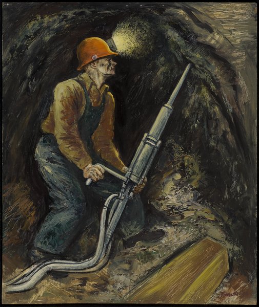
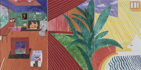
This is not to say there are no interesting juxtapositions and conversations to be gleaned from the exhibition. Even at a distance, there are many, many delights to behold: the close proximity of John Currin’s Park City Grill to one of Tom Wesselmann’s Great American Nudes actually made me laugh out loud in the gallery. Enjoyable, too, are the Marsden Hartley masks cozying up next to a typically mask-like Warhol self-portrait; then there is David Hockney’s Hollywood Hills House, whose lush pinks-and-greens seem to make a mockery of Sydney Fossum’s gritty 1943 Miner next door, as if the figure is literally stuck in the walls of Hockney’s sunny pastel pleasure palace, trying to dig his way out. As noted, there are fewer similar pleasures on the abstract side, since a full two-thirds of the pieces (19 of the 28 on display) were created in the same 20-year period (1950-1970). Consequently, seeing Rothko and Morris Louis and Kenneth Noland pieces side-by-side-by-side suggests little other than “Gee, all these guys probably knew each other” (and for the most part, they did). If all the abstract work is going to be grouped together, then why not have more work by living artists who not so closely associated with the New York School canon? Including more work by painters like Mary Heilmann or Peter Halley instead of, for example, a small piece by a Rothko/Louis/Noland contemporary like Ellsworth Kelly might have told a more expansive story. There are tentative stabs at this idea; particularly, the placement of work by a mid-century Minnesota artist like Charles Biederman alongside two-dimensional work by the sculptor David Smith and New York abstract expressionist Adolph Gottlieb suggests interesting crosscurrents that bear further investigation on the part of the viewer. Whether that viewer finds it worth his or her time and trouble to peer, myopically, through a set of binoculars in order to make those investigations is another issue altogether.
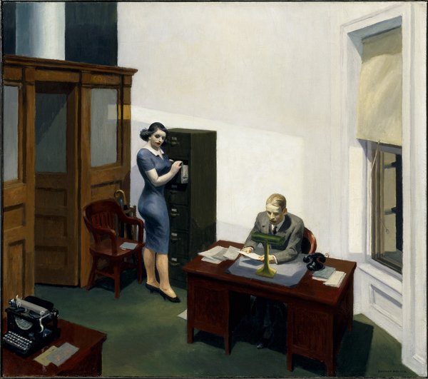
It’s entirely possible to enjoy the show for the interesting details and pairings that peek through the unwieldy format. And any show that so consciously creates a continuum between the past and the present has to be applauded. It’s hard, however, to look at Edward Hopper’s great Office at Night through a pair of binoculars, twenty feet in the air, and not get the unsettling feeling that a joke is being played on you.
______________________________________________________
Noted exhibition details:
Benches and Binoculars will be on view at the Walker Art Center through August 15, 2010 in the Perlman Gallery.
______________________________________________________
About the author: Andy Sturdevant is a writer, curator, and artist living in South Minneapolis.
[1] Obviously, she was too polite to phrase the question in precisely these terms, but this was unquestionably the implication.