Lack of Definition: “Ever More” at MMAA
Alex Starace finds himself frustrated and confused by the "Ever More" show at the Minnesota Museum of American Art (through July 16 on the St Paul riverfront at 50 West Kellogg Boulevard).
The “Ever More” exhibition at the Minnesota Museum of American Art has a peculiar curatorial rubric. The idea of the show (says the plaque on the wall) is to display art that requires time, effort, and repetition to create. Furthermore (continues the plaque) artists who perform the same mundane task over and over are engaging in a meditative “heightened artistic impulse” that is unique to the process of focused monotony. This (the plaque tells us) is why the particular art on display is worth looking at – this is how it is grouped.
However, the category is so disparate, so unfocused that nearly any piece of art at all could be included in the show. What piece of artwork doesn’t take time, effort, and repetition to create? Perhaps, when the curators refer to repetition, they mean that the artists use the same image or building block to create a piece? Perhaps.
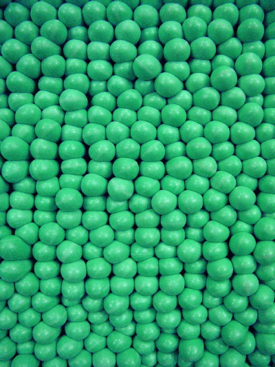
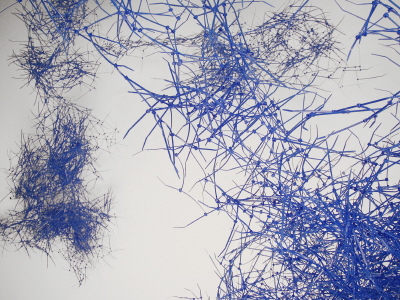
The work of Trever Nicholas (probably the most compelling artist in the show) would indicate this. In his piece Plug Rug, he’s created a hospital-scrub-green wall hanging by poking several thousand earplugs through a nylon mesh. The result is a 3-D field of bumps. It’s rather arresting and jives with one of his other pieces on display, Plastic Atmosphere, which is composed entirely of royal blue plastic cable ties. The ties are clumped together and hung from the ceiling in a large formation that mimics photographs of far-off galaxies taken by the Hubble Telescope. The result, as you walk under and around the hanging clusters, is a very intergalactic, mysterious sensation, one that reminds us of the elemental.
Nicholas’s art references quarks, biology, and physics: the wonder that the natural world can be made from such basic elements and yet give us so much. Visually, the bright monochrome of each of his two pieces is so stark, so affronting that one can’t help but notice the texture and shadows along the works and the space each takes up – in other words, Nicholas uses minimalism quite effectively.
Several other pieces in the show resonate with Nicholas’ work, including George Morrison’s Untitled (delicate ink lines on white paper, forming an abstract study of Lake Superior) and Doug Argue’s Some Memories (an elegiac 25’ by 20’ black-and-white, oil-on-canvas painting of small thin leaves that fill the picture frame). But vast cipher-like objects and seemingly-infinite images composed of finite particles, is not, in the end, the sole focus of the show. There’s a whole section of yard art.
This inclusion would be baffling if the tenuous connection to the stated theme weren’t so painfully obvious: yard artists collect objects and build things out of them. Therefore, their work is similar to that of Plug Rug: both involve the use of everyday objects to construct other, larger objects. Furthermore (or so would say the curators of the show) both involve patience and repetition to create the finished piece. But these are weak excuses.
The connection between minimalist-inspired art and yard art needs to be more fully justified: theoretically the two are worlds apart and visually they create entirely different effects. One has a sparse, distant, koan-like quality while the other is quirky, representational, and humorous. An exhibition that seriously undertook an effort to compare the two could be quite fruitful – such a serious effort should be admired. Unfortunately, in the instance of “Ever More,” it seems the curators just plopped minimalistic stuff in one room, yard-art-inspired stuff in another, slapped a title on the thing, and left it at that.
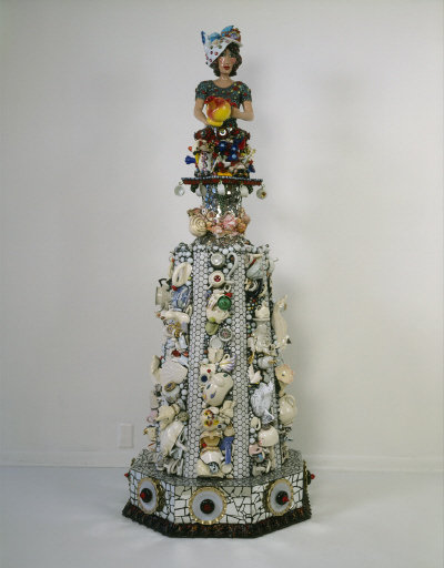
This is not to say that the yard art is bad. Judy Onofrio’s piece, Serve It Up, is as appealing as her work usually is: much like crows can’t resist shiny quarters, it’s hard for humans to resist a sculpture-mosaic of gleaming tiles, polished porcelain, and bits of broken mirror. In this particular version, the torso of a woman serving tea is set atop a rotating pedestal. This is in turn set atop a bigger, taller pedestal that’s alternately striped with bathroom tile and bits of teapots. It is, if not her most engaging work, quite well done.
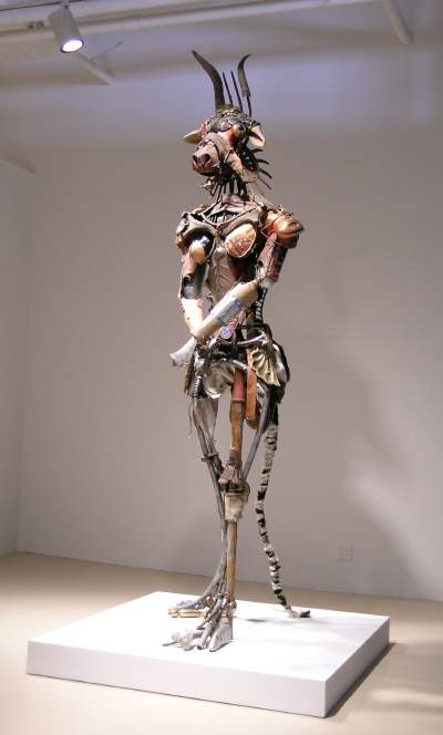
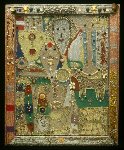
Similarly, Al Wadzinski’s Minoan Matador uses garage sale junk to create the ten-foot-all, titular creature. Among the highlights of the cobbling together are: antlers for a clavicle, mittens for testicles, a shoe for a hip, and a pipe for a shin. It is, like Onofrio’s piece, well done, and resonates with Simon Sparrow’s Untitled Assemblage, which is a painting/assemblage done within a picture frame using necklace beads, glitter, shells, and buttons.
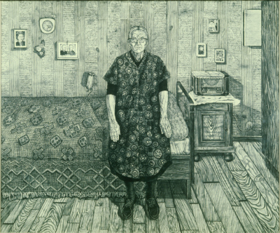
In fact, both the yard art and the minimalist-inspired art are good enough that the “Ever More” exhibition could be forgiven if it were merely a show with two themes going in two different directions. But the exhibition is more scattered than that. Take Simon Dinnerstein’s piece, Marie Bilderl. It’s a charcoal drawing of an elderly woman standing in her bedroom. The piece (and woman) has all the stiffness of a daguerreotype, or of a woman who’s not used to displaying herself and therefore feels pinned back and awkward in front of an artist. In it’s way, it’s an adorable, arresting, primitive work of art. But it has nothing to do with the two aforementioned categories.
The curators leave us with this note: imagine the time it took as Dinnerstein “drew this woman and the entire contents of her bedroom in endless detail.” Time? Endless detail? Both of these qualifications are dubious: if time spent focusing on the creation of art is what it takes to be included in the “Ever More” show, why not include Impressionist works? Or Surrealists? Surely what they painted took time and focus as well… As for “detail,” the drawing doesn’t seem especially detailed – certainly not remarkably so. And how does “detail” relate to yard art or minimalism anyway?
Equally absurd is the inclusion of Becky and Steve Lloyd’s porcelain bowls and teapots, all which have leaf patterns on them. That the leaf patterns are similar to those in Argue’s Some Memories and that the porcelain and teapots (if one really stretches it) have some connection with Onofrio’s Serve It Up, is really a poor excuse for the Lloyds’ inclusion in the show. A pattern on ceramic is not the same as a wall of earplugs, nor as an enormous painting of leaves. Simply put, a repetitive pattern on a piece of pottery is about as conceptually nuanced as stripes in wallpaper; it just doesn’t match the other art in the show. Furthermore, the planned, holistic feel of fired pottery seems to be the antithesis of yard art – it simply doesn’t fit.
This, in the end, is the problem: Is the show about rote repetition of forms? If so, there are many pieces that seem to be outliers. Is the show about minimalism? If so, there are a lot of outliers. About found art or collage? Again, same problem. About the building and construction of art? Still a lot of outliers. It’s a clumsy, flimsily cobbled together exhibition, one that makes weak efforts to connect its disparate parts and therefore falls flat. Perhaps the only good thing that can be said is that some of the art in “Ever More” is pretty good – although it would be a lot easier to enjoy under a clearer conceptual framework.