In Medias Res: Punching It Out with Appearances at Soo VAC
Untitled 3: Third Annual Juried Show, to July 18, Soo VAC, 2640 Lyndale Avenue S. Curated by Olukemi Ilesanmi, assistant curator of visual arts, Walker Art Center, and Sylvia Chivaratanond, guest curator, Museum of Contemporary Art in Chicago.
Artists and critics have been flailing around for thirty years calling what they’re doing “postmodern,” but modernism from its inception always had the postmodern within it, in its constant questioning of its own means in a search for the truly new. Is there anything left to be discovered in this vast plain of recursion? It has seemed that by now there isn’t. But artists can turn away from the artworld and turn instead to the world—the one you stub a toe on.
A recent review by Barry Schwabsky in Artforum of the paintings of Raoul de Keyser puzzles at length on the fact that his works seem relevant and fresh because they are not paintings that address the languages or meanings of painting but because they have other subjects. They engage with the world, not the artworld. Painting is regaining a role as a primary producer of meaning, rather than the secondary role as a commenter on itself.
This is something that we see here and there, now and then, and long for. But all too often, highly schooled art still regards a careful emulation of appearance—styling, the right look, the right arworld accent–as the sign of quality. “Untitled,” the third annual juried show at Soo VAC, is unfortunately rife with this. The professionalism and skill of the 21 artists in the show are obvious. But the several clear themes in the show seem like the fruit of lots of assiduous art-journal page-flipping—or perhaps the result of the curators’ tastes.
In any case, what I saw were these familiar categories: a great deal of work that showcased the sad or antic poetry of the cruddy built environment (O Denny’s! O stained wall-to-wall carpeting! The pathos of the figure in the wallpaper of childhood!); another group that takes this same imaginary further; a few portraitists; and the playful surrealists. And there were a few who fell outside these categories.
The poetry-of-cruddy-built-environment group—Caroline Houdek, Christa Dalien, Jacob Lunderby, Mike Start, Anthony Marchetti—are the most numerous. Photos of anonymous squalid domestic settings, kind of anti-shelter-magazine wallpaper snippets with silkscreened or stitched motifs laid over them; these form the bulk of this group. It’s a familiar mode, and I don’t really have a lot to say about it, as the significance of the work seems mainly founded on stance and style as evokers of ill-defined atmospheric mood. It seems to want to have its cake—its critical distance—and eat it too—to revel in a certain nostalgia.
Another group, related, takes this in a more romantic direction; if the previous group is the Wordsworth and Coleridge of the domestic landscape, then this next group is, say, Shelley or Keats, romanticizing the complex layering of detritus and production in the American city, and even mysticizing it a la Blake (this last would be Margaret Pezalla-Granlund’s role, with her little N-dimensional parking garage models made of cardboard).
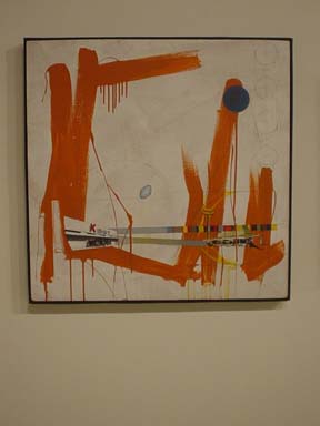
The High Poetic mode can be found in Gerald Prokop’s severely high-contrast sensually invested industrial gears and high flywheels, towers and lifters, all on drywall. Geoffrey Euclides’ busy but unreadable lines of force lancing through a Disneyland romance of future-past urban architectures are sort of like Julie Merehtu’s little comic-book-reading brother might do. Larry Bem’s abstracts only belong in this category because they evoke a similar mood in their heroic championing of the pathos of the too-recent past that longed toward an unreachable future. Jon Oken’s documentation of two contrasting cemeteries could be interesting in this context but the photos themselves are too cursory.
In a related mood are the playful surrealists, doubtless the crowd favorites. First among them are Tectonic Industries with another installation of stuffed animals being cute, funny, and mysterious on a large scale—proof of the fact that mysterious gestures toward meaning don’t always mean anything. Work like this relies on people’s haste, their reluctance to figure it out, their willingness to attribute some kind of meaning to a thing if a claim appears to be consistently laid to it. Actually it’s meaningless. It is doubtless not sporting of me to point this out.
Vito Giuseppe Galisto has a set of photos which superimpose tritely costumed female wrestlers on various unlikely settings. Whatever did we do before Photoshop, I wonder, to amuse ourselves?
Tiffany Bolk’s photos are similarly laden with familiar tropes but at least have the blessing of actual settings. Her posing of models, however, is neither sufficiently theatrical to generate an entire idea nor sufficiently stealthy to cause a moment’s doubletake at the possible role of chance in the scene.
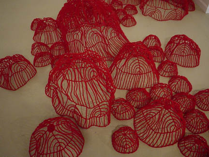
Liz Miller and Trevor Nicholas, however, do make a charged space – these are two separate pieces, but their installation, visually overlapping, works well. Both artists at least have sensuality on their side; Miller’s evocation of the conditions of meaning (arrows, lines of flow, pattern, goal, etc.) without the provision of actual meaning repeats again, unfortunately, the condition of so much of the work in this show—trying to make the atmospherics of appearance do the duty of actual sensual meaning. Nicholas, on the other hand, brings it off. His choices of medium, color, and form all cook together to make an entity that communicates itself, its form, its color, and he doesn’t shortcircuit the concretized meaning of the work by gesturing toward significance. This kinda thing makes me proud of sculptors—raw material becomes a mind of its own.
It begs comparison with Stephen Mohring’s small dwelling-form-thing in steel and wood, which I wanted to like but couldn’t. There’s, again, a premature reference to dwellings in the form of little ladders, but no resonant use made of that reference in materials or form.
And perhaps the most skilled work in the show: Cherith Lundin’s really beautifully made oil-on-panel paintings, done on supports so well-considered I was breathless. She constructs thick wooden panels and bevels back the sides at a 45-degree angle, which floats her dense, rich fields of color an inch off the wall. He painterly skills are remarkable, and her mix of close observation and gorgeously handled color fields works beautifully. The only problem is she couldn’t look more like an acolyte of Gerhard Richter if she’d grown up in his armpit.
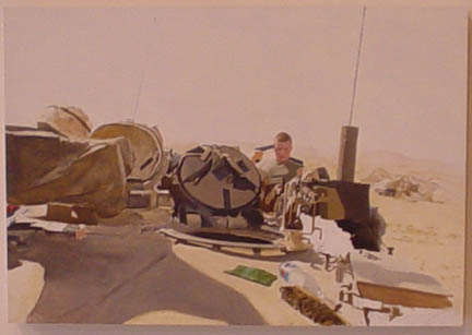
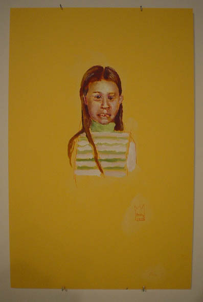
The portraitists—and Lundin has a panel with a beautifully observed portrait—are Clea Felien, Jaron Childs, and Peter Haakon-Thompson. though Childs does a surreal version of portraiture, flat photorealist painting put through a posterizing filter. His soldier in the desert with an unremarked pistol up against his temple is startling, awakening. His technique is fine, and not about itself. The interruption, the split second, is his subject, and he treats it well. Felien here has the slightly skewed, seen-through-the-right-brain portraiture that we know her for; some of these are fine. Haakon-Thompson does photographic versions of himself, in various outdoor settings, with some wit. His vibratory presence behind an utterly still small tree, and his tempestuous head in a grandly elegiac field, are both evocative of notions of the romantic individual. All of these artists create, in one way or another, some real sense of the complex singularity and unknowability of any individual human being.
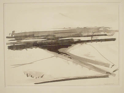
And last, humbly, but not least, are Timothy Granlund’s ink drawings, small, without immense chops, but satisfying as observed experiences. “Overpass” is particularly nice.
There are eras when working within the languages of appearance, the current styles, the familiar tropes, is fine, times when these forms of appearances are sufficiently generous, contain enough indeterminacy, enough potential for disparate gesture, to accommodate great energies and diverse ideas. This is not, sadly, one of those times. The staleness of the tropes largely used here is obvious, was obvious 10 years ago. Most gestures toward possible meaning here are empty, likely by design. Either the taste of the curators has been cultivated like a privet hedge, constantly clipped to match some ideal contour, or a lot of obedient art students submitted their work to this show.
I don’t know who to take to task, but the place is capable of better than this. What’s at fault here? The youth of the contributors? Narrowness of choice by the curators? An assumption that old news is new here? I truly don’t know.
Let’s hope for better next year—after all, Soo VAC is one of the great spaces of the city, one of our best hopes for a distinguished, and distinguishing, scene.