Every Picture Tells a Story: Kyle Hunter’s Cover Designs
In a bonus "Thinking Souls" piece, Shannon Gibney interviews Kyle Hunter, who designed both of David Treuer's new books for Graywolf Press.


According to the old adage, we shouldn’t judge a book by its cover. Yet, if we’re honest, we must admit that most of us do just that. So what’s in a book cover, anyway? Kyle Hunter, who makes his living by negotiating the aesthetics of this art form, discusses this question. Hunter designed the covers of David Treuer’s new books The Translation of Dr. Apelles and Native American Fiction: A User’s Manual.
SG: What is your professional title, and how long have you been doing this work?
KH: I try to steer clear of the term “graphic designer,” although it is probably the most readily accessible job description. I prefer to think of myself as a person who has an overdetermined interest in the visual and some computer skills.
SG: How did you learn how to do book design?
KH: My principal training is in philosophy and art history. Graphic design – for lack of a better term – was kind of a fallback position.
SG: Why book design, specifically?
KH: I fell into the design field by accident, although it makes sense in retrospect. I was always interested in the visual but never felt that the job title “artist” or even “graphic designer” were ones that were open to me. My thinking about job prospects was shaped, too, in a time before the coming of computers, which is hard to conceive of nowadays. Book design was an accident – a happy one. It appeals to the frustrated intellectual in me. I tend to approach the design process as if it were a book report – which can be good, and can be bad.
SG: Can you outline your process for working with an author and a press to create a book cover?
KH: Each cover is different, of course. Depending on the publisher, authors seek and obtain varying degrees of influence in the design process. Some authors are very into the “separation of powers” idea and prefer the hands-off approach. But I’m flexible, and I enjoy the collaborative process. Authors tend to be creative, thoughtful people, and I feel a huge obligation to have them like the thing that is wrapped around their words and that has their name on it.
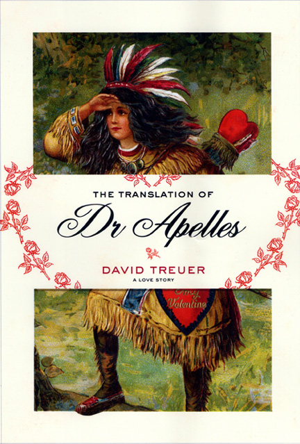
SG: What was your process with David Treuer’s books? What did you want his covers to say?
KH: Image selection is key, and generally comes down to an instinctive but often ill-defined “ah-ha” moment. The rest of the design process is often just an extended reaction to the image’s initial appeal. A similar process obtains where the author or publisher provides art – which was the case with the Treuer book. In which case, it is often about highlighting certain key details or employing some kind of creative repositioning – cropping, shrinking, enlarging, rotating. In worst-case scenarios, it’s simply about making the cover look pretty – -which sometimes is enough.
In the case of the Treuer book [The Translation of Dr. Apelles], there were some late-breaking alterations that went a long way in producing the final effect. In earlier versions, the main Indian Princess image bled on all four sides and the type was layered over a semitransparent band of paper.
For the final cover – after David requested a more opaque background for the type – that now non-transparent paper background expanded itself around the entirety of the image, with the foot of the Princess eventually poking out from beyond the boundaries of the now circumscribed main image – changes which touch upon, if obliquely, themes within the book – the theme, for instance, of crossing boundaries, genres, and other limits, visible and invisible.
In general, I think my most successful covers have been those that interact with the title and touch upon, subtly and by indirection, major themes of the book. My favorite covers are those that give objects multiple or contradictory meanings. Kind of a two-birds-with-one-stone approach, where the stone veers off course, flying out of frame, while the two birds, unharmed and relieved, turn to stone.
A cover is truly successful when I can look at it and not recognize it as mine, when it seems to have a reason for being of its own.
SG: Is designing covers for Graywolf different than designing covers for other presses?
KH: Yes. A Graywolf cover always guarantees me a good read. It’s then up to me to somehow design up to the quality of the writing – which is always the best challenge to have.
Read reviews of David Treuer’s The Translation of Dr. Apelles, and Native American Fiction: A User’s Manual on mnartists.org (Hunter designed both covers). And don’t miss your chance to add your voice to the mix – the Thinking Souls online book club is the place to hash out both formed and incipient ideas about art and writing in Minnesota!
Next month: We’ll talk to Arleta Little of the Givens Foundation for African American Literature about their work promoting and preserving Black literature. Pick up a copy of Harriet Jacob’s Incidents in the Life of a Slave Girl, an American classic and a Givens Foundation re-issue, for September book club discussion.