DESIGN: Letterpress Art, By Design
Britt Aamodt offers an engaging profile of the up-and-comers behind Studio On Fire, which pairs the charm of old-world letterpress craftsmanship with new technology know-how and design savvy to come up with ingenious, gorgeous innovations in print design.


THE PRINCIPAL OF STUDIO ON FIRE IS BEN LEVITZ, wiry and boyish with blunt-cut sandy hair and spectacles that, like Sarah Palin’s, stand out from his face. But unlike the Republican vice-presidential hopeful, Levitz isn’t aiming for conservative chic. He’s got the untucked-shirt-over-jeans look goingwardrobe shorthand for art school grad, left-bank intellectual, design professional, self-made man, or all of the above.
It’s September 2008, nearly two decades into the digital revolution (or more, depending on where you date its start), but the clamor emanating from Studio On Fire’s second-floor press room sounds more like the querulous grinding of machine parts than the sophisticated white noise of a 21st-century design studio. Because that’s what Studio On Fire is: a design studio parked on the fringes of Northeast Minneapolis, squirreled into one of the many refurbished warehouses that have collectively re-branded this blue-collar, industrial sector as an arts community.
Levitz’s conception for Studio On Fire is simple: “It’s design work, letterpress printing, and our letterpress product line,” he says, laying his hand on the door to the press room. “The three areas support each other. And at this point, it’s design specifically for letterpress printing, sometimes retrofitting the [letterpress] process back into the design of something, so that the [mode of] production becomes the design.”
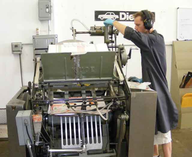
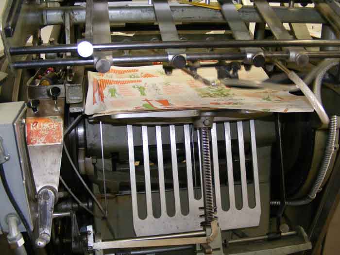
As the door gives way, his words drown in a roar of machinery. Chris Forsythe and Tori Bush, two of the studio’s eight employees (a number which includes Levitz), operate letterpresses whose essential design, with latter-day modifications in engineering and metallurgy, has remained virtually unchanged since the 15th century. Scholars generally credit Johannes Gutenberg as the father of modern printing in the West. His introduction of moveable type in 1440 and his development of a horizontal-bed wooden press a decade later set off a social revolution so earth-shaking as to dwarf the pretensions of our modern digital age.
_________________________________________________
The clamor emanating from Studio On Fire’s second-floor press room sounds more like the querulous grinding of machine parts than the sophisticated white noise of a 21st-century design studio.
_________________________________________________
Before Gutenberg, manuscripts were either copied by hand or printed using wood blocks. Both processes were laborious and time-consuming, limiting the number of copies that could be made. Gutenberg’s press not only made it possible to mass-produce printed material; his invention also streamlined the dissemination of text. These advancements led to the spread of literacy and the expansion of universities, religion, commerce, law, and culture.
From Gutenberg’s day to our own, the driving emphasis of printing has been toward faster, cheaper, and slicker production processes; it’s a trend that, with the advent of offset and digital printing, nearly relegated letterpress to the trash heap of extinct technology. However, in the 1990s, hobbyists began purchasing the presses cast out by commercial printing houses. Levitz bought his first letterpress, a Chandler & Price model, in 1998; and bucking the faster-is-better mindset, he set up a design shop steeped in the bygone printer’s craft, yet which also had all the advantages afforded by light-speed digital efficiency.
Studio On Fire’s hybrid process replaces traditional moveable type and engravings with digital files. Text and image are copied to something like a film negative, which is then placed atop a sheet of polymer. Both are vacuum-sealed and then exposed to ultraviolet light. Where light passes through, the polymer hardens. During the wash cycle, only the non-hardened areas are washed away, leaving a relief plate. This is the plate used in printing.
It is this straddling of old and new techniques that has made Levitz and his studio the toast of commercial designers and agencies looking to add a whiff of the personal and tactile to their campaigns, and a favorite of gift boutiques interested in letterpress product linesminus the antique cuts and floral-and-fruit motifs favored by their grandmothers’ generation.
“We knew there was another demographic out there for letterpress,” says Selina Larsen, Studio On Fire’s studio manager. “It’s the guy who doesn’t want to give a cherry blossom letterpress card to his girlfriend, who has tattoos down her arm.”
“That’s our point of departure from traditional letterpress,” Levitz clarifies. “We’re trying to do something more visually engaging than just a pretty piece. To me, good design does two things: it communicates and it creates desire. If you can’t read it or it’s falling on its face in terms of not making sense, that’s bad design. But finding a path to somebody’s sense of yeah, that’s what I want or I want to be part of that, that engagement factor, where you are creating an object of desire, is a hallmark of great design.”
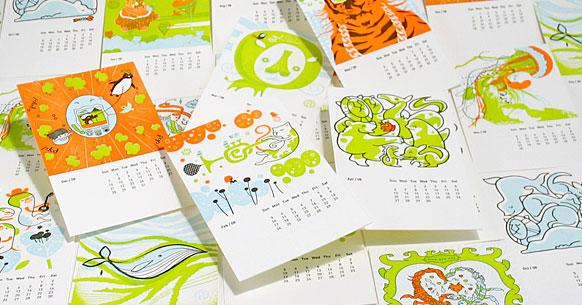
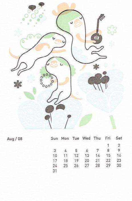
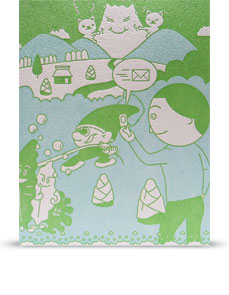
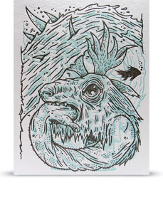
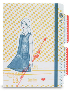
And that allure is a hallmark of Studio On Fire’s output, which in their card and desk lines reveals tantalizing shades of Asian pop art, folk art, vintage advertising, graffiti, and cartoon illustration. The studio’s products, as well as its commercial portfolio, represent an agglomeration of styles and artists’ work that Levitz, as the principal designer at Studio On Fire, curates with an eye to the next generation of letterpress art: ’80s neon hip-hop tigers, musical cats adrift in a sea of circular cloud shapes, a three-eyed serpent tamer, skeletons, a blonde Hollywood goddess, jellyfish tendrils against a field of white. Seriously, this is not your grandma’s letterpress.
The Imprint of a Good Idea
Like many designers, Levitz started out in art school, and started with the notion that full-time, self-directed art was a legitimate career path. “I studied painting, sculpture, photography, and graphic design at the College of Visual Arts in St. Paul,” Levitz remembers. “And I basically got to the end of that two-year foundational program and struggled with, ‘Do I want to do sculpture? Or do I want to do communication design?’ It got to the point where I realized, well, that I kind of want to eat and make a living.”
Upon graduation in 1998, Levitz picked up his first design gig. Even though, happily, he wasn’t following the model of the starving-artist (Vincent van Gogh stumbling, one ear short of a full deck, through olive groves in the south of France), his initial foray into design didn’t exactly satisfy his career hopes and expectations either. “I spent eight hours-plus a day, sitting in front of a computer. I thought, wow, there’s got to be more to life than this,” he says. “In school, I really liked the shop time. Being in the studio and doing something physical with tools, machines, and weldingthat kind of stuff was totally missing from design.”
_________________________________________________
In his studio, Levitz had settled a Chandler & Price platen press alongside his Mac computer. “I thought, what a wonderful juxtaposition of the antique way and the modern way to produce something.”
_________________________________________________
On a nudge, Levitz sought out a printer friend who’d recently purchased a letterpress, equipment, and metal type from Augsburg College. In his studio, the printer had settled a Chandler & Price platen press alongside a Mac computer. “I thought, what a wonderful juxtaposition of the antique way to produce a thing and the modern way,” says Levitz. He went home that evening to alert his wife, “‘I think I’m going to get a printing press.’ And I just really haven’t held back since.”
Studio On Fire was, for many years, a one-man show. Levitz would put in four hours on the letterpress every morning, hustle to his senior design job at Carmichael Lynch, and then put in another four hours in the evening. The funny thing was that in an age of desktop printing, photocopiers, online print-on-demand, and offset printing, Levitz couldn’t keep up with orders. Brides-to-be sought him out for letterpress wedding systems, companies for event invitations, and agencies went to him for mailers that possessed that special handcrafted quality impossible with glossy offset processes. “Traditionally, with letterpress, the idea was to have just a kiss of ink on the page,” Levitz explains. “Now, people are expecting to see a crisp, clear inking but also have it be tactile. That’s certainly a modern iteration. Nowadays, if a letterpress print doesn’t have that visible impression, it’s like why didn’t you just run it offset?”
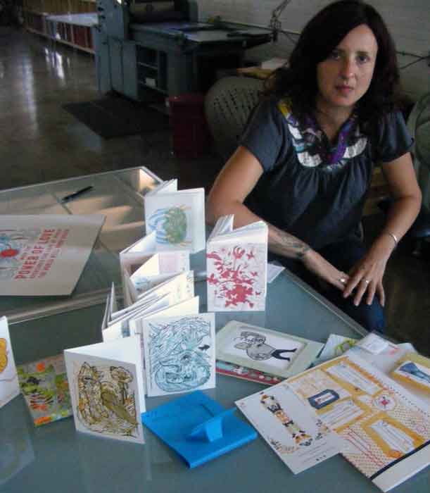
Levitz discovered there was a desire, and a hungry market, for high-quality, modern interpretations of letterpress. So, he hired a friend to help with printing. Then at the 2006 Poster Offensive, an exhibition of politically-themed poster art, Levitz ran into Selina Larsen, then a project manager for GraphiCulture. Larsen remembers the meeting. “Ben said, ‘Have you ever considered managing a letterpress studio?’ ‘Well, no, I haven’t. But tell me more.’ It was another one of those moments where Ben went home to his wife and said something that probably shocked her.”
Soon after that fateful encounter, Levitz quit his job at Carmichael Lynch, and Larsen came on as studio manager. The risk paid off. Studio On Fire has transformed from a one-man garage shop into a full-service design and letterpress studio, serving clients like Borders, Fallon, Mossimo, Target, and Harley Davidson. Most of their work comes from outside Minnesota, “through word of mouth,” says Larsen.
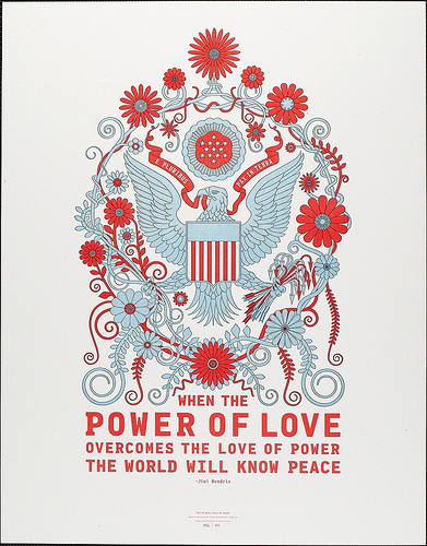
The word about Studio on Fire has spread like, well, fire. Minnesota’s arts community has seized on their letterpress studio for one-of-a-kind posters, invites, business cards, CD packaging, and even LP covers.
In the press room, Levitz points out a stack of narrow horizontal sheetsthe latest CD packaging for the St. Paul band The Get Up Johns. “A lot of bands are looking at CD packaging as a way to make the album more important. With letterpress, it’s about the tactility and making that CD an object of desire, in itself, giving the customer another reason to buy your album.”
Curating a Modern Letterpress Art
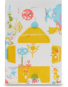
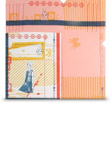
Levitz and Larsen will tell you: their cards, self-mailers, punch-out calling cards, desktop calendars, and index card and folder sets aren’t just letterpress. They’re letterpress art. Everything down to the mailing envelope, the packaging, and the space between punch-out pieces has been created with Levitz’s rules of design in mind: communication and desirability.
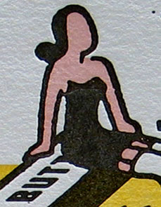
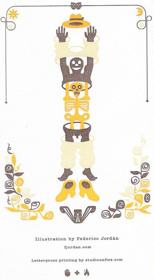
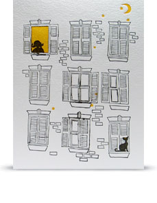
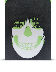
To that end, the duo have solicited and deployed the work of an international roster of acclaimed illustrators and designers. The only rule Levitz and Larsen lay down for their artists is this: “Give us something you would want to buy.” Aesthetic Apparatus of Minneapolis translated that advice into a tri-color line drawing of a gartered lady sailing upon a butter stick. Colorblok, Inc. (Argentina) supplied an iconographic apple-topped bowler, Harmen Liemburg (Netherlands) a series of dreamy cartoons, Federico Jordan (Mexico) Day-of-the-Dead skeletons slipping into skin and clothes, Rinzen (Australia) a punk-rock skull and a midnight apartment block with cat.
Studio On Fire’s cherry blossom-free product line is sold in high-end boutiques across the United States and overseas. It’s an avenue Levitz plans to cultivate and refine into the future. “What we’re trying to do is curate the art,” Levitz admits. “We want to collaborate with artists and create pieces you’ll actually want to keep. If it’s good design, you’ve bought an extra couple seconds in somebody’s hands because it was created with letterpress versus a Kinko’s digital copier. Our goal is that if you love letterpress, you’re going to leave with a letterpress object” for the girlfriend with tattoos on her arm.
About the author: Britt Aamodt is a freelance writer living in Minneapolis. She loves the arts, meeting new people, and grocery shopping.