Cities, Twigs, and Cells: “Topics for Further Discussion” at Carleton
Glenn Gordon visited this show of the work of David Lefkowitz and Stephen Mohring at Carleton just before it closed, and brings you his experience of it here.
“Topics for Further Discussion,” a recent show at the art gallery of Carleton College in Northfield, features works by two artists who teach at Carleton, David Lefkowitz and Stephen Mohring. The catalog says that the show is “dedicated to the proposition that art is at once an end in itself and a catalyst for conversations about ideas.” The reviewer wasn’t present, however, to hear what was said during the talks given by each artist, so will have to confine himself to talking about what was before his eyes and not the talk about it. In any case, most of the work in the show was more than able to hold its own without recourse to words.
David Lefkowitz is primarily a painter, but most of the works he showed here are essentially sculptural. Done in a playfully inventive spirit, they make witty use of cast-off mundane materials, the unnoticed detritus of contemporary consumerdom.
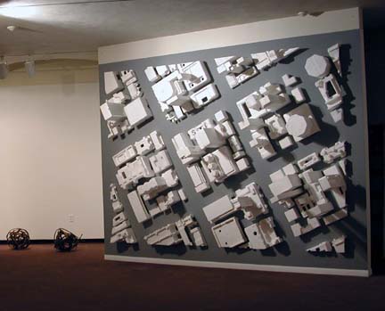
Glued to one wall of the gallery is a birds-eye view of an imaginary city, an urban grid made of dozens of those molded styrofoam blocks and spacers used to protect computers and other electronics in their shipping cartons. The view of the grid is angled, or slightly skewed, as though it were a picture snapped leaning vertiginously out the window from a helicopter wheeling overhead. The work hints at the isometric drawings and architectural models of big, optimistic city planning presentations — The Ideal City, La Ville Radieuse — the styrofoam forms all a pristine, Utopian white, some of them looking like office towers and apartment buildings, others like factories.
The next wall has another aerial view, this one a tangle of highway interchanges –- cloverleafs, on- and off-ramps, etc. In this case, the view is depicted with thin twigs pinned to the wall.
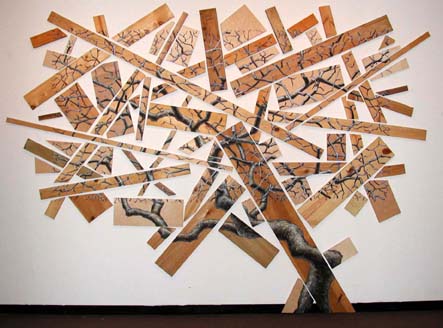
Back down to a vantage point from the ground, Rectangular Composition is both a painting and a sculpture of a gnarled old tree, its trunk, branches, and twigs painted in segments on disconnected scraps of standard lumberyard lumber–1 x 2’s, 1 x 4’s, 1 x 6’s, etc. Broken into discontinuous pieces but still readable as a whole tree – a tree made out of the material that a tree is turned into — the work circles back on itself like a good joke.
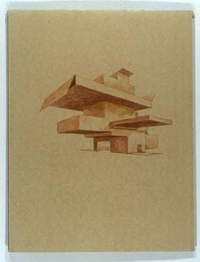
36 Improvised Structures is a selection of Lefkowitz’s drawings of imaginary buildings, each one done on an identically sized piece of corrugated cardboard. The color and texture of the cardboard vary slightly from one piece to the next. Each building is delicately painted in one single oil color or another, thinned, the background of raw cardboard left untouched. The buildings are fanciful, some of them looking like cartons with flaps unfolded in odd origami configurations of uncertain functional intent. They could be architecture, but for exactly what purpose no one could say: for all anyone knows, they could be visionary architectural renderings for future improvements to Northfield’s Malt-O-Meal plant a few blocks away. They remind me both of the japes of the New Yorker magazine artist Bruce McCall and of the serious photographs of water towers and other industrial structures made by the German photographers Hilla and Bernd Becher.
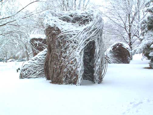
Standing not far outside the Carleton Art Gallery on the college quad is an astonishing sight, a work called Twigonometry, created by the artist Patrick Dougherty in 2002. A cluster of large shaggy huts made of swirling lengths of willow, buckthorn, and dogwood twigs and saplings, from a distance they look like a collection of colossal tumbleweeds or gigantic beehive hairdo’s. Closer up, you see that the huts are woven like birds’ nests—immense ones, twelve feet high. Twigonometry was projected to stand for two years before deteriorating and collapsing, but it looks like it’s still going strong. You can’t spend any time around Carleton without these twigs and saplings at some point getting woven into your consciousness. David Lefkowitz made use of twigs in one of his pieces in the gallery, and of fragments of tree in another, and Stephen Mohring in the half of the gallery devoted to his work alludes to twig nest construction as well.
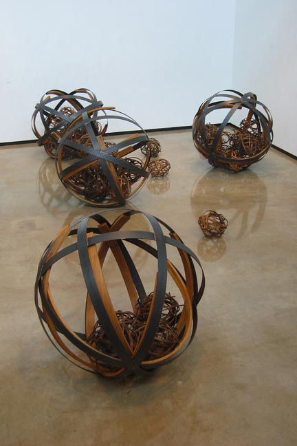
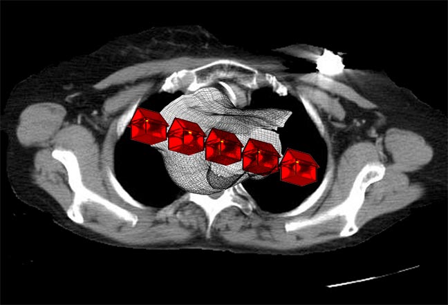
Mohring operates in several media, making use in this exhibit of wood and steel, video, ink-jet graphics, and kinetics, in pursuit of themes on gestation, birth, disease, and death. The dominant work in this show is titled metastasis III and consists of six large and a few dozen small openwork spheres strewn on the gallery floor, or, in the case of one grouping, mounted high on one wall. The larger spheres are about three feet in diameter and look like crude armillary spheres. Each one is constructed of four wide equatorial bands of steel crisscrossing each other, and, just inside these, thick boards of oak that have been steam-bent into curves roughly congruent to the steel’s. The welded steel armatures entrap and resist the powerful forces of the steamed oak’s tendency to spring back to its original unbent form. Caged and clustered within these large spheres, and also strewn on the floor outside of them are a couple of dozen smaller birds-nest-like spheres, each of these roughly a foot in diameter, constructed of thinner sticks of oak steam-bent into nearly full circles and held together with bits of twisted baling wire. These curved sticks are finished to appear scorched around their edges, perhaps in reference to the dangerously metastasizing cancer cells that Mohring describes as his impetus for doing the piece.
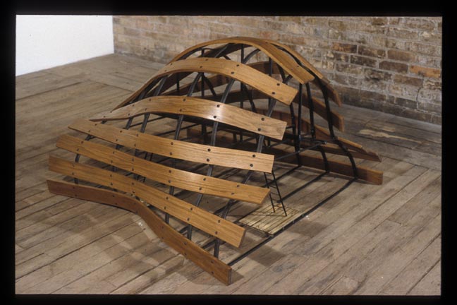
Mohring’s large and small spheres are mysterious and interesting from the point of view of materials and technique and the expression of the forces that inhere in them, but the rhetorical claims made for them in the artist’s statement seem to me to be a stretch, and I think work against the work itself. The same is true for the rationale given for another piece, 39 weeks, an upsidedown boatlike form whose curves derive from a cast taken of the artist’s pregnant wife’s swollen belly. Underneath its curved staves are some small ladders and a steel armature that make the structure confusing to read — it lacks the formal unity of the spheres, and leans too heavily on explanation to give it meaning.
Mohring and Lefkowitz both show some strong work here. The didactics posted on the walls of the gallery, however, weaken the ability of the work to speak for itself. No doubt explication sometimes helps, but in general, I think works of art are better left to explain themselves… for people to interpret through their own experience rather than through the manipulative conditioning filter of text and talk. Not to cut off conversation, but we should encourage the creation of works of art that have the substance to speak without words, and the cultivation of individual responses to those forms that truly have the capacity to speak.