Cheapscapes: Real Plastic, Real Film, and Some Really Good Eyes
Suz Szucs writes about a solid show of work done with plastic cameras--that avoids the "plastic camera esthetic." It's at Washington Galleries in the Washington Studios building in Duluth, through April.
Cindy Sherman ruined it for all of us.
Used to be, you could get intimate with photographs in an exhibition. Back in the old days, before enlargers, photographs were only as large as the film, so a viewer might be overwhelmed with wonder at a 16”x20” glass plate image, but that was an exception. There was a beauty and elegance in the small statement, and although every once in a while photographs would be blown up real big as in Steichen’s Family of Man exhibition (which however wasn’t really concerned with aesthetics so much), it was Sherman who decided that she was going to pull a full-on frontal assault on painting and go big, and bigger (and scatological, but that’s another story) and Art photography has never been the same.
Now, big is everything and if you aren’t filling the museum wall with a single image, then what’s the point? Gursky, Demand, Mori…even Sugimoto, the purist, has succumbed… Heck, our own Blacklock bought a billboard for his last project! Good for them, good for nearsighted people, but expensive for the rest of us. Let’s forget about the cost of making, storing and transporting the work, the average viewer can’t even afford to buy a piece now and again and where would we hang it anyway? Hey, I don’t know about you, but my summer house is full up! Photography, the art for the people, the form that John Berger blissfully hoped would follow Benjamin’s theory and free the people from the tether of ART, is now THE ART. Unfettered Capitalism wins again and the state of Art photography demonstrates quite succinctly everything that is pretty well wrong with the Art World in general…Long live the king, the king is dead.
So four friends get together over a few beers and talk about maybe having an art show together. As they have spent most of their spare cash on beer, they decide that it needs to be cheap, and it needs to be kinda quick, cause they are going to fill a space in the exhibition calendar at Washington Galleries. They’ve got two months and they’ve got plastic cameras. They’ve got a title, Cheapscapes and everything is going to fall into place.
Plastic cameras are easy to fall in love with. Usually, a plastic camera not only has a plastic body, but a fixed plastic lens. That means that there may or may not be one point of sharpness through the lens and a very limited depth of field, also known as the amount of the image that will be in focus. Holga is a very common brand of plastic camera that is still available (at the Society of Photographic Educators conference I saw college students scooping up the $15.00 deals), although Diana, which I believe is no longer made, remains the most famous. In fact, the whole genre of plastic cameras is often called “Diana camera” and is noted for its blurry, short-focus dreamy imagery. Because of the ease of getting something that “looks cool,” a lot of the imagery can be repetitive and thoughtless although fun to look at.
Not all the world is digital yet, and the four photographers who have put together Cheapscapes, Eric Dubnicka (ok, he’s moonlighting from painting), Dave Kunst, Travis Melin and Brian Volkmann, have pulled off an exhibition that is fun, thoughtful, varied and, yep, cheap. They have also managed quite deftly to elude the seductive trap of the Diana camera. They decided right off that using the plastic cameras would be a challenge, not only to get good exposures with inconsistent tools that sport no light meters, but also to avoid the pitfalls of the Diana aesthetic. “We put some thought into how we were going to use it,” says Volkmann, “to not showcase the cameras, but the images.”
The idea from the get-go was to use the cameras to make inexpensive work, both for them to produce and for people to buy – to use the cameras, but not to make “plastic camera” photos. Dubnicka was the most naïve going into the process. Known primarily as a painter, he felt pressure to create a project that would reflect his other work, to stand up to it if not surpass it. For him it was a diversion that took on a greater intensity than he had anticipated.
As Volkmann says, “You can’t just pick up a camera and turn it into gold.” Dubnicka, like the other men, found it was a little harder to tame the beast than he had expected. To support the project, adhere to deadlines and drink more beer, the artists met weekly for critique sessions. Their process of communication and wrestling with their individual projects became part of the exhibition, not explicit on the walls, but evident in how tight the show is. Surely, through seeing and supporting each other’s work along the way, it helped to move them beyond stereotypical image making and on to projects that each have strengths of their own.
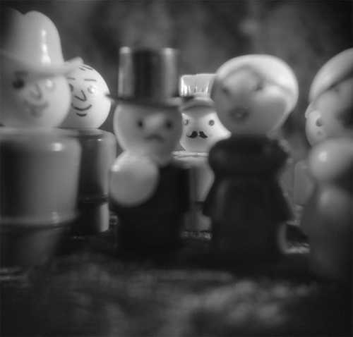
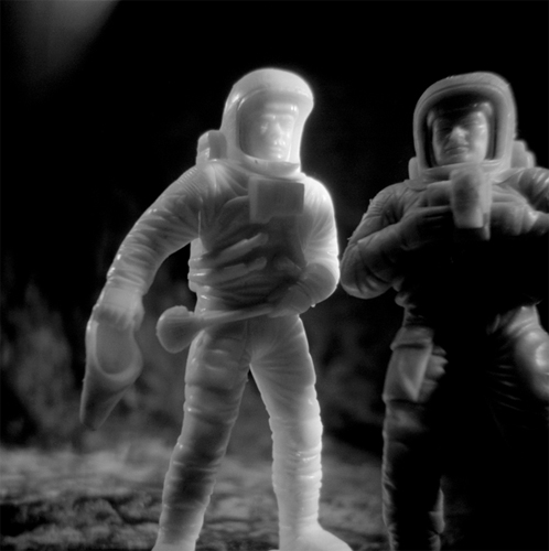
For Volkmann, the camera added a process through which he could not be cavalier. At the time the project was beginning, he was handed a box of childhood toys that he hadn’t seen in 25 years. Primarily a digital shooter, he had become used to seeing images come in quickly, being able to adjust focus and depth and shooting until he got what he wanted. With the Holga he had to put more care into each image – think about the process – and this was conducive to creating a relationship with his tiny subjects that had at one time been so dear to him. Ironically shooting plastic subjects with a plastic camera, Volkmann’s images – none larger than 20”x20”— memorialize and aggrandize the small figures. In Moon Men, the subjects appear to be talking with one another, discussing what steps they might next take.Group #3 is taken from the vantage point of the little people. The viewer is part of the crowd; the mustachioed man our mirror. Volkmann has created loving portraits that feel animated.
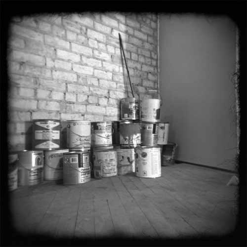
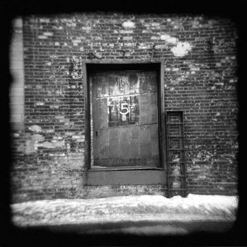
For Dave Kunst (whose last name, incidentally means art in German, lucky guy), who also regularly shoots digital sometimes painting over his images, he found that his subject matter shifted. “There’s the aesthetic,” he said, speaking of the Diana phenomenon, “but you need something to build with it.” He found himself looking at mundane things that most people overlook, and was excited “just to see what I would get.” He chose to leave the furry edge of the Holga’s frame in his final images and the viewer can clearly see where the focus crescendos in the center of the image and falls away at the edges, creating a soft, blurry vignette. This slight distortion creates a disturbance in the minimal compositions – a pile of paint cans, the number 5 implanted on a door, light reflecting on a wall – they take on a dreamlike scale, one of memory, not the hard fact of photography. However Kunst does not push the effect, he lets it fall where it does, concentrating instead, and rightly on his compositions.
Travis Melin is a large format man. He’s steeped in it, you can tell when he walks into the room. View camera shooters are control freaks, which you would know right off if you have ever read one of Ansel Adam’s books. Yikes, so many numbers, so much math! Most of the artists I know have a natural aversion to fractions, but VC guys live for it. Now, I don’t know Melin, and I don’t mean to suggest at all that he’s uptight, but I do imagine that it was tougher for him than the other fellas to let go and throw himself into this project. When he told me about strapping his plastic camera to a ladder with electrical tape I was surprised, and a little impressed. That kind of “getting the image at any cost” is important – it means the image comes first, the equipment second and yeah, part of my own education comes from a sign posted at my local photo store that said, “the camera doesn’t make the image, the photographer does.”
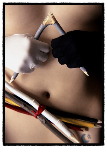
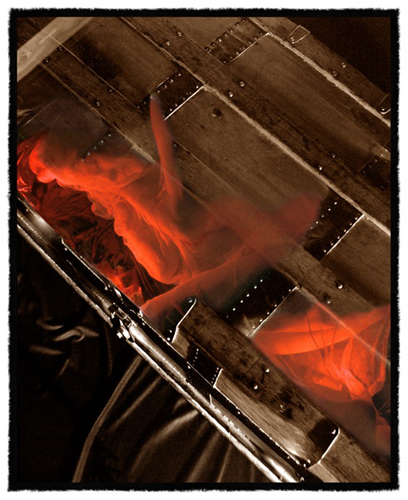
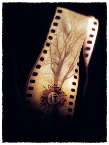
Nevertheless, Melin has made probably the most controlled set of images in the exhibition. Primarily a nature photographer, this project gave Melin the opportunity to work on something more conceptual than his regular work. Although he planned his shots meticulously, he did have to remain flexible and take some risks that may inform his more traditional work down the road. Based on dreamlike narratives that remain rather vague for the viewer, I don’t believe one would recognize these as plastic camera images at all. His liberal and singular use of red yells digital and Melin did admit that he was more liberal with his use of that medium to get his images where he wanted them to go. Knowing that he works primarily with nature informs the images as there is conflict with the natural world in all of the them. Despite the challenge of plastic, his images are very formal, which leads me to prefer his Untitled – Back, which although hard to read, has a restlessness and randomness to it that gives it energy.
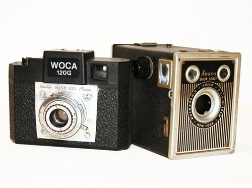
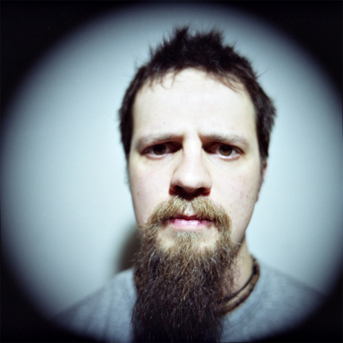
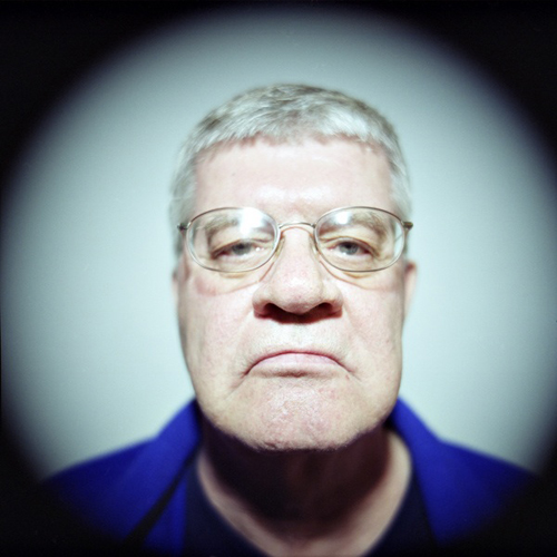
With his first attempt not living up to expectations, Dubnicka decided to work with models, something he wants to get to with his painting. Having fashioned a Kodak Pony 135 lens on his Holga, Dubnicka had stepped out of the plastic lens world and away from the simple distortion that identifies that type of imagery. A “normal” lens for a medium format camera like a Holga (2 1/4” x 2 1/4” square film area) is 80 mm. By comparison a 135 mm is a long lens so isn’t going to give full coverage on the film in a fixed position and it will stretch out the features of the subject. As a result Dubnicka created monumental portraits that looked as though someone shot through a reverse spy hole. What is most interesting about these images is how he chose to print them. At 22”x 22” they are all just bigger than life sized, but he drained the yellow so the images seem like rosey marble busts, living Roman portraits. In his painting, Dubnicka likes to, “see the impact I can get out of that one mark… a blank slate where the focus is on that individual.” Together in a room with these portraits, it feels like they are stuck before speech, but their thoughts are racing. They demand space; they want to be heard.
In the interest of staying cheap, all of the artists printed their work digitally and to be honest, you wouldn’t even know they are not traditional photographs. I always learned in school that it was film that made the difference – your negative was the cake, the print the frosting. What is nice here is what a solid job they did in using traditional techniques with digital technology (incidentally, each applied their own limits as to how much digital finishing they would do). My great fear with the advent of the kamikaze digital generation is that aesthetics will be thrown out with the need for speed. These image makers have very adeptly shown that you can have both – beauty and care in the finishing can be cheap.
So what was the biggest challenge the four encountered while exhibiting together? Well, that would be that the tap keg wouldn’t work at the opening. Otherwise, they managed to maintain their friendships and are already talking about doing it all again. “What?” exclaimed Dubnicka, wearing a worried expression on his face.
Cheapscapes will be showing at Washington Galleries in Duluth through April 30th. Go see it. The art is good, it’s cheap so you can afford to buy a piece and small enough that you can hang it on your wall. So buy two if you have a big wall.
For more information on plastic camera imagery, just Google “Diana camera” and you’ll get more than you could ever want.
For information on work in the Cheapscapes exhibition, contact Erik Dubnicka at
edubnicka@yahoo.com