. . . But I Know What I Like: “Grotto” at MIA
Michael Fallon reviews Bill Klaila's installation "Grotto" at the Minneapolis Institute of Art's MAEP Gallery. The show runs February 28 - May 4.

What, exactly, makes good or bad art? Is there a set of criteria one can refer to? Are there questions to ask, like whether the painting has pthalo blue highlights? Is it painted fat over lean? Does it exhibit the artist’s inner struggle in the face of man’s own inhumanity? Or is there an oracle, a sage at the end of the yellow brick road from whom a novice-to-intermediate art critic—say, like me–can glean the art-critical wisdom of the ages? (Oh mighty wizard of Kimmelman, I’ve come many miles; can you tell me what makes good art?) Is there any way I can mitigate this damnable tendency to assess art based on my own likes and dislikes?
Believe it or not, these are the questions I often ask myself in Art Critic Land, and they are the questions that came to mind upon seeing Bill Klaila’s “Grotto: An Alternative Reality” currently on display at the Minneapolis Institute of Art. That is to say, I am torn by the experience of this installation work, which fills the whole of the Minnesota Artists Gallery. On one hand I like the thing, am wholly charmed by it. But on the other hand, I am pretty certain it is not very good.
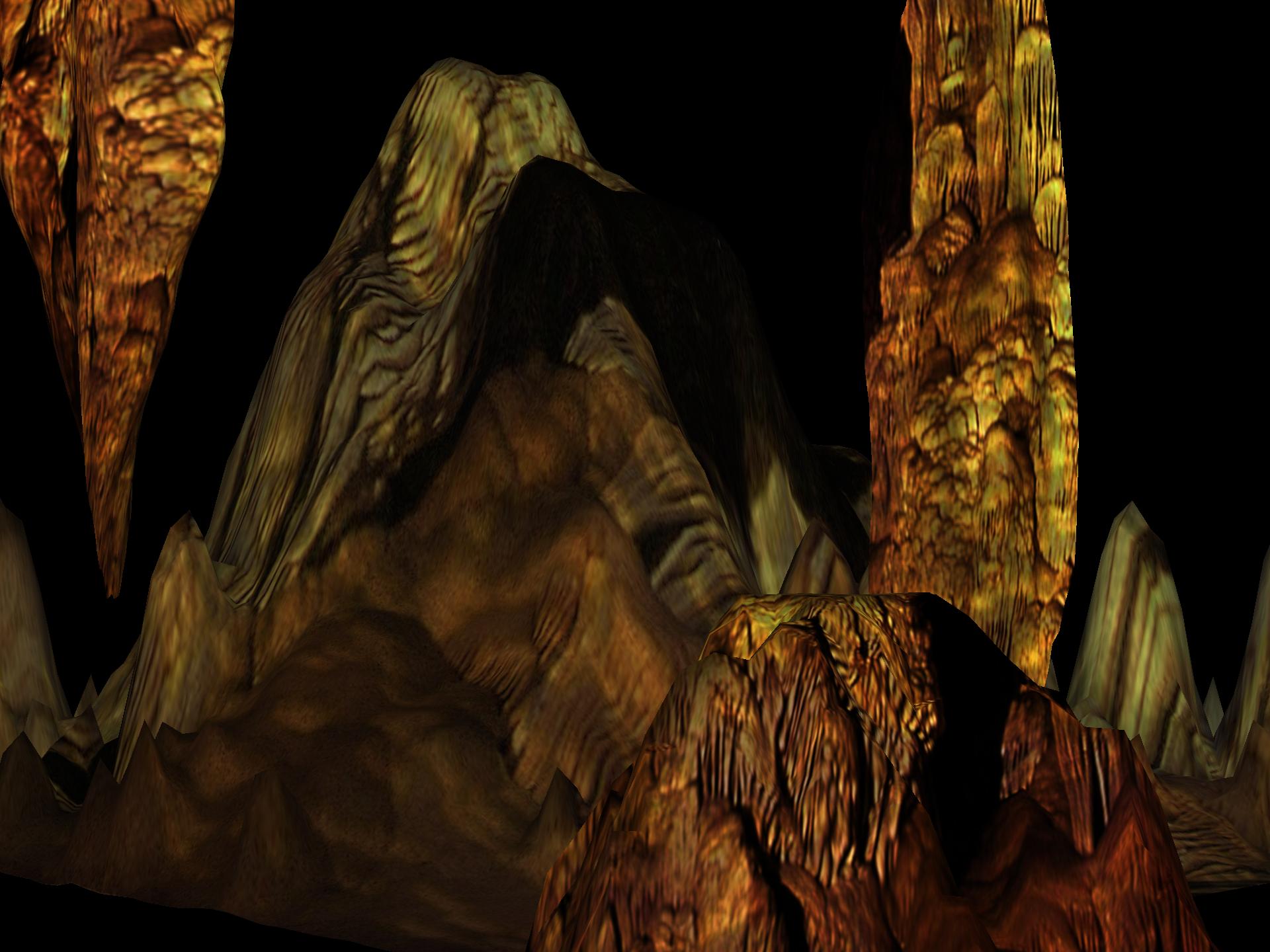
Klaila’s “Grotto” is the sort of art that bigwig art critics love to tear apart. It’s all display and splash, and very little substance. It’s a cardboard stage set with a little man behind the scenes operating levers and pulleys to make it a spectacle. A quick description: The entire gallery has been painted dark gray, and the lights have been turned off. From the two doors at either end of the gallery, curved, eight-foot-high gray walls lead to the center of the gallery, wherein lies an medium-sized, open-framed, room-like space. There are two side walls to this smaller room, made up of a screen material that is lit up with computer-projected displays of stalagmites and stalactites. The floor, too, is composed of a similar material and displays a shimmery, rainbowy, cathode-tube-like array of color. The floor hides touch-sensitive devices of some sort, so that when you walk out into the middle of the room the touch of a foot sends out virtual ripples across the display and bloopy sounds over the speakers.
What more can one say about this work? For a culture brought up on big-screen TV and flat-screen computer displays, it seems marvelous and yet humdrum. The technical achievement is wonderful and the interactive aspects fun, but we are used to processing technical marvels and filing them away to the cynical side of the brain; that is, we see and process the marvel immediately, and then we say: “OK, what’s next?” There are many national artists currently exploring the limits of computer-assisted virtuality; the Whitney biennial last year had a section devoted to such work by artists like Robert Nideffers, Margot Lovejoy, and John Klima (whose interactive model of the earth most closely resembles what Klaila is doing here). Once you get past the spectacle and the novelty, though, you will likely happily move on to the more real Egyptian spectacle that is nearby.
And that’s about it. Except here’s the thing. I have to admit I like this empty electronic flash-show, though perhaps not for reasons that Klaila intends. I don’t care too much about the cave thing—the sense of nature being represented by electronic media is not so deep to me as I suspect it is to the artist. But I like the light of the space, and I like being able to position myself in the midst of the weird environment of red-blue-green light. I was in high school back when Disney’s Tron showed what it could be like for humans and computer reality to intersect (a conception that would pave the way for more contemporary visualizations such as Lawnmower Man, The Hacker, and The Matrix). Klaila’s space reminds me of Tron. Both visual realities are built on computer-generated grids of imagery wherein everything thing feels strange, rudimentary, creepy, and, well, computery. While all movies rely on some degree of fakery, these movies in particular use lighting and camera filters to differentiate between the real world and the virtual. The Matrix used such tricks to create a cold blue look for the real world, and a decadent green one for the Matrix. According to the film’s photography director: “The Matrix should make you feel sick, and in ‘reality’ you should feel a little more at home, but never comfortable.”
Klaila’s work comes across something like a computerized carnival attraction–a virtual funhouse, perhaps, or the freakshow. And that’s pleasing to me, as I love to be carried away in a good bit of fakery. I like too that there is no ceiling to the cave; the framework of the room opens to the larger gallery and the projecting cameras are exposed—thus wholly spoiling the sense that this could in any way be a real cave. At first this bothered me—I thought I wanted more illusion, not less. But the more I thought about it, the more it struck me as purposeful—as if the artist wanted to draw attention to the smoke-and-mirrors quality of the project, to wink and let us in on the snake-oil joke. And while I’m sure such talk will get me run out of the art critic’s union, all I can say is–so be it. I like what I like, even if it’s bad.