Big Box Art
Jay Orff looks at the mass-produced decorative art at Target, and in the process at the larger cultural and commercial aesthetic sensibility that sells knock-offs of 19th and 20th century fine art side by side with socks, cheap chinos and toothpaste.

THE TARGET CORPORATION HAS TURNED OUT TO BE one of the great patrons of 21st Century art, giving loads of money to many of our big cultural flame-keepers. Given that, I couldn’t help but wonder about the art that Target offers for sale to the rest of us.
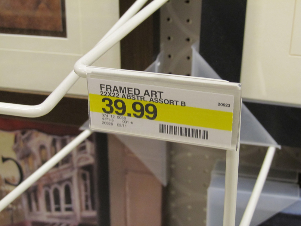
The art in Target stores is a product, like toothpaste and shoes. The work is put on shelves and designated by numbers and bar codes and simple descriptions. It’s odd, for a second, to see the nearly identical shelf tags for envelopes and abstract art. The art is the least purposeful of the retailer’s products, perhaps. It is decorative art, so its purpose is to decorate, I guess, but you can’t wear it on your feet or clean your teeth with it — not very easily anyway.
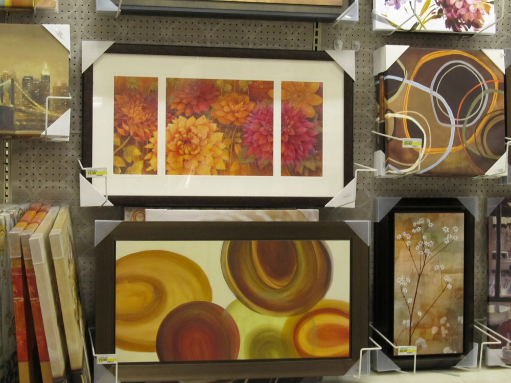
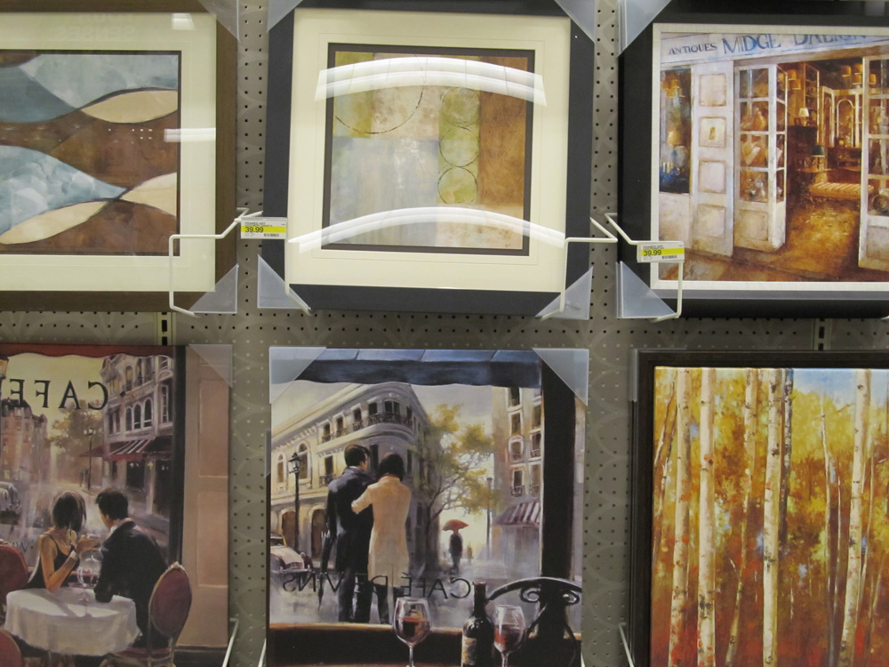
And the first thing I noticed when I stopped by my neighborhood’s iteration of the big box store was that all of the decorative art for sale at Target references fine art; that is, it’s meant to look like, or at least remind you of other fine art. In a sense, the art works Target sells are knock-offs, in the same way their cheap chinos are knock-offs of those you might find at The Gap or J. Crew or Brooks Brothers, or wherever one finds the ideal trousers from which all others draw their inspiration. I don’t really know if the chinos at one place are somehow more perfect than the others — perhaps that I think so is only evidence of a thorough, but erroneous brand-cultural indoctrination.
But there was a time when certain kinds of art were, in fact, more valuable, when art was more admired simply because it took greater skill to make, or was made out of valuable materials, or placed on the ceiling of a historic church. Along the way, though, we began to ascribe value to art according to the supposed creative genius of the artist. Raw materials and skill still inform the prices of some products, to be sure, but even shoes and shirts and other perfectly useful things, like cell phones, are not priced merely by how much they cost to make. As with contemporary art, the value of many contemporary products is based on how much individual genius the product reflects, or in the collective esteem we hold its maker. As others have noted, Apple products cost more, in part, because of the value we’ve given Steve Jobs’ aesthetic sensibility, his penchant for design. Van Gogh’s paintings don’t cost a fortune because he used expensive paint.
And the art at Target has a little Van Gogh in its mix. The idea of the individual creative genius is referenced, at least, in Target’s decorative art. But as I looked at it, there was something disconcerting and confusing about it to me; when I looked at it I felt I knew exactly what I was supposed to feel and think. The art seems to work in the same way all of the other products in the store work: it is there to accomplish a pre-determined goal you have when you enter the store, like finding a pair of socks to cover your feet or getting a coffee-maker to make coffee. Which doesn’t seem like art.
I feel like I am stating the obvious: the art at Target isn’t very good. But is that true? According to what standard? I’d argue we could make that determination using the very criteria Target itself uses — not that it can really use any other. After all, the store exists in and is a product of this cultural moment, as are we all, so it makes sense that the retailer’s aesthetic stance would mirror the gross way art functions in our culture. What Target’s choice in art products seems to be saying is, “Here’s something for you people who don’t spend a lot of time with art but want something you will recognize as artsy.” The work for sale looks and feels almost like, but is not in fact art, certainly not in the same way that the work it knocks-off once was.
Let me explain.
As never before, I think, art can be whatever it wants, or, as Warhol said, whatever you can get away with. Art can be a bag of bugs or some melted crayons or a painting in the perfectly imitated style of Titian or Rembrandt or O’Keeffe, or a cute drawing of a bird with a machine gun. And then there’s outsider art, which I suspect is popular, in part, because it’s a way for more traditional (and less fashionable) forms of practice to sneak back into the contemporary art world. But one thing all of these approaches have in common is an ability to undermine our expectations, to present us with something that we are “not in anticipation of” (I borrow this phrase from Edward Ruscha). Art makes the world new – at least for a second, maybe forever. Even very old art, our favorite work, does this; it makes us realize or feel or at least suspect for a moment that there is something more, something beyond our assumptions, and that gives us a hope and excitement for what more might be possible; it gives us something to live for, at least it does for me.
______________________________________________________
Meant to look like, or at least remind you of other fine art, the artworks Target sells are knock-offs, in the same way their cheap chinos are knock-offs of those you might find at The Gap or J. Crew or Brooks Brothers, or wherever one finds the ideal trousers from which all others draw their inspiration.
______________________________________________________
There was certainly a time when creating a painting of a Paris street in the rain with reckless brush strokes or abandoning representation by painting circles of mauve and burnt umber were new approaches. When freshly made, they were attempts by artists to escape the past and explore a new mode of expression using their artistic vision, that genius that we have since come to value so highly. Of course, those once-groundbreaking modes are now well established and have become some of the most recognizable of 19th and 20th Century art. The work at Target leans on these well-known modes, even borrows some of their cache, at the same time that it perversely reinforces our most familiar, tired assumptions about art. As represented in the art-like products on the shelves, these borrowed modes give a superficial tang of aesthetic authenticity while assuaging any doubt or questioning; this “art” doesn’t challenge, but makes us comfortable in our preconceptions — about art, if nothing else. You will not find a cute drawing of a bird with a machine gun on their shelves. Not as art, anyway. There are surprises to be found at Target, of course, but I’ll get to those in a minute.
Interestingly, I think, as one moves up the home goods food chain — from Crate&Barrel to Room&Board to Restoration Hardware — one finds that the art for sale takes more chances; its references aren’t as old. It’s as if the more you are willing to spend on a couch, the more robust your definition of art must be. But isn’t that just a natural consequence of a larger (if sad) societal presumption: those with money have more experience with art and culture, and therefore may ask a little bit more from their art products? But I think these more expensive products offer the same thing as those at Target; they don’t cause anyone too much ideological trouble but they allow us to feel that we are in touch with an artistic sensibility.
And I have to ask: If you’re going to spend 500 bucks on a print at Restoration Hardware, why not go to a gallery and buy something from a real, breathing artist?
So, if the knock-off art at Target amounts to little more than cynical exploitation of some culturally received nostalgia for once-great art — artiness, if you will — are all the contents of the store so bereft of imagination? Hardly. Now that I think about it, going to the decorative art section was probably a kind of dumb place for me to look for art at Target in the first place.
The decorative art is located in the middle of all those other things one needs to outfit a home; before long, wandering the adjacent aisles I soon discovered that there are 34 different kinds of spoons for sale at Target. Nearly all of the difference among them is in the handle, of course — but there are 34! People apparently want options in their spoon handles. This sign of creative exuberance in kitchen utensils spurred me to go in search of other exuberances in the store.
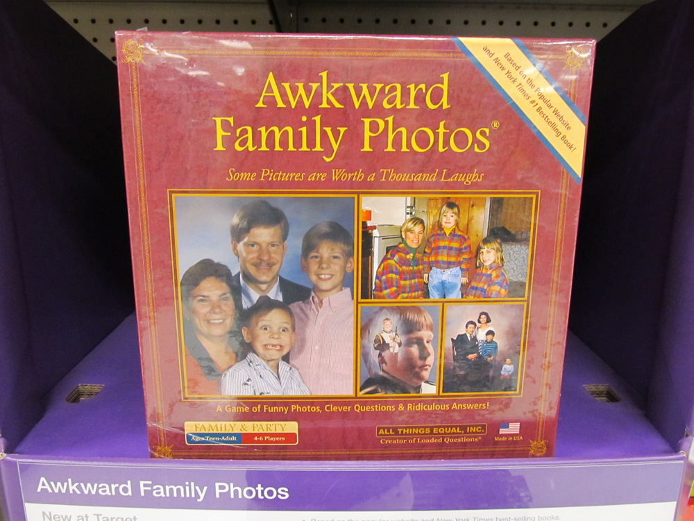
I decided to take a shortcut and go to the toy section. The products we make for children are much more likely to take chances, to incorporate design elements meant to elicit amusement or curiosity. Next to the usual assortment of brightly colored, explicitly “creative” toys and things used to build other things, a new game (apparently it’s a game) jumped out at me. It’s called “Awkward Family Photos” (named for a popular website of the same name) and seems destined for a thrift store near you. I was not in anticipation of the game — actually, I hoped for something like it, so I guess a part of me was — but I was glad to stumble across it. It’s what we’ve all been waiting for: a game pre-equipped, off the shelf, with a deep sense of irony, carrying a clear and surprisingly subversive (if not mean-spirited) message that our loved ones, our past, ourselves are here to be laughed at. And then, perhaps my favorite part, the sign underneath on the shelf read: “Awkward Family Photos, New at Target.”
I suspect they’ve been here all along.
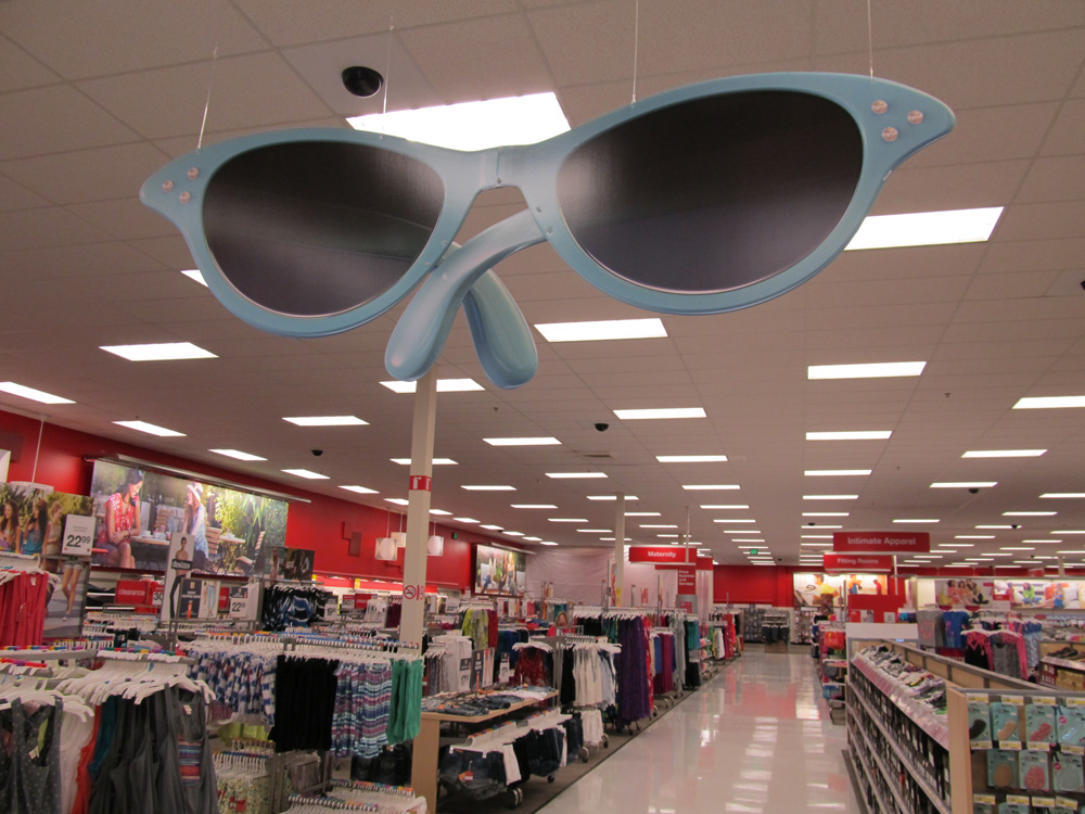
And I discovered something else, too — another find outside the “art” aisles, and something purely visual. Actually, I saw it when I first walked in the store: a giant, six-foot pair of woman’s sunglasses, hanging from the ceiling, which almost immediately put me in mind of the Walker’s recent Lifelike exhibit (the giant comb, the giant eraser, the giant folding table and chairs, et al). But then I noticed there were more giant things hanging from the ceiling throughout the store, creating a disappointingly apparent theme that explained what they were all doing there.
But I saw the sunglasses first, and for just a second I was transported someplace where what I didn’t expect could happen. The smooth plastic blue frames with three decorative rhinestones, the deep black lenses — unanticipated, their purpose unclear, they invited me to consider them and wonder how they had come to be. And that’s all I can really ask of art. The sunglasses were hung near some of those black orbs on the ceiling that conceal security cameras. Considering these two objects placed arbitrarily in close proximity, I let my mind wander, satisfied for the moment with the art of that happy accident.
______________________________________________________
About the author: Jay Orff is a writer, musician and filmmaker living in Minneapolis. His fiction has appeared in Reed, Spout, Chain and Harper’s Magazine. Read more on www.jayorff.com.