Art Review: “Top Mix” at MIA
VACUM (Visual Arts Critics' Union of Minnesota) sponsors a series of talks on the MAEP shows at the Minneapolis Institute of Art. This is Jeffrey Kalstrom's talk on Alyn Silberstein's show "Top Mix."


In terms of the amount of publicity Al’s show has received, and the interest this reveals, his exhibit is surely a success. Getting lots of press is what every artist longs for—and in this economic climate good press is about all the reward any artist can hope for.
One thing I found curious about the coverage–in the Star Tribune and City Pages, the NPR radio interview and the magazine piece in Wired— is that these articles talked a lot about the process of making the work and the decisions behind the development of this process, but not at all about the possible meanings of the work. We know about Al’s decision to work digitally because it eliminated the problem of “now that the show is over what do I do with all that unsold work?” And the digital print process enables him to create additional pieces on demand, and to scale the work to suit clients’ needs. Al has expressed in his press statements a clear desire to entertain the public, to go large, go theatrical; kick out the jams, and all that goes with it.
But the question that still occurs to me after reading all this is still “What could this work mean?”
My primary questions when looking at a work of art are “What does this work communicate to me?” and “What can I learn from this work”?
Now some might say that a visual artwork, like a piece of music, does not have to “mean” something – it can just exist as a moment of beauty, excitement, and enjoyment. Language does have its limitations.
There are depths of meaning in a work of art that language can only start to touch. But through language we are enabled to share our varied perceptions and reactions to the work and can push each other into a deeper understanding of the work and thus of ourselves. What an artist intends his work to say does not matter in the end, but the sensations, thoughts, feelings, and associations the work engenders in its audience matter a great deal. And it is incumbent on us as critics and viewers to look for these and try to discover what they mean.
How is the situation where meaning can occur created? An artist’s job is to create objects and circumstances of reflection; the task of the audience is to look and listen to what the work is communicating; the critic’s job is to use words to open doors into the work.
Vision
When you look at a work of art “what you see is what you see.” I believe in the primacy of each individual’s vision in experiencing and understanding a work of visual art. It is very easy for words, concepts, and categories to short-circuit the meanings a work of art embodies. Case in point: A friend of mine asked me, “who is Alyn Silberstein?” I replied, “he’s a bike freak who scans stuff and blends, chops, and flip-flops with Photoshop.”
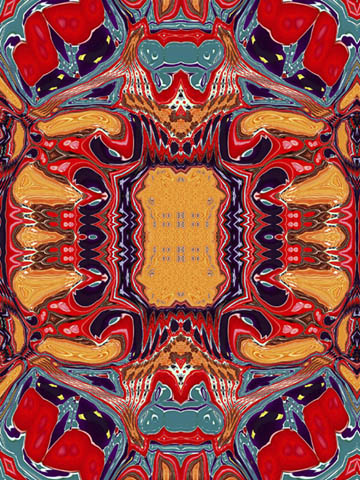
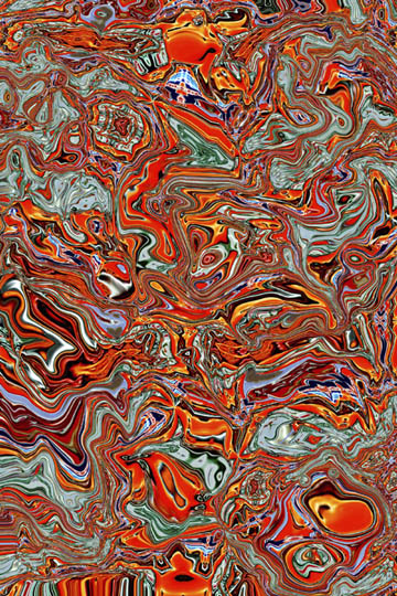
I then described the exhibit as “a post-psychedelic, designer pop op installation”: a glib, quick, and shallow description. But I went on to say that Al’s prints reminded me of the swirling rainbows of gasoline floating on rain puddles in a parking lot. This simple physical association, which linked the work to a physical memory, opened up the work for me. Making links between a work of art and memory can be a key to understanding its meanings.
The beauty of the floating gasoline develops from our memories of the flowing beauty of natural elements like water, windblown grass, and rainbows. I can recall spending considerable time watching these streams of lurid color dance and flow on spring afternoons on my way home from school. I recall the queasiness I felt when my Dad pointed out that this marvelous beauty was spilled gasoline, toxic to fish and other creatures.
The iridescent streams of gasoline are fluid, complex, beautiful, and toxic. There is a dance between the gasoline’s danger and its beauty.
Nature / Culture
There are in Al’s work some of these similar conflicts and contrasts between nature and culture. In the exhibit Al has created an all-human interior gallery installation, but the aesthetic roots of this built environment are found in the structure of the natural world. I believe that we base our sense of visual and spatial aesthetics primarily on the natural environment. We compare and contrast our sensations to culture through our memories of our bodies in the natural world.
I like to think about the relation between nature and culture in terms of Claude Levi-Strauss’s raw / cooked dichotomy. This analogy gives us a model for how the human world is constructed out of the natural. In these terms, one of the most interesting ways to think about Alyn’s installation is to think about its similarities to a walk in the woods.
A walk in the woods is a time-honored prescription for clearing the mind of worry, trouble, and conflicts. There have been studies showing that the forest has this effect because of its particular blend of order and complexity. The natural growth of trees and plants in a section of woods is never random. Each living thing grows in the locations that suit its species and each grows large or small depending on a number of environmental factors such as soil quality, rainfall, and the like. There is a high level of complexity in the woods, yet this complexity is highly ordered. This type of complex structure takes up such a large portion of our perceptual ability that nonessential thoughts tend to drop away. We tend to become wordless and often (occasionally) without cares while walking in the woods. Yeah, I know Al would probably say that he would rather go biking than walking – right? – But I would say that biking is a humanized form of “walking in the woods”.
In Al’s installation there is total integration of space, similar to in a forest. The individual prints are bound and linked to the walls by the underpainted wall pattern. While the art itself is purely two-dimensional, the totality of its installation brings it close to approximating the spatial complexity of the woods. I do think that the painted wall pattern is essential for the show to work as an integrated installation. (I would, however, have chosen a dark gray instead of the black for the wall color. The black distorts the value balance within the individual prints.)
In the woods this sense of order, which is barely graspable through the complexity, is balanced in the Apollonian brightness of day. As the shadows of night fall this balance is upset and the Dionysian chaotic edge of the woods starts to show. The terror we feel in dark woods is a standard of both fairytales and slasher films.
In Al’s installation night is perhaps just starting to fall. The tension, excitement, the edge of the show is in its closeness to the Dionysian excess of night. There is almost too much going on in the individual prints and the balance between the prints and the wall painting is precarious.
Other Influences
There is a strong link here to the psychedelic painting of the 60’s, which attempted to recreate the visual effects of hallucinogenic drugs, where immoveable objects shift, wiggle, and pulse, and solid objects, melt, flow, and drip (or so I have heard . . . ) It is the nature of the drug experience to flirt with the edge of chaos. A sense of danger gives the drug experience much of its hypnotic grip.
Those of you who were at the opening might have noticed the music: electronically created techno. The driving gloss of this music has its fans, but many find that it has some of the same qualities they would ascribe to digital art itself; that it is hard, cold, repetitive, textureless, and emotionless. I happen to be one of the odd old farts that enjoy it, and I wish that it were a continuing part of the installation.
I know the experience of motorcycling of which Alyn is a fan has a similar mix of danger and control. (Although the biggest bike I have been on is a Honda 50, which a buddy of mine won in a contest in Boy’s Life Magazine, I did find this terrifying nonetheless.) The man-machine relation in motorbiking is analogous to the computer – nature relationship in Al’s work. He takes commercial hard-edged, rectilinear, grid-based graphic design and smears it into a simulation of organic complexity through digital manipulation. I see clearly in his work a desire for both a balanced order between nature and culture and a drive towards the excitement of pushing limits of this balance.
Al’s work in its physical engagement with the world becomes a fruitful opportunity to know the relations of nature and culture –– the raw and the cooked, the grid and the smear.