A Matter of Taste: Review of the 56th Arrowhead Biennial
Julia Durst reviews the 56th Arrowhead Biennial at the Duluth Art Institute, up through January 23, 2005.


Juried art shows can be a lot like all-you-can-eat buffets—crowded, lacking any distinct flavor. Who wants lukewarm quiche from a 30-foot long trough, particularly when it sits just eight inches from an oozing burrito? Who wants to look at 70 pieces of art when they have little relation to each other in media, content, or overall quality? Ah yes, juried shows– a rich medley or a discordant disaster.
Sans sneeze-guard and heat lamps, the Duluth Art Institute is serving up its 56th Arrowhead Biennial. Hundreds of artists from the upper Midwest compete for a place in the exhibition, which is regarded as Duluth’s most prestigious. This year Christi Atkinson, assistant director of education at the Walker Art Center, assumed the juror’s role. She chose 59 works in several different media to fill the DAI’s John Steffl Gallery.
So how’d she do? In short, not bad. She definitely got people talking, which is much better than the complacent, glazed-eyes, I-like-everything response. Questions regarding her selections sometimes eclipse the actual work (not a good sign), particularly in spots where something arguably fantastic hangs next to something painfully dull or poorly crafted. But, in fairness, her juror’s statement explains this well, as she forthrightly states how she aimed to “preserve a sense of the many voices of artistic expression.” She certainly succeeded in capturing a cross-section of the region’s art. Pair that with the requisite subjectivity of any juried show and Atkinson’s choices make sense.
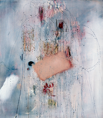
Hands down, the paintings steal the show. Ranging from regional landscapes to nonobjective abstraction, from portraits to cartoons, these canvases earned their wall space. Barb Roche’s award-winning “Emilio’s Arpeggio” is a stunner. Layers of white oil paint and circular drippings hum over a fog of hazy blues and almost-reds. The pigments hint at the body– the color of cartilage and anatomy-book varicose veins, all with a big beige rectangle (uncannily like a Band-Aid) over it. Roche leaves ample room to interpret in a painting that requires no interpretation at all.
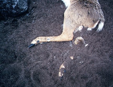
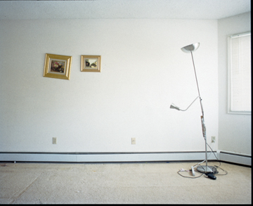
Jon Langager’s photorealism, Adu Gindy’s playfulness, and Patricia Lenz’s complex colors make the variety of paintings intriguing. The photography doesn’t fare quite as well overall. The most successful ones challenge our expectations of what art photography should be. Suz Szucs’s large dead deer photos transcend their regional resonance and become formally beautiful. Death has frozen the creature in time, her agile limbs still against the landscape. Anthony Marchetti gives us negative space, literally, in his photos of almost empty rooms. A remaining piece of furniture, picture frames hung askew, and indentations on the carpeting provoke questions (how crafty!) about who has left and why.
Marchetti compensates for a handful of photos that are less impressive. They aren’t bad, per se. In fact, most of these small black-and-white landscape/architecture shots are quite nice. But with space at a premium, the smattering of ho-hum photos could have been as easily represented by one very good one, such as Judith Eastburn’s “Fenceline, Nebraska.”
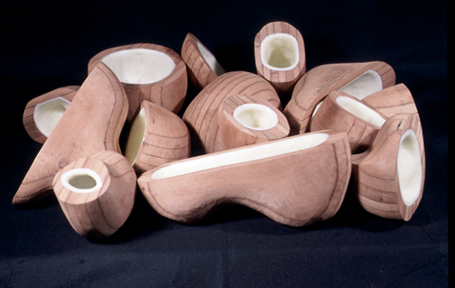
Many sculptures were magnificent, particularly a floor piece of wax-lined wooden orbs by Alonso Sierralata and a hefty, textured earthenware abstraction by Gary Erickson. Relatively few drawings and prints made it in, two of which caused some murmurs. The graphite/photo emulsion frog drawings by Christine Baeumler look unfinished. The design sort of imitates the page of a science book, which could really work were it not for the graphite looking tired and smeared and the torn edges around the page (part of her intended design presumably, but it detracts). Baeumler falls short in part because the only other artist to use graphite– Ken Hanson– did so with more control and mastery.
In spite of the occasional blunder, the Biennial succeeds. While diverse, it avoids being a hodge-podge (though only narrowly). Regrettably, it does take on buffet-table proportions, with work—especially paintings—sometimes begging for more breathing room. Atkinson’s spirit of inclusion likely accounts for show’s size.
Guaranteed, not everything will suit your palate. But that’s the beauty of a buffet. Keep walking till something piques your senses.