A Look at Design in the Twin Cities
Here By Design II, which opened February 16 and runs through April 20, is the second in a projected series of design biennials mounted by the College of Human Ecologys Goldstein Gallery on the St. Paul campus of the University of Minnesota.

The first edition of Here By Design, in 2001, cast its net across all of Minnesota; this one narrows its compass to design in the Twin Cities, touching on current activity in furniture, graphics and typography, packaging, lighting, clothing, retailing, and crackpot invention.
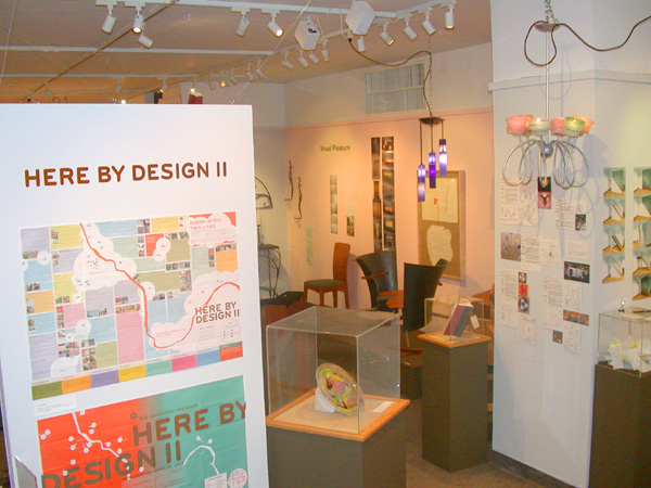
The exhibition is called “Here by Design” but appears to have been installed in the gallery as much by accident as by design. Conceptually, the show is all over the place, and the gallery, too small a physical space for all the curators wished it to contain, has too many objects unrelated in intent unhappily jammed together like passengers on a crowded bus. Works are not all displayed to best advantage, and most of the photography on the walls is of poor quality, but despite all this, the show has a lot of vitality. There are some gems, but you’ll have to look for them—they almost get lost in the crowd.
Some examples of the exhibition’s range: outerwear for the youthquake market–part snowboard grunge, part paramilitary togs with a profusion of flaps, zippers, and jumpy graphics meant to signal the wearer’s coolness, or dudeness, or whatever. Graphics, packaging, and display for toys, milk bottles, vitamin bottles, and organic household cleaning products. Handblown glass lighting fixtures. Wilderness tents for wheelchair users. A purse made out of pieces of PVC plumbing. The Wedge food co-op (presented as a paragon of anti-corporate design.) Pro bono poetry posters for city buses. An Art Nouveau table made of tendrils of steel. Chairs for the elite. Stools for the multitudes. A coat rack made of toothpicks. A desk made of straw…
In some cases, what is meant by “design” is overdesign. Tom Oliphant’s ambitious rocking chair for two, for example, configured in the form of a yin and a yang, is intriguing, but too self-consciously tricked-out in materials that amount to gang-signals for “upscale” —carbon fiber for the seat backs, teak for the seats. More interesting is the designer’s early, primitive, full-scale mockup, shown right alongside. The model, in cheap, lumberyard materials, is rough, uncertain, and full of questions still waiting to be explored–quite possibly successfully, if the designer keeps at it.
Fully resolved, on the other hand–and by this same designer– is a pair of simple coat hooks I’d be happy to look at every day. They are available from another of the show’s exhibitors, Redlurered, a pristine, blindingly white design showroom run by a pair of architecture graduates in the Uptown neighborhood of Minneapolis.
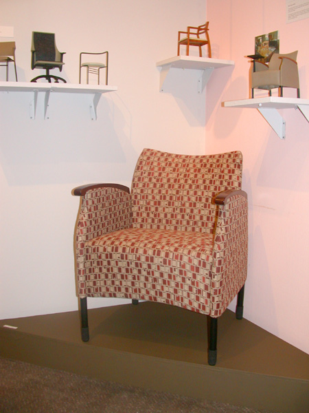
The show’s strong suit is furniture. Dan Cramer, a designer of award-winning chairs for the contract furniture industry, makes subtle use of emerging new materials and technologies, and stays alert to the shifting winds and currents of consumerdom. Sparing but sensuous in the use of wood to offset the coldness of metal, the disciplined grace and strength of his designs is informed by long experience of the economic and physical realities of manufacturing.
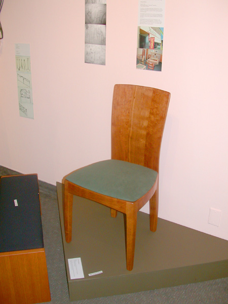
Xylos, the cooperative showroom of woodworkers in south Minneapolis, is represented with two pieces by the poetic designer, Richard Helgeson, a woodworker with unusual sensitivity not only to form but to the character of his materials. He is showing an understated dining chair of cherry, classic in its poise, and an equally elegant small bench of Douglas fir.
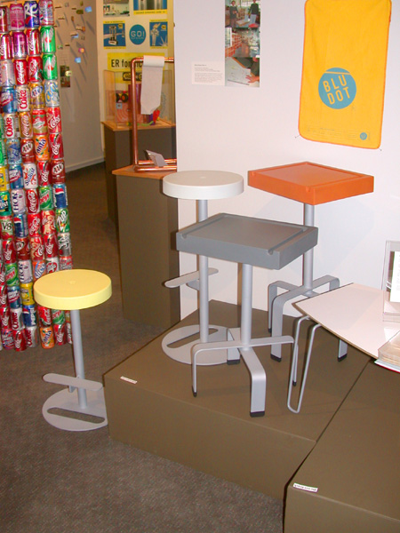
Blu Dot, whose motto is “ Design you can actually afford,” displays a group of stools that show this partnership’s rigorous thought about economies of means. In one design, a racetrack oval cutout lasered out of the flat disc of the base is used as a footrest further up the stalk that supports the round seat. The pastel colored seats on all these stools appear to be hard plastic but are actually made of a self-skinned, resilient foam whose “give” discombobulates the senses the first time that you touch it.
Tucked into a back corner of the gallery is a “green” work station on casters by a firm called Baltix , whose thinking, I hope, points to the future of industrial design with renewable materials, without (I also hope) requiring that we all go clomping around self-righteous in our Birkenstocks. Straight-ahead in form, dead-practical in its details, and candid about what it desires to accomplish, it is constructed of panels variously made of wheat straw, the compacted shells of sunflower seeds, and particles of ground-up cork—all coated in clear finishes that show their inherently beautiful, variegated textures, which will be interesting to stare into while at work.
Across the board, the work in Here By Design is uneven and the display somewhat chaotic, but it is good to see so much thought about design all assembled in one place, especially work by young designers testing their chops. The show makes me look forward to the next edition, two years from now.