Xerox, Scotch Tape, Rubber Glue & Letraset
Andy Sturdevant looks into the forgotten world of handmade gallery flyers from the 1980s and '90s, investigating the surprisingly obscure design history of this remarkably practical, rough-hewn art.
Sitting across from me on my coffee table right now is a very handsome monograph of the work of designer Art Chantry, signed by the author when I saw him give a lecture in 2002. Chantry is not a household name per se, but alongside designers such as Frank Kozik, he is one of those rare figures that has achieved prominence outside design-geek circles. Chantry’s field is primarily poster art, largely done for rock bands and independent regional record labels. The fact that his work has been collected in this nicely-packaged anthology says something about his prominence as a designer. Rightfully so, too: Chantry’s work has been extremely influential and his distinctive, highbrow/low-culture design style widely imitated since he came to prominence in the ’80s.
You will find no real corollary to Chantry’s work in the art world. There is not a graphic designer anywhere –and certainly not in Minnesota –that I know of who has made creating poster or promotional art for galleries and art exhibitions their primary focus. While, it’s true, there have been a great many artists and designers who have concerned themselves with creating poster art that stands up as art in and of itself, the work that they create is very rarely about art itself. “Posters have become one of the most ubiquitous kinds of cultural objects,” wrote Susan Sontag in the 1960s, “prized partly because they are cheap, unpretentious ‘popular’ art.” Fine art tends to be perceived as flying against the currents of cheapness, unpretentiousness and popular appeal. So, while you can easily find mass-produced posters for major museum shows in dorm rooms and dentists offices anywhere in the country, anything closer in spirit to those beautiful Chantry posters for punk shows in dive bars and VFW halls is considerably more difficult to come by.
Flyers for art shows are traditionally afterthoughts; the artist’s name, the date of the show and the gallery, and an image from the show to pique the interest of the viewer. The purpose of such pieces are surprisingly practical and straightforward: it’s simply a way of saying “here is what this artist’s art looks like, so come see the show at this date and time if you like this image.” Now, doesn’t it seem unbelievable that fine art, a field that rewards visual innovation, beauty and craftsmanship, should not have developed an incredible subculture of imaginative artists and designers whose primary interest is creating visual materials promoting exciting alternative arts spaces and risk-taking galleries?
Doesn’t it seem unbelievable that fine art –a field that rewards visual innovation, beauty and craftsmanship –should not have developed a subculture of imaginative designers whose primary interest is creating visual materials to promote exciting alternative arts spaces and risk-taking galleries?
It does seem fairly unbelievable, until you really think of the specifics behind why creating posters and promotional materials for art shows has remained such an obscure artistic pursuit. I asked Dan Ibarra of the Minneapolis-based poster collective Aesthetic Apparatus how much work he did for art openings. “Not as much I should,” he shrugged. And when I asked him why this was, he gave me a brilliantly simple answer: “There’s not a lot of room, in making that kind of poster, for interpretation.” He went on to explain this idea further, by pointing out that with a poster for a band, the designer has a lot of latitude to suggest visual ideas to complement the band’s music or personality or aesthetic. A look through Aesthetic Apparatus catalogue bears this idea out: there is an unmistakable, imaginative freedom at play in their posters. Each of the images captures a certain feel for its band’s personality, without being too literal. Doesn’t listening to Detroit’s Dirtbombs, after all, sound more or less like a hypnotized zombie with a head wound? Does to me! Could one just as easily, however, create a catchy conceptual poster to promote a show of ceramic vases? How about something wildly clever and interpretive for a very carefully thought-out and painstakingly choreographed performance art exhibition? One could, but any designer in this situation would run the considerable risk of either overshadowing the artist’s work with their own or of driving an intractable wedge between the artist’s intent and the designer’s response. It’s a reversal of that old Elvis Costello quip “writing about music is like dancing about architecture.” OK, so making art about someone else’s art is like well, making architecture about architecture, or dancing about dance. What’s the point in taking someone’s work and reproducing it secondhand? Perhaps the quixotic nature of this pursuit consigns the subgenre of art show flyers to an even greater degree of ephemerality and obscurity than its more respected cousin, the rock show flyer.
This year, I curated a retrospective show for The Soap Factory‘s twentieth anniversary, drawing from all the archival materials stored away and piecing them together to tell the story of the organization’s development. Much of the material I drew from was promotional in nature, as this is the sort of work that tends to be created in bulk for events and then put into storage afterward. Among the wealth of ephemeral materials I was able to turn up Polaroids, diagrams, handwritten notes, typewritten letters to landlords, exhibit maps – these promotional materials were what I found most fascinating. And I found them fascinating, I think, primarily because of their completely unassuming practicality.
The world of art posters since the 1980s is a microcosm where Macintoshes, screen-printing, Xeroxes, hand-lettering, the Internet, rub-on transfer type, and photomontage ebb and flow, and all coexist together in strange, unanticipated ways.
But these materials also trace perfectly the evolution of design during a critical period in design: the era following the advances in printing technology of the 1960s (photocopying, for example), and which extends right into the rise of desktop publishing as the pre-eminent method for creating printed materials. It turns out, the world of art posters since the 1980s is a microcosm where Macintoshes, screen-printing, Xeroxes, hand-lettering, the Internet, rub-on transfer type, and photomontage ebb and flow, and all coexist together in strange, unanticipated ways. These leftover bits of design ephemera reflect a kind of resourceful, by-the-seat-of-the-pants sensibility that, in this age of universally available Illustrator and Photoshop programs, is largely forgotten.
Obviously artists had made a variety of simple exhibition posters for some time, using such techniques as serigraphy, photo-offset printing and lithography. However, by the 1980s, the tools in the arsenal of an aspiring designer were considerably more varied and accessible: Macintosh introduced the first desktop computer publishing programs in 1984, and so by the late 1980s, the software for creating professional-looking typefaces was fairly accessible. The first Kinko’s opened up in the early 1970s, and by the 1980s, most neighborhoods had a corner copy center where one could make Xeroxes fast and cheap. Even on the low end, one could still find Letraset in abundance, a tedious but effective dry-transfer lettering system that allowed the designer to rub individual letters one-by-one off a sheet of clear film onto paper that fell out of favor with big-time designers during this era.
There is another thing to consider here, as well, and that is the rise of punk rock as a preeminent force in American popular culture. Punk rock and its attendant DIY philosophy happened to coincide with these technological innovations in design that made previously impossible reproduction techniques accessible to nearly anyone. (It was at this time and under these circumstances, in fact, that Chantry got his start.) In the 1980s, a small Minneapolis band could simply find some striking imagery in a magazine, cut it out and glue it to a sheet of paper, scrawl some lettering over it and put some typewritten information at the bottom, take it to a copy shop and run off a hundred copies; and, within a few hours, they could have bold, attention-grabbing flyers stapled to every phone pole between Uptown and the Warehouse District – a feat that would have been absolutely unimaginable only ten years earlier. “Computers were out of reach, rub-on letters were a luxury, so we improvised,”wrote Dead Kennedys frontman Jello Biafra of punk rock poster art techniques of the time.
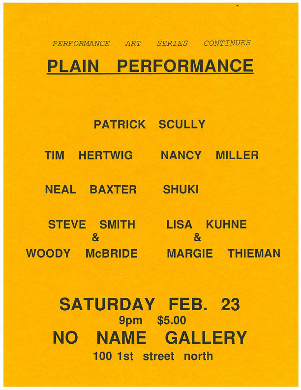
A small Minneapolis band could do it, as could an emerging Minneapolis artist. Looking through the pages of Artpaper, the Twin Cities primary source for arts news in the 1980s, one could come across any number of staid, typeset ads for shows in respectable downtown galleries. But smaller, more experimental spaces like Speedboat, Rifle Sport and, later, No Name gallery were run primarily by younger artists who had grown up with punk rock.
There is an appealingly rough-hewn, improvised quality that puts these ’80s gallery promotional materials closer, aesthetically, to punk-rock flyers than to art prints. If a punk ethos was not explicitly a guiding principal for their designs, it was at least a significant cultural presence in the background.
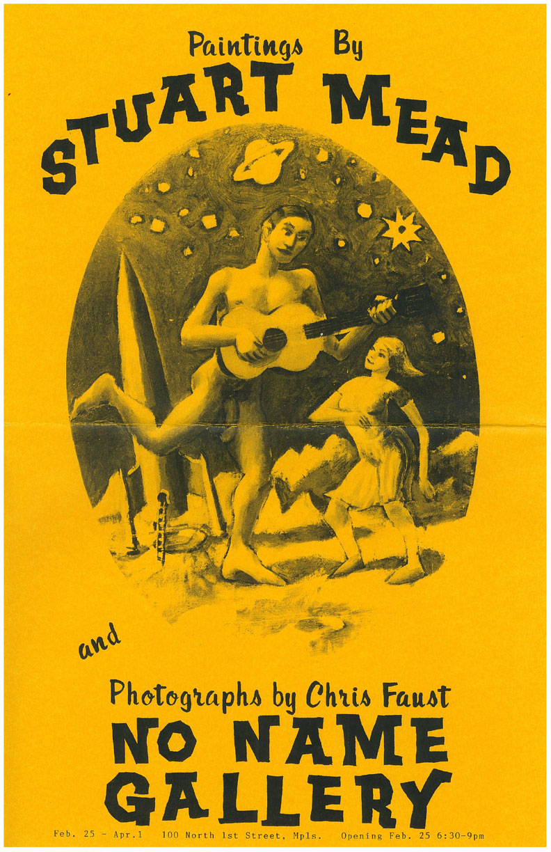
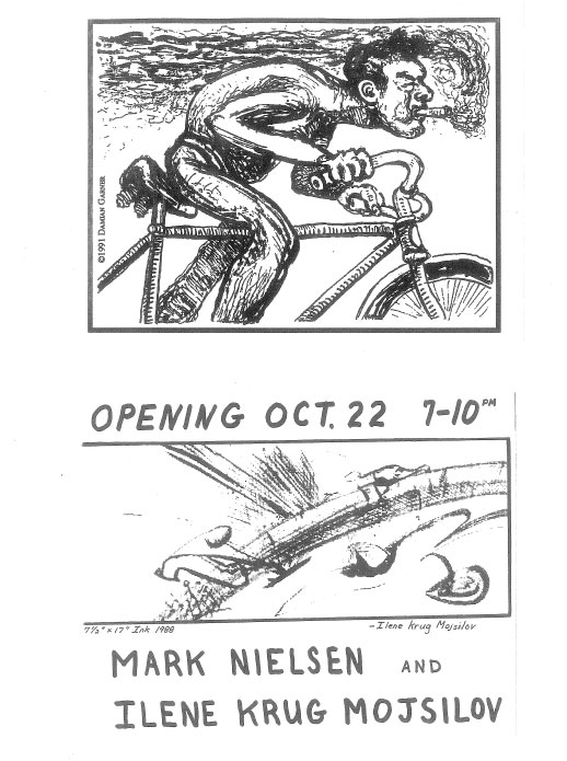
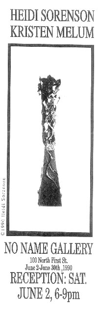
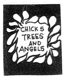
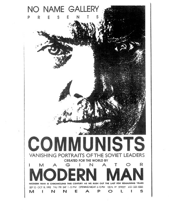
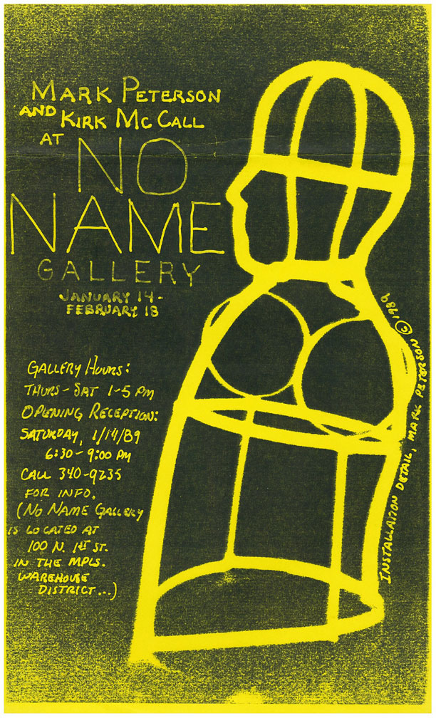
And if a punk ethos was not explicitly a guiding principal for their designs, it was at least a significant cultural presence in the background. Early No Name flyers from this era bear out Biafra’s simple, back-to-basics philosophy. They are handmade, oftentimes by the artist whose work is being exhibited. There is an artistry to them, but there is also an appealingly rough-hewn, improvised quality that puts them closer, aesthetically, to punk-rock flyers than to art prints: White-Out is painted overtop a photograph for light-on-dark lettering; photocopies of paintings are taped onto patterned paper, and then reproduced on attention-grabbing fluorescent sheets of 8½ x 11” paper; strips of copy written in forgotten ’80s-era typefaces like Van Dijk are Scotch-taped over enlarged, Benday-dotted photographic reproductions. The screaming, subtlety-free impact of the fluorescent paper perfectly captures the transgressive, confrontational, performance-oriented art of that time.
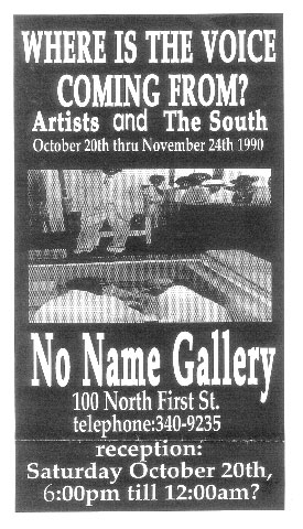
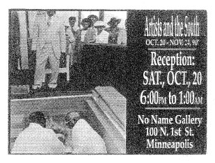
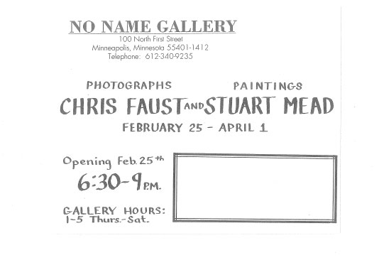
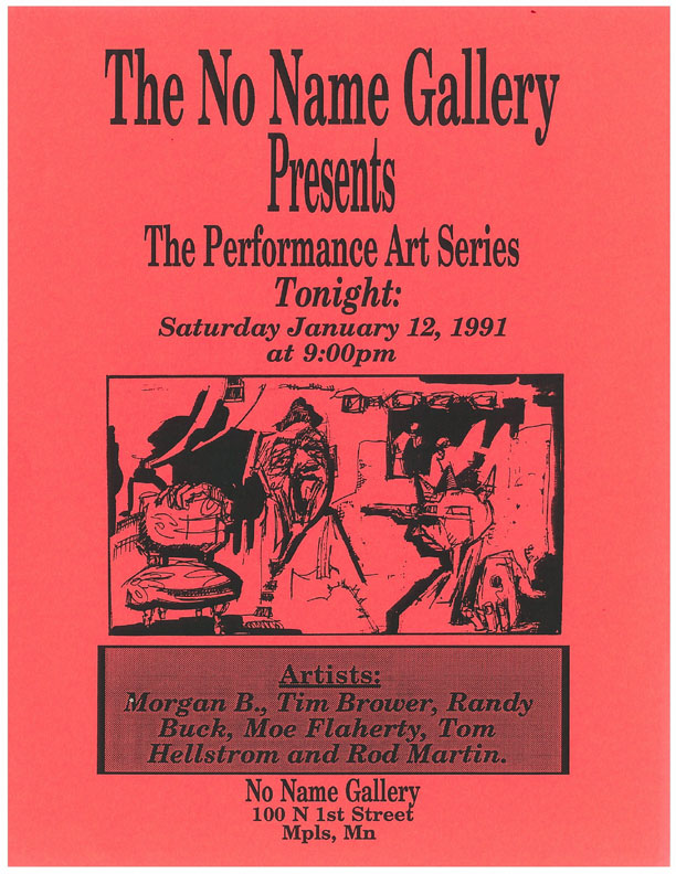
Another interesting thing to note is that there is really no attempt at visual uniformity or brand identity in any of these pieces – each show brings with it a different set of hands and a different set of aesthetic priorities. It could be the work of a whole bevy of galleries, not just one. Some flyers make use of Letraset in very precise rows of neat, orderly text. Others are anarchic scrawls and drawings that refer directly to the work of the artist in the show. Still others make use of sophisticated desktop publishing techniques. The majority seem to exist somewhere in-between these three approaches, making use of all of these available tools to one degree or another. A gallery logo is conspicuously absent from all of them; stapled anonymously to a telephone pole on 1st Avenue North next to flyers for Babes in Toyland or Run Westy Run, they must have looked right at home. These will never be exhibited side-by-side with posters from the Situationists or next to a retrospective of WPA artists, but they are perfect reflections of theirspecific time and place.
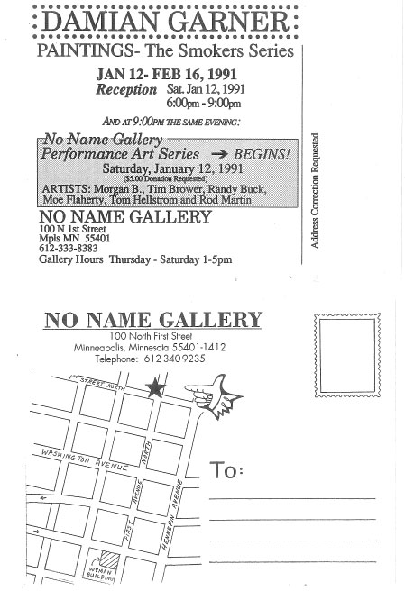
In the case of No Name gallery, this anarchic guerilla approach to branding grew more mature through the 1990s. Jenny Carpenter came on as a designer for No Name as it became The Soap Factory in the 1990s; and she was perhaps the first designer for the gallery to aim for a more unified look – her flyers all adopt a uniform size and feature consistent, sophisticated typography and graphics. Joseph del Pesco, who came on as lead curator in the early 2000s, continued in that vein, creating promotional materials that drew on a pool of themes, typefaces and color palettes and which were, even at one glance, unmistakably made for The Soap Factory. Matt Zaun, an extremely talented young designer, made some of the best posters The Soap Factory ever distributed, before his untimely death in 2007. Carpenter was herself a designer by trade and had access, after-hours, to her employers printing technology, so her 1990s-era work has an extremely polished look. But by the end of that decade, extremely sophisticated professional-grade desktop publishing was essentially accessible to most anyone with a decent computer. The era of Xeroxes, masking tape, rubber glue, Letraset and determined amateurism was over.
In preparing to write this piece, I sent out a call to the six or seven of the best-connected Minneapolis artists and gallery owners I could think of, to ask them if they had any archives from the late 1980s I could have a look at. Most of them said the same thing “I have some stuff, but I didn’t really keep a whole lot of it.” Of course there are whole personal archives of Xeroxed punk-rock flyers, but with art flyers, not so much. I’m glad I had access to No Name/The Soap Factory’s collection, and I’m glad they thought to hold on to it.
Recently, I’ve been reading Thomas Frank‘s excellent new book The Wrecking Crew, where he takes a look at the far Right’s infiltration of government and their tireless attempts to undermine it from within through privatization. I was struck by one passage in particular, in the chapter where he writes about the significant effect that direct mailings had in spurring a pre-Internet conservative voting bloc to financial action. These letters “have largely disappeared,” he writes. No library that I know of made a comprehensive effort to keep up with the stuff. This form of prose changed the country, and yet it is today as obscure and inaccessible as the lost plays of Menander.
I hate to equate the promotional work of Minneapolis fine artists to nasty letters written by reactionaries intending to scare Reagan-era Right-wing widows into coughing up cash, but there’s a certain similarity. In the days before the Internet, when information was not so easily disseminated, one had to spread word however one could, in ways that today seem downright primitive. What’s left of these ephemeral materials that aren’t backed-up on a hard drive somewhere? There are whole hidden histories of American culture out there that unfolded beneath the radar of libraries, museums, collectors, and the formal institutions of record. These handmade flyers are a peek into that world that –though only twenty years old– seems, when measured in cultural time, like an eternity ago.
About the author: Andy Sturdevant is a Minneapolis-based writer, artist and curator. He is a regular contributor to ARP! and The Rake‘s Thousandth Word blog. He curated the History Room: 20 Years of No Name and the Soap Factory exhibition at The Soap Factory this year, and is currently working on an accompanying book about the gallery’s history. Andy is also a contributor to the Electric Arc Radio Show music and performance series, which begins its new season September 20 at the Ritz Theater in northeast Minneapolis. He lives in Powderhorn Park.