Artist Profile: Jon Neuse
Kim Surkan went to Minnesota artist Jon Neuse's studio to talk to him about the process he follows through his monoprints
Asked whether he considers himself more of a painter or a printmaker, Jon Neuse looks thoughtful for a moment. “Actually,” he says, “I do a lot of different things. I really think of myself primarily as an artist.”
A glance around the studio that is located in his Kenwood home bears this out – art is everywhere: monotype prints, watercolors, drawings, small clay figures, and more. The Neuse portfolio is diverse and eclectic, not unlike the path that led him here.
Neuse is the first to admit that his career path has been a circuitous one. “I came to this somewhat late in my life,” he tells me. Before becoming a full-time artist, he had been a Peace Corps volunteer in Afghanistan, a college teacher, a management consultant, and a hospital administrator. His first two master’s degrees were in theology and educational administration, but he says that the third, his MFA from the University of Minnesota, “was the only one that really took.”
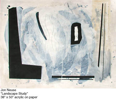
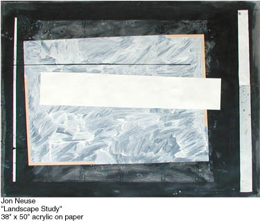
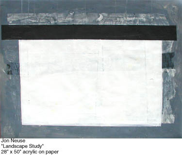
Originally trained in painting, Neuse was introduced to monotype printing in the early 1980s by a colleague, and it quickly became a significant part of his work. He describes the creation of monotypes as a “painting-printing process,” created by first applying lithographic paint to a piece of plexiglass, and then running the plexiglass through a press to create a paper print of the image.
In some ways, the process is similar to intaglio, but with one key difference: the image is on the surface of the plexiglass and not etched into a copper plate – which means that it can only be printed once. “You can do a lot of similar ones, you can do some that are almost the same, but they’re never exactly alike, because there’s no line that will always and forever stay in that same place,” Neuse says.
The originality of each piece appeals to him. “I’d rather do new things all the time,” he explains, rather than creating stacks of prints from a single image. Neuse’s creative insistence on diversity in his work has on occasion gotten him into trouble with those marketing his art, however. “I did run into several galleries that said they wouldn’t represent me because ‘you do too many different things,’” he says ruefully. “They want a marketable, consistent thing. . . and I just don’t see much sense in that. What’s the point of being an artist then? If I did only these, I’d go nuts!”
The Layered process of monotype printing
Monotype printmaking is a relatively fast artistic process. In making the decision to abandon other professional work to focus exclusively on making art, Neuse made a commitment to himself to try to make one piece a day. For the most part, he says he has kept pace with this goal for the past 15 years; only the arrival of twins (who are now 12) slowed him down in the early years of parenting.
Neuse’s monotypes are largely abstract pieces, some in black and white and others in color. Each print can go through the press multiple times, adding a new color or line with each layer, until the piece is finished. Looking back through the portfolio involves some speculative sleuthing to unearth the process that created each work.
I watch as Neuse pulls out a monotype and squints at it. “I can just do one time, one shot – but I usually don’t.” He points to the panoply of color left by the press on the paper. “I think this probably has the orange down first, and then I cleaned the plate off and put the green over it, and then whatever color this is – it looks like a blue – and then I put red on top of everything.”
Neuse is indeed known for his adventurous (and some would say wild) use of color. I ask him if he is a believer in color theory, or if he thinks an artist can do just as well without it. He nods in reply. “A lot of my work is like that. I really shove colors up against colors. You really have to take all of this stuff with a grain of salt.”
The artist chuckles. “Wanda Flechsig at Circa Gallery always points that out to her clients. . . [she says] ‘Now who puts pink against some kind of green – that’s nuts! It makes you want to vomit, but he’s able to pull it off somehow.’”
Not all his work is abstract, however. In fact, the first monotype he showed me was a self-portrait. Creating an even somewhat figurative piece in layers is no small feat; it involves registering where the paint was initially placed on the plexiglass. This is done by tracing the lines on the reverse side with a black marker, so that subsequent layers of lines and color can be matched up with the marks already on the print.
Given that the artist must think in reverse (like intaglio or any printmaking process, the plate reverses the image on the paper), and envision the final product through a series of layers, I’m awestruck that Neuse’s self-portrait actually does bear a strong resemblance to the man standing before me.
Alignment between layers is a relative thing in monotype – there are any number of reasons an image might not line up exactly as hoped for. Neuse remembers first being fascinated with this kind of misregistering when reading Sunday comics as a much younger person. “You would have Beetle Bailey’s pink face here in the drawing, but the pink would be moved over [the line] slightly.”
Neuse creates other effects with mineral spirits, thinning the paint on the plexiglass before running it through the press. Sometimes he uses sand to emboss the paper, giving it a texture. With each run through the press dramatically altering the look of the piece, the end result is a piece of art that is visibly layered.
Part of the challenge in working with a layered process is deciding when to stop adding to a piece. Adding a layer is always taking a risk; how will it transform the work? I ask Neuse if he ever regrets a layer or feels he has made a mistake, given that in monotype printing there is no “undo” key. “That’s true, but art is responding to what is – if you screw up, then it goes in a different direction,” he says. “That’s what exciting about doing art.”
For Neuse, a failed layer offers a number of creative options. “One response is to throw it away. Another response would be to remove what you could, cover it up with another layer and see what happens. Another response would be to cut this part out and make a little piece. Another response would be to cut it all up and reconfigure it in a collage. If you want to keep going with it, you can.”
Neuse lets his creative instinct guide him in determining when a piece is finished. “That’s just where it has to go,” he explains. “It’s like doing a collage. I believe in a collage that there’s only one place where each of these elements can go. If you’re lucky, you go ‘Oh, that just takes my breath away!’ – and then you’d better stop.”
Working in a series
One aspect of Neuse’s artistic process is that he works consistently in series. He often prefers to work on more than one piece at a time, particularly when painting watercolors, in order to let the work sufficient time to dry. The structure of a series can also be helpful in keeping his creativity going. His alphabet series of animals, for example, grew out of a period of frustration with his work.
“I wanted a structure so I could just do something, so I thought of doing the alphabet, A through Z,” Neuse says. “I thought, well, I’ll just do animals – so I did from Ape to Zebu.” (A zebu, he says, is kind of like a bull, or a big bison).
He ended up doing the series four times in total – first in pen and ink, then in watercolor, and finally two series in monotype, one small and one large. They’re delightful images, playful and appealing to adults and children alike. Neuse embraces the childlike quality of the animal series, which include some that are closer to stick figures and others that have more detailed, almost human faces and expressions. He also encourages his students to return to the creativity children innately bring to their drawings.
“I say to my students, ‘Look, your best bet is to get back to where you were as a child’,” he tells me. When I protest that surely children’s stick figures aren’t all that great an artistic goal for an aspiring art student, he is insistent that confidence and encouragement are more important.
“I get satisfaction out of seeing people discover that it is okay to do something like this. It’s okay to have an ape that doesn’t look like an ape,” he says. “It has some freedom. With music, for example, I think Stravinsky has that childlike quality, Erik Satie too – it’s just playfulness.”
Audience and art
Neuse is thrilled to discover that people like his work, but actively resists interpreting his own art. He’s much more interested in what other people see in the work. “I learn a lot about my art from my viewers,” he says. “When people look at particular pieces, and more so in shows, they’ll come up and ask me what it is. I usually say, ‘Well, what do you see?’ I’m willing to say some things, but I want you to be involved. What does it matter what I say, really?”
Ultimately, this is an artist who loves his work. “I like making these things and having them.” Is he torn about selling the art? “No, I think it’s wonderful if they go to somebody else’s house, or some corporation, and other people are enjoying them,” he answers. He’s still awed when he sees his work framed and hanging in private homes. “People will buy some of this stuff, and hopefully cherish it, or at least get a good deal of thought or enjoyment out of the pieces.”
Neuse’s next show opens in December at Circa Gallery, and will feature both monotypes and paintings. He welcomes everyone to come see his work and talk with him about it.