The Grocery Store as Gallery
Jay Orff asks, "Is food packaging art?" From Warhol's famous soup cans to the minimalist design of the boxes of tea for sale at his neighborhood co-op, he considers the confluence of aesthetics, commerce and creativity in our grocery aisles.
IS FOOD PACKAGING ART? Short answer: yes, of course. It’s worth considering the query more fully, I think, but when I do so, I find I quickly run into a cascade of other, related questions – about design and utility, aesthetics and commerce, desire and consumption — hard to address in a short essay (or a longer one, for that matter). Frankly, I am not capable of writing a po-mo, deconstructionist dissertation of the sort that might show up in a linguistics or semiotics journal – that’s not my interest or expertise. It’s also important to note, right up front, that food packaging of the kind I’m talking about, the mass-produced stuff on contemporary grocery shelves, began as a Western invention of the industrial, corporate age of food production; but it’s since become a global medium that cultures the world over have made their own.
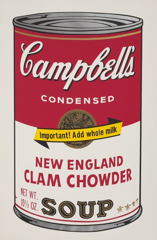
It’s hard to write about food packaging as art without referencing Andy Warhol; actually, his Campbell’s soup can prints are a good place to begin such a conversation. When asked why he created a series of prints of the well known soup can, Warhol said someone had given him the advice to paint what he loved — apparently, he really loved soup. He ate it most every day. Campbell’s reportedly expressed interest in being involved with his soup can project not long after Warhol began the series, but the artist demurred saying that “the whole point would be lost with any kind of commercial tie-in.” Which leads to something of a paradox: in reproducing the design of a commercially available product, an artist is creating art that is unavoidably commercial; commerce is the product’s very reason for being. Warhol seemed to feel that the art lies in the creative repurposing– his interpreting the soup can and representing it on canvas is the catalyst for its aesthetic transformation.
But isn’t the object on the shelf as much “art” as Warhol’s reproduction of it? The label on the can is a print endowed with aesthetic choice and deliberation, its various elements and colors and shapes intentionally arranged to serve some function above and beyond the mere pleasing of our bellies. Think of it this way: the label’s visual elements could exist any other number of ways but many of us – including Warhol – have a strong emotional reaction and connection to the Campbell’s soup can design. I submit that all food packaging similarly represents a series of aesthetic choices aimed, specifically, at engendering just that kind of personal affinity and emotional response.
As soon as you look at a package, any package, you start to unravel a cosmology’s worth of associations. In our marketplace-driven culture, packaging and product presentation intermingle with everything that informs our perception of the world around us, and food is an intensely personal commodity: we put food products into our mouths and eat them, after which those products effectively become us. Food packaging is arguably even more formative of our daily experience than other consumer goods, because of the uniquely fundamental product it contains, so it’s no surprise that there’s a lot going on under the surface, consciously or not, when you pick up a can of tomato soup. Take Warhol’s Campell’s can, for example: he’s calling to light its status as a secular icon, symbolic of nourishment, comfort and home. His prints point out that emotional and aspirational content, the meta-function of the label’s design encoded in the aesthetic choices made for the sake of that mass-produced can. Look at objects on the shelves of a grocery store as you consider your purchases, and you enter a realm of art appreciation where you’re, albeit unwittingly, deeply and creatively engaged with the goods all around you, responding to a host of intellectual, social and emotional cues invoked by products expressly designed to entice you.
It’s easier to get a sense of how food packaging works on us if we look at groceries from another culture. When the overlay of assumptions and learned responses we have to products remembered since childhood are absent, the surface details, the aesthetic and creative choices are more nakedly in evidence. As an experiment, I headed to United Noodles in Minneapolis — a terrific grocery store by any measure, but also a prime site for aesthetic tourism.
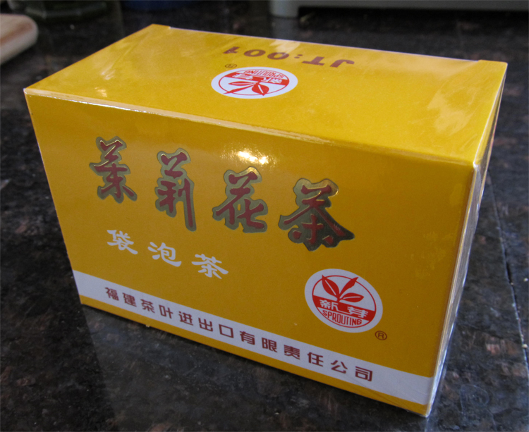
My favorite artifact from that trip — the object I would consider having on a shelf, in the same way my mom shows off her Precious Moments™ clown — is a pack of Chinese jasmine tea. I love the package for its simple, spare design, its bold colors and elegant Chinese characters. But even after a cursory look, from the package I can sense the precision of Chinese illustration, and perhaps the design’s affinities with Soviet propaganda poster art. The tea package screams “People’s Republic of China!” to me, but that’s not why I like it. I am never going to join the Red Army, but all of that human history is encoded tidily in this tea package design, and it would be silly to pretend otherwise. Then again, I’m an American – so, history, for me, is negotiable. I may appreciate the product’s spare, clean aesthetic sensibility, but it’s still true that the product design signifies something culturally and emotionally specific that I am simply choosing to disregard or, at best, appreciate ironically. And that gets to my next point.
______________________________________________________
Food packaging anticipates, even engineers our response to the aesthetics of its objects for sale – it relies on that response in order to communicate a particular and targeted message. Can’t you say the same of Warhol?
______________________________________________________
We don’t usually think of an art work’s meaning as predetermined, understood before we encounter it. Indeed, I suspect we fancy that much of our interaction with art resides in the very process of deciding what it means, whether we think it’s good or bad, or if it works on us in some way. In this narrow sense, one could argue that food packaging doesn’t really meet the criteria of “art.” After all, food companies go to great lengths to control and predict our reaction to their packaging. But I don’t think “art” is as open-ended as all that; the art for sale in any home decor department is certainly meant to invoke a predictable response, created using the same kind of demographic information a food company musters for its designs. Even Warhol, in reproducing his soup can, intended to invoke that learned response to the product, to play on the label design’s emotional and symbolic signifiers – he was painting what he loved, after all, and he knew how that familiar label worked on him. Food packaging anticipates, even engineers our response to the aesthetics of its objects for sale – it relies on that response in order to communicate a particular and targeted message. It’s the way we react to things in our world that gives them meaning and value; our interpretation of those things is what constitutes the texture of our experience, the world of feelings and beliefs we’re swimming in every day. It doesn’t matter really whether we are interacting with a play, a painting, or a box of tea.
It’s worth mentioning: this idea — that an artifact is created to communicate a particular meaning, to get a specific response — is often missing in conversations about contemporary art. But I’d argue that even if a work of art is meant by the artist to have indeterminate content and message, that intention itself falls into the category of meaning-making and communication. Some artists also endeavor to make work that’s ugly or shocking; in the attempt to elicit such a reaction in the viewer, they’re leaning on stimuli likely to evoke those feelings – stimuli whose effectiveness rests in the fact that their cues are collectively defined and familiar. You need look no further than a bottle of vodka in a glass skull to see food packaging using the same sort of approach. Clearly, there is ongoing play between art and commerce – the boundary between them is porous, if it exists at all.
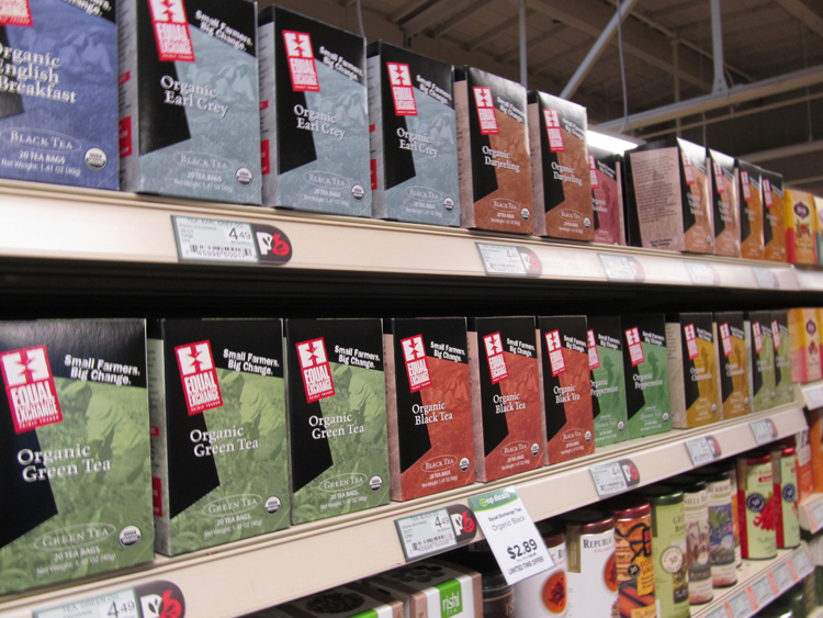
After my foray at United Noodle, I decided to browse the tea aisle at the nearby Seward Coop to try and gauge my reactions to the more culturally familiar product designs. I notice, first, that the boxes are colored in soft earth tones, often raw cardboard; all of them appeal to me. I catch myself thinking that any of these minimalist-designs would look good sitting on my kitchen counter for the month it would take me to consume the contents of the box. It occurs to me that tea packaging, in particular, is meant to be around for a while, often visibly sitting out on a counter; my reaction is probably something the designers anticipate, as their product is more likely to serve as an aesthetic object in one’s kitchen. The message embedded in the design of these co-op teas is as bound up with my own cultural milieu as the Chinese tea boxes’ design is encoded with Chinese cues. The designs convey a sense of tastefulness and reserve; they read as calming and self-aware, green and recycled. What thirsty, eco-conscious suburban mom could resist? These co-op tea packages appeal to the life their target consumers imagine for themselves — and that life doesn’t come with a day-glow package that reads, “Now blasted with more EXTREME tea flavor!” As much as I resist and resent the notion that a tea company could understand, and even anticipate my individual aspirations in that way, much less how that self-consciousness translates into my preferences in home decor — clearly, they do.
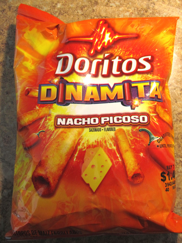
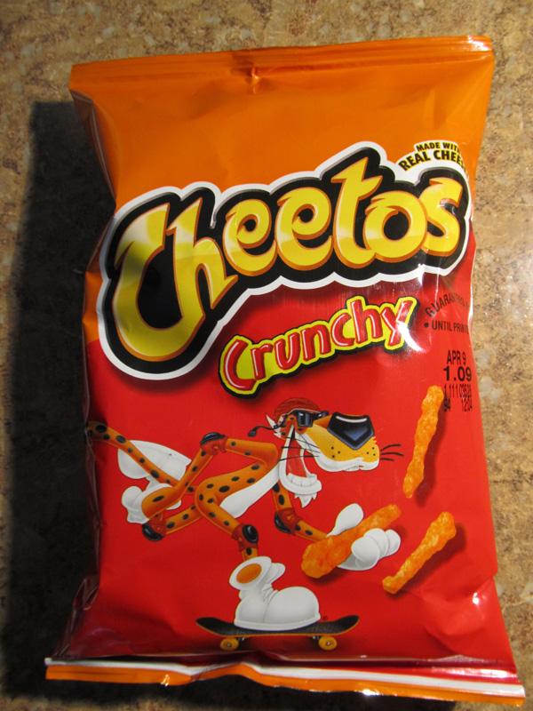
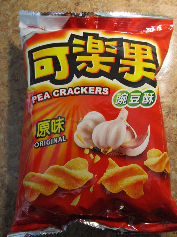
For fun, let’s talk a minute about snack food packaging. I find that, unlike other grocery items, snack foods have an international, pan-cultural aesthetic grammar. As I write, I’m looking at strikingly similar bright orange foil packs of snack food in three different languages, rooted in three different culinary cultures. And yet, inside are similarly salty, crunchy nuggets made from extruded and fried vegetable meal, which have been liberally coated with flavorful powders. On all of the packs, the snack item itself is pictured next to the brand name rendered in a big, bold font — like the big, bold snack inside, I guess. The relative uniformity of these products makes sense. Snacks are the pop culture of the world — like music and movies, they’re something we share easily, something less bound to a specific tradition. Maybe the bright orange foil pack is the globally recognized marker at this point – the snack food equivalent of a song with a catchy beat.
These snack food packages are a good example of the way designers know that it is more important for you to recognize the emotional resonance of their package than the particular product. And if I’m honest, the sight of a box of Cheez-its has as much emotional resonance as most paintings I know well. We recognize all aesthetic objects the same way, and we categorize those objects using a branding codec which we have been taught from childhood. Some we like, some we don’t, but the idea that a traditional art object has exclusive access to a deeper resonance as an aesthetic object doesn’t hold up to close consideration. Food packaging doesn’t hide its purpose or function; the packaging is the product of trained marketing teams and focus groups — utilitarian, yes, and a means to an end, but it’s still creative human work. And even if its primary goal is to make money, what hard working artist isn’t, on some level, trying to achieve that goal as well?
Actually, one of the things I find most fascinating about food packaging is that its art is anonymous, created by a group of people who work collaboratively for the sake of trying to devise an object that means something, that does something. They’re making self-referential, ultimately unnecessary aesthetic objects which represent and communicate something of who we perceive ourselves to be, our emotions and beliefs. If that’s not art, what is?
______________________________________________________
About the author: Jay Orff is a writer, musician and filmmaker living in Minneapolis. His fiction has appeared in Reed, Spout, Chain and Harper’s Magazine. Read more onwww.jayorff.com.