Sculpture Designed to Be Used
"Functional Sculpture," highlighting Upper Midwestern furniture designers, is a new show at the Carleton Art Gallery in Northfield. Co-curator Glenn Gordon offers this lovely essay by way of introduction to the artists' work. Exhibition runs through 3/10.

EVERYTHING IN THE CURRENT WORLD OF ART and design seems to want to be what it is not, or at least not what it used to be. Contemporary craft wants to be thought of as art. Art, disdaining the fuss and preciousness of craft, wants to be conceptual. Photography wants to be painterly and painting wants to be photographic. Architecture wants so much to be sculpture that it shoulders actual sculpture aside. Sculpture, meanwhile, maybe in self-defense, wants to be about the creation of sites—it wants to be architecture. Furniture, like other fields of design, is restive with its niche and pushing against the limits of genre. You could look at this churning of old categories as a symptom of ferment, or as a sign of confusion, or both. With imagery streaming freely in all directions, formerly unrelated ideas are combing through each other and giving rise to hybrids that would have been unimaginable as recently as 10 years ago.
You could say that every made thing—shoes, spoons, cars, clothing, buildings—is sculpture and by necessity has to have form. The notion of use can be expanded (or diluted, depending on your point of view) until the very idea turns back upon itself—useful to whom, and in what way? A range of thought about form’s relation to utility is embodied in Functional Sculpture: Furniture from the Upper Midwest, an exhibition of contemporary studio and prototype furniture by 16 independent furniture makers, sculptors, and industrial designers working in Minnesota, Wisconsin, and Michigan.
In terms of style, these works run the gamut—everything from the geometric austerities of Modernism, the Bauhaus, and De Stijl, the sinuous curves of Art Nouveau, through the streamlining and stylized angularities of Art Moderne and Art Deco, to the unexpected disjunctions of Surrealism, the goofiness of Memphis, the folk tradition of bent willow, and wood worked with the purism of the Japanese temple carpenter. The makers, in other words, do not follow collectively the dictates of any single aesthetic manifesto. Paradoxically, what unifies them—whether they describe themselves as sculptors, industrial designers, or craftspeople—is their independent-mindedness. Some are traditional woodworkers, but others—restless with methods that seem no longer economically, ecologically, or artistically tenable—are experimenting with new forms, materials, and processes.
Traditional modes of craft have become marginalized since the Industrial Revolution. The individually made object today is desired not so much as a practical response to a necessity but as a novelty. We treasure objects made by hand as markers of a lost (and for all we know, entirely imaginary) authenticity. An object made by a single artisan (one whom you might even know) comes as a respite, a moment’s shelter from the hail of impersonal objects rained down by the corporate technological juggernaut. Works of craft are not so much used today as they are collected: Glass and textiles and objets de vertu serve as poignant touchstones of lost innocence, through which we hope to signal that we are not utterly corrupted, not merely slavish consumers, but people of upright, independent, and discerning judgment, still honestly connected to our roots. We want these works for what they say about our soulfulness.
Makers of contemporary studio furniture, as it has come to be known, have a corresponding desire to create works of unmistakable individuality, employing furniture as a vehicle for personal and idiosyncratic sculptural and painterly obsessions, sometimes with little concern for cost or functionality. A tension exists between the sensual impulse to make sculpture and the puritanical production of functional implements. This pull in opposite directions can be felt in the work in this exhibition: the Dionysian impulse to sculpt vies with the imperative to appease the jealous gods of function. Occasionally, the impulses are reconciled, but given that setting up for mass manufacturing requires huge investments in technology, and that a serviceable five-dollar resin chair prices them out of the market, many independent furniture makers would just as soon play at art. On the other end of the exhibition’s continuum, however, is furniture by industrial designers operating out of an express desire to produce things everybody can afford, or to design to meet the office and institutional furniture industry’s standards of function, ergonomics, durability, and not least, elegance.
The intent of this show, then, is to look at some of the best work being done across the board. Some of the pieces were wrought beautifully by hand, while others were designed to be produced in volume with sophisticated machinery. Each work was selected because it engages questions of form, purpose, and material in ways that seem relevant to issues in the material culture of our time.
Furniture, no matter how wild or how subdued, is architecture at intimate scale. It is linked to our size and the way our bodies are constructed. We wear furniture, almost like it was clothing. A chair, in particular, is a metaphor of the human form, which, along with the forms of other animals, has been the basis of sculpture through most of the history of art. With arms, legs, seats, and backs named after parts of ourselves, chairs are the three-dimensional shadows of the creatures that use them. In a sense, a chair is incomplete until there’s someone sitting in it, and the strange thing is that when you’re sitting in one, you can hardly see it as an object. The designers of the chairs in this show seem to understand this instinctively; ideas for chairs originate in a feeling in the body, and develop as much by the seat of the pants as by more rational methods of design.
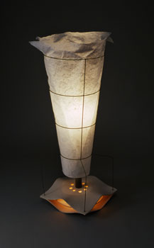
The chairs in this exhibit range from rustic to constructivist in style. The artist Clifton Monteith, working in rural Lake Ann, Michigan, uses flexible switches of local green willow and aspen to weave nests of truly organic Art Nouveau, such as his Waiting for Sunrise and Getting Tall chairs. Other examples of Monteith’s extraordinary refinements of the bent willow tradition can be seen in the Renwick Gallery at the Smithsonian and at the Art Institute of Chicago. “The medium in which I work,” he says, “has certain limits set by the nature of the materials themselves. . .. The materials are only worked in their natural state, not asking them to make bends they are naturally incapable of doing by synthetic methods such as soaking, boiling, or steaming. Each plant species has organic characteristics that lend themselves to certain applications and being sensitive to these peculiarities is important to the work’s development.” Also exhibited is one of Monteith’s lanterns, which are not so much constructed as slowly and patiently accreted around armatures of found twigs, using the organic materials and techniques of the traditional Japanese crafts of washi (paper) Urushi lacquer, and a stiffening material called Kakishibu, made from fermented persimmons. Another source of light in the exhibition is a floor lamp by Keith Moore, a graduate of the Minneapolis College of Art and Design’s furniture program. The lamp’s lotus-like porcelain base has the grace of an Asian garden lantern. A wire frame inspired by the shape of a tomato garden cage supports its informal Japanese paper shade.
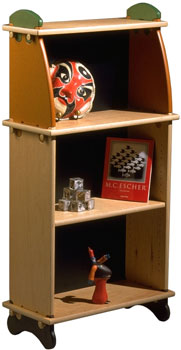
The constructivist chairs of Tom Loeser, who heads the furniture design program at the University of Wisconsin in Madison, sit at the other end of the scale from forms grown from organic materials. Loeser developed these chairs in the 1980s, producing several dozen with playful variations of geometry, color, and detail. Openly indebted to the work of the great De Stijl furniture designer and architect Gerritt Rietveld, Loeser melds the structural clarity of Rietveld’s Red/Blue and Berlin chairs, the irreverence of the Memphis movement of the 1970s, and the Shakers’ practice of storing their chairs on pegs on the wall. Loeser does the Shakers one better by hinging his chairs so they fold and hang flat. Also exhibited are two of Loeser’s wall-hung cabinets, a sampling of his witty and extensive interrogation of the whole notion of storage. Both of these examples feature the artist’s signature detail, painted corrugated surfaces formed by hand with a gouge. The handle of the vertical cabinet, Crictor Jr., curves out to offer itself to your hand, its bamboo-like segmentation forming a nice grip for your fingers.
Chair design involves a lot of experimentation, often requiring construction of a succession of prototypes. Once it has been determined that the underlying concept is sound, the designer’s next instinct is to explore variations on the basic, hard-won idea. A chair can be produced in versions with and without arms, for example, or fashioned of different materials, finishes, and price ranges. The generously scaled lounge chairs of George Mahoney, a graduate of and teacher in the Minneapolis College of Art and Design’s furniture design program, demonstrate not only the design’s flexible support but also the flexibility of the designer’s mind. In his Metropolis and Moke chairs, Mahoney dispenses with conventional coil-springs and upholstery, and instead uses wide, springy slats of laminated birch or fiberglass and Kevlar wrapped in fabric to give a dynamically resilient form of support.
Dan Cramer’s award-winning Molti chairs, developed for the Gunlocke Company, exemplify an archetypal design that can lend itself to production in hundreds of finish and detail variations. Cramer is a graduate of the Cranbrook Academy, long an incubator of some of the best industrial design; he also teaches furniture design at the Minneapolis College of Art and Design. His Molti in all its many variations is the best-selling chair in Gunlocke’s long history as a manufacturer of high-end contract furniture. Among other things, the chairs can be stacked for storage, and they can be ganged together in rows. Cramer’s design makes intelligent use of wood’s warmth and steel’s strength, each to its best advantage. The arm’s graceful form is more complex than it might seem, its cross-section subtly changing as it flows in smooth transition to the front leg of tubular steel. Illustrating the design’s adaptability, a different feeling has been imparted to each chair just by varying the shape and pattern of the cutouts in the backs.
The Minneapolis-based company Blu Dot, a collaboration of three entrepreneurial designers, John Christakos, Maurice Blanks, and Charlie Lazor, was founded on the belief that good design isn’t all that good if no one can afford it. Trained as architects and sculptors and relentlessly pragmatic in their minimalist approach to both the aesthetic and financial economics of design, their success as a company is based on a drive, not unlike Ikea’s, to produce the best possible design at the least possible cost. They do this by analyzing a given furniture type until they get to the nut of it, then designing reductively until, as Antoine de Sainte-Exupery put it, “There is nothing left to take away.” Blu Dot takes obvious pleasure in the names it gives to its designs—in the metaphorical overtones, for instance, of its Buttercup Chairs, whose petals are open to receive you as though you were a visiting butterfly or bee. The Buttercups, a swivel chair and a rocker, are manufactured using a technique pioneered by mid-century designer Charles Eames for bending layers of thin veneers into curved plywood shells. The stainless steel of the bases is oriented flatwise, miming the broad, relaxed flats of the arms. The chairs’ wood and steel components talk to each other in harmony, particularly in the rocker, the shape of its base a sympathetic reflection in steel of the curves of the plywood above.
Study Buddy, a desk with a bookcase, a slide-out tray, and a secret compartment, and Monopoly, a kitchen table, are part of ingenious Minneapolis designer Bert Taylor’s Furnucci line of colorful “KD” (knock-down) or “RTA” (ready-to-assemble) furniture. These two prototypes, using green and recycled materials, are from Taylor’s evolving exploration of computer-aided design and manufacturing. Every piece in the line is designed to ship flat in a box, and no nails, screws, or glues are needed to put the parts together. The only hardware used in Furnucci is the soft but durable Corqs of resilient recycled plastic that the wine industry uses in place of bark corks. When pushed into place, the Corqs cinch everything tight. Furnucci’s precisely machined, cleverly interlocking components are modular and stackable, the parts easily configured in different ways to form bookcases, desks, tables, chairs, dressers, cabinets, and chests.
With an eye to serving the broadest possible market, Bert Taylor, like Dan Cramer and the partners at Blu Dot, is alert to new developments in materials, technology, and the reach of global manufacturing. The speculative industrial designer Tom Oliphant is no less intrigued by new materials and processes, but his efforts are aimed more towards the market for custom- or limited-edition furnishings. His indoor/outdoor double rocking chair, its seats facing each other yin-yang fashion, is a brave and complex design. He describes it as “a balanced configuration that allows two individuals to rock as naturally as one. . . [as] ribbed seats flex under the sit-bones. . . [and] feet rest comfortably off the ground on pegs.” A graduate of Cranbrook Academy’s program in industrial design, Oliphant likes combining stylish classic materials with new ones that have a certain cachet. Here, the up-to-the-minute materials of bulletproof Kevlar (for the chair backs) and lightweight titanium (for the frame) are combined with the classic nautical stuff of teak, used for the seats, which are made something like the duckboards in the galleys of fine wooden boats.
Most of the work discussed up to this point is made under the familiar constraint of “time is money.” For some studio furniture makers, however, the most important thing is sheer virtuosity, whatever the cost. This brings us to the realm of “court furniture,” works that are exacting to execute and often conspicuously opulent; for example, the furniture of the ebenistes at Versailles, or the work of the early 20th-century French Art Deco master, Emile-Jacques Ruhlmann, or the exotica of the flamboyant Italian automobile designer Carlo Bugatti. Two exponents of the decorative tradition of Bugatti and Ruhlmann are Linda Sue Eastman and Tim Gorman.
Eastman, whose studio is in Winona, Minnesota, is known for her exquisitely crafted work in dyed suede and antiqued hand-tooled leather. One of her works is a tasseled stool made in homage to Bugatti; the other is a chaise longue created expressly for this show after Eastman’s recent intensive study of classic 18th-century furniture techniques at the North Bennett Street School in Boston, a bastion of woodworking excellence. The chaise testifies to her love of lush surfaces, her graceful swirls of asymmetrical paisley applied here to a painted, understated frame that by comparison is austere in its restraint.
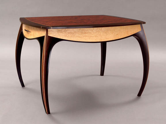
Gorman is a Minneapolis designer and craftsman who makes, at most, one or two pieces a year. His Ellipsoid Table, a design Ruhlmann surely would have appreciated, is a tour de force in exotic materials, including West African bubinga, ebony, makore, figured maple, and fine brass racing stripes inlaid to form a little checkerboard detail where they intersect on the top. The table’s conception and construction made full use of Gorman’s background in engineering, mathematics, and computer-aided design. Sculpturally, there is tremendous energy in the table’s stance; its tusk-like legs take commanding possession of the space. The flow of all the table’s curves has been thoroughly considered, satisfying the eye from every angle.
Renowned for the uncompromising purity of his craftsmanship, the Minneapolis woodworker John Nesset works almost entirely with hand tools, some of which he makes himself. Exhibited are two of his benches, both of them ennobled by the patina of age and use, a finish that you cannot buy. The skewed and canted legs of I am Nature, a powerful work made from a single broad plank of white ash, are joined to the top with compound-angle, hand-cut dovetails. The joints are structurally audacious, their angles dramatically poised near the point of collapse, but they are nonetheless incredibly strong. The warring impulses to sculpt expressionistically and at the same time design for the stresses of use are held in tension here as in no other piece in the show. Nesset writes that the title of the bench alludes to Jackson Pollock’s reply to a critic who complained that he painted not from nature but from his own imagination. Pollock fired back, “I am nature.” The bench in pine is a quieter design, but its proportions, the placement of its supports, and its understated details, like the notched setbacks worked onto the uprights right before they join the underside of the seat, have perfect pitch.
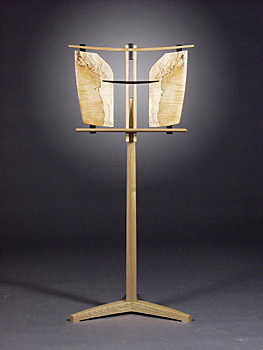
Another work made with particular sensitivity to the character of specific pieces of wood is Char’s Bench by Ross Peterson of Hanover, Minnesota. Attentive to the curve in a fine walnut plank, Peterson let it generate the bench’s design, and the result is a fully realized work of functional sculpture. The progression of its three separate elements—from the dark wenge slabs of the legs through the connectors of pale figured maple to the walnut of the seat—clearly articulates the musical logic of its structure. Peterson’s design for his music stands reads the same way, as a sequence of musical passages. Sheet music rests against pieces of rare figured woods that have been resawn (i.e., split in half, so that they read like Rorschach blots) and spread open like the wings of exotic butterflies. Peterson has made at least 30 of these stands, no two alike. One of them was purchased by the U.S. State Department as a gift to the Ambassador of Japan.
Three elegant meditations on the question of how to elevate a surface off the ground are embodied in a trio of side tables of Richard Helgeson, a designer and craftsman who began as a carpenter and went on to study furniture making in England. The subtle structural poetry of his variations on a theme all but dissolves the need to make any distinction between sculpture and furniture. The tables are made of recycled Douglas fir, ebonized poplar, and fiddleback maple. Dyed the blue of a northern lake, the figured maple gives the illusion wind is rippling across the water’s surface. You’d never know it to look at it, but the straight-grained fir was sawn with great care out of the beat-up plank seats of benches salvaged from Williams Arena, the University of Minnesota’s old hockey stadium. Helgeson has a studio in Minneapolis, where he does liturgical commissions and residential furniture, primarily dining tables and chairs.
An illusion of water also figures in the design of the glass-top Hydraulic Table by Carl Gromoll, a noted sculptor and furniture maker in Eagle River, Wisconsin. The base appears to pass right through the plane of the glass as though it were a bass breaching the surface of a lake. The table is made of pine sawn from trees logged off Gromoll’s own property. Gromoll is a master of the smooth fair curve. The fluid forms of his voluptuous chairs and tables are carved from laminated stacks of solid wood or fine Baltic birch plywood. He gives some of his pieces a clear finish, allowing the sculptures’ undulating layers to show like the strata of topological models; others he gives a shiny hot-rod finish; candy apple red is a favorite.
Cameron Van Dyke is a designer and sculptor based in Grand Rapids, Michigan, a city whose roots in the furniture industry go all the way back to the Stickleys. Van Dyke takes a radical approach to the whole idea of seating, particularly seating in public places. Whatever material he uses—carbon fiber, steel, leather, wood, fiberglass, concrete—his monolithic benches and stools are emphatically sculptural. They have great presence, projecting from the ground as though an abstract continuation of it, and presenting places to park yourself as though you too are part of the landscape. His Bulls Horn Stool, made of leather whipstitched together with hemp twine, speaks of the shape of saddles and raises the question of whether to call it furniture or sculpture. The best answer is both. The stool’s exposed stitching makes no secret of how it is put together. The mysteriously seamless carbon fiber form of Van Dyke’s more recent Stealth stool, wryly named for the expensively undetectable bomber made of the same material, takes the opposite tack.
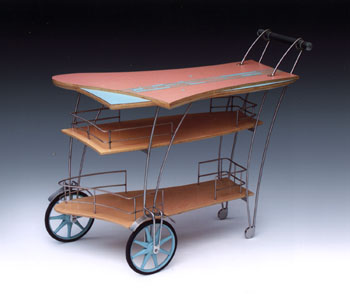
Dean Wilson, the head of the furniture design program at the Minneapolis College of Art and Design, has influenced several of the younger designers in the show. His work is known for its exuberant playfulness and adventuresome combinations of materials—wood, fiberglass, steel, aluminum, plastics, and rubber being only a few. His Cocktail Cart, a slightly loopy conveyance crafted from Baltic birch plywood surfaced in Miami colors of plastic laminate, has a frame and guard railings of welded stainless steel rod, and rubber Soap-Box Derby wheels. Cheerfully asymmetrical, a slightly drunken wheelbarrow, its wheels are offset from one another, not on the same axis. They can still, however, if asked, move together in a straight line. The railings are like those on the deck of a cruise ship, so bottles and drinks don’t fall overboard.
Every art form since Duchamp has been free to go off the deep end, and often seems driven by desperation to do just that. Furniture isn’t immune to the temptation, but even in its most mannered, experimental, and least traditional manifestations, it is so connected to the body that its tactility and essential humanness of form and scale cannot be obscured. Furniture is mute, but continually communicates its presence. Addressing such practical questions as what to sit on and where to store things, furniture is there all the time, at the edge if not the center of your senses, subliminal but profound. The work in this exhibition illustrates that for these 16 artists and designers, furniture’s limiting factor—the necessity that the work function—frees them to create art that people can touch.
This essay appears in the catalog for Functional Sculpture and is reprinted here by permission of the author and the Carleton Art Gallery.