ABCs for You and Me (The letters and labors of Chank Diesel)
Writer and design maven Jake Nassif profiles Minnesota-based font guru Chank Diesel with an engaging look into the strange (and strangely compelling) world of modern typography
You could be forgiven for thinking fonts aren’t fun. An ancient and esoteric craft, typography exemplifies the hard ideals of clarity and consistency, imbuing the printed word with authority and stripping it of the messy irregularity of handwriting.
You’ll find a dozen paths to typographic conformity on a standard PC, from the machined refinement of Helvetica/Arial to the tweedy legibility of Times New Roman. Only the softheaded Comic Sans affords the average user the semblance of a human touch, which explains its dominance in grade school handouts and cheesy café menus.
But where do you go for type that’s both thoughtfully designed and unabashedly expressive?
It’s in this gap that Chank Diesel, one of the world’s best-known type designers, has made a name and a living. Chank (legal name Chuck Andermack) has devoted much of his 20-year career to affirming the role of humanity in design, one alphabet at a time. The colloquial, handmade feel of his work reflects local inspirations and personal passions in an impersonal world. Featured in the Smithsonian’s collection and on the pages of the Wall Street Journal and the New York Times, Chank’s creations have inspired countless designers, from amateurs to titans of global commerce, to loosen up their aesthetic.
Though he’s a member of the typographic elite, both Chank and his work are distinguished by a conspicuous lack of pretension. “I’ve always been about getting non-professionals involved. 95-percent of users are recreational, and I try to reach as many of them possible,” says the self-dubbed American Alphabetician. “I give people the tools to design things differently. If I’m lucky, they keep coming back.”
Birth of an Alphabetician
Like his body of work, Chank Diesel’s career is the product of organic development. While studying fine art at Macalester College, he began experimenting with type in his role as the creative director for the music magazine Cake. The loose, dirty look of grunge music culture became the signature design style of the early ’90s, something Chank helped pioneer through typefaces tailor-made for the music posters and CDs of the era. Inspired by requests from admiring designers, Chank used the magazine as a showcase and marketing vehicle for his new fonts. With some 20 typefaces to his credit, Chank pitched his wares to the record labels he met through the magazine. He filled orders via floppy disk.
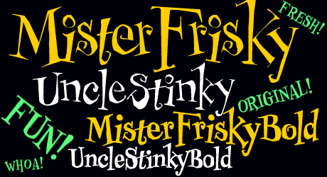
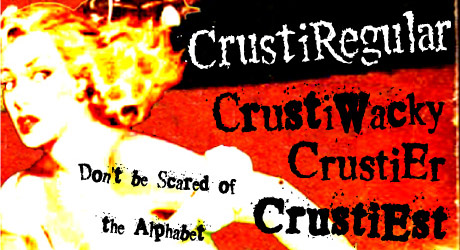
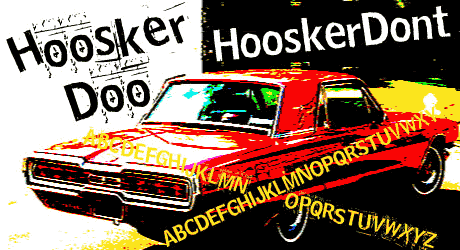
The work was idiosyncratic from the start. Mister Frisky, Chank’s first font and still his most popular, is a jaunty, off-kilter tangle of handdrawn forms, equal parts wacky and spooky. (The font has found its way onto Barbie merchandise, countless Halloween promotions, and Taco Bell wrappers, most notably). The Crusti and Hoosker font families, designed in 1993 and widely copied, are full of distressed, smudgy letterforms created by repeated Xeroxing, a scrappy rebuke to the perfection of classic type.
In 1997, with the price of paper skyrocketing, publishing Cake became impractical. Then technology intervened. On the Internet, “you could take your product and show the whole world,” explains Chank. “Make a font once and sell it as many times as you can.” With the launch of Chank.com, he settled into the business and became a typographic institution.
The Font Factory
Twelve years later, Chank Co is a small, independent affair. Chank makes and sells fonts from his home in Northeast Minneapolis with his business manager/spouse. He’s grateful for his enviable run of self-employment. “It’s amazing what a person can create alone. You have a good idea, you put it out there and people help you make it happen.”
Designing type is not a small undertaking. Chank’s free fonts are comprised of 256 individually rendered characters, but that’s just the tip of the alphabet. Fonts for global companies can involve the creation of over 1,000 characters, marks and symbols for a single typeface (thanks largely to the languages of Central and Eastern Europe). Multiply that by 20 weights or more to round out a complete “family.”
On the Internet, “you could take your product and show the whole world,” explains Chank. “Make a font once and sell it as many times as you can.”
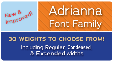
The Chank Co library includes over 300 complete sets, from exuberant display fonts to versatile and understated faces like Adrianna, which includes 30 weights from Light to Extra Bold Italic. Creating a family like Adrianna is a long, meticulous, and repetitive process. Such a painstaking endeavor, at first, seems at odds with the spontaneity Chank brings to his work; but an openness to outside input and collaboration, he says, keeps the job fresh.
By the People, For the People
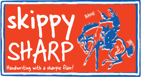
“My main directive has always been listening. Once you’re out there, people write in with ideas and ask for things.” Capitalizing on the best ideas that come his way (and tireless efforts to expose new audiences to his work) has fueled Chank’s success. Regular requests to create fonts out of somebody’s handwriting led Chank to launch Go Font Yourself in 2006. For $200, your penmanship is immortalized by a renowned type designer, and Chank keeps the rights to use the resulting font as he likes. “I wanted to see a more human element in design,” says Chank. “With my handwriting fonts, it’s magical how something dirty and organic can be used in the computer, how it becomes a tool you keep using.”
It’s a deal that can bring delightful surprises to the customer, as when Chank’s friend Skippy discovered his own handwriting on Starbucks scones and Skittles wrappers. “Skippy tries to tell people at Starbucks, ‘look it’s my handwriting!’ No one believes him.” Last August, GFY fonts appeared in full-page newspaper ads for Microsoft Vista, intended to evoke the multitude of customer personalities and needs.
Putting the tools of type design into the hands of students and professionals is another part of Chank’s M.O. He enlivens his regular speaking engagements with font-making workshops to engage his audience in a hands-on way. In a typical workshop, Chank assigns each participant a character, then they all gather source material from the immediate environment. This summer, Chank and the Las Vegas chapter of the AIGA created Atomic Vegas Seasnakes, a font made from twisting strands of glow-in-the-dark plastic jewelry. “Cheap Chinese imports like these flow into Las Vegas. And they look like neon.” At a summer workshop in Northern Minnesota, designers built letters from found bits of nature with inspired results. “People were using flowers, leaves, sticks. I didn’t know if it would turn out, but it ended up very Victorian—fancy and frilly.” For another Minnesota workshop, Chank had students sculpt an alphabet from the region’s most abundant resource: snow.
Local Color
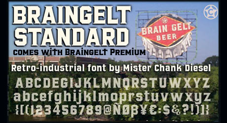
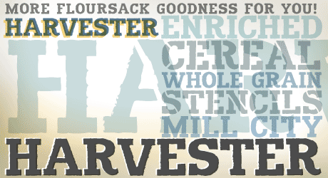
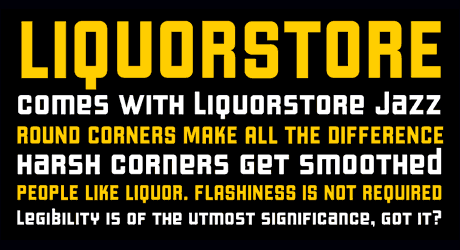
Like his workshops, Chank’s fonts draw on the inspiration at hand, in many cases the rich typography of his adopted hometown. The font BrainGelt is based on the Grain Belt Brewery sign by the Hennepin Avenue Bridge. Liquorstore is adapted from handpainted signage in Northeast Minneapolis (with a little LIFE magazine logo thrown in). “There’s still a lot of stuff around town worth doing. I recently created the Ceresota Flour font, from the building off Washington Avenue downtown. There’s Murray’s Steakhouse. I always wanted to do Nye’s Polonaise.”
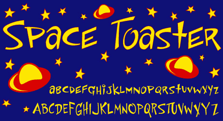
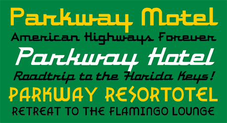
Chank’s fonts draw on the inspiration at hand, from the rich typography of his adopted hometown to design elements remembered from his childhood in Florida—”that sun-soaked style, roadside attractions, little hotels, Disneyland”—which show up in retro, space-age fonts like Parkway and Space Toaster.
Elements from Chank’s childhood in Florida—”that sun-soaked style, roadside attractions, little hotels, Disneyland”—show up in retro, space-age fonts like Parkway and Space Toaster, among others.
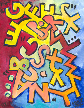
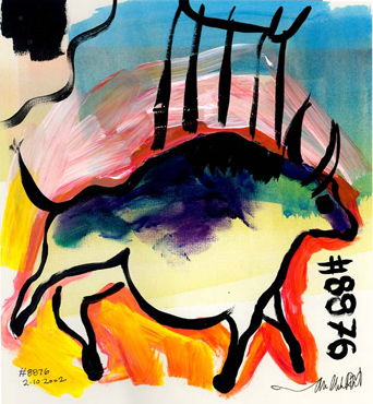
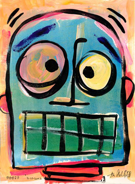
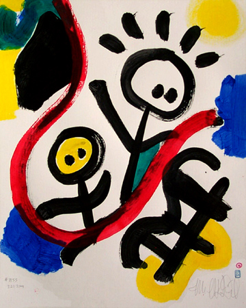
Fittingly, Chank has had an effect on the local landscape as well. A lifelong painter, his brightly colored pop-art murals adorn several Twin Cities walls, including the Creative Lighting store off I-94 in St. Paul and Uncle Franky’s in Minneapolis. On a smaller scale, Chank’s artistic legacy includes over 15,000 paintings (he’s abandoned his goal of topping Picasso’s lifetime record of one million). By his own reckoning, Chank has earned a respectable living through his fine art alone, which he currently sells through eBay and a handful of events. Though his yen to paint has subsided in recent years, evidence of his prodigious output lingers. “That’s the frustrating thing about being an artist,” he laments. “People buy all the good work. You’re left with the mediocre stuff.”
The Last Letter
How long can a one-man type machine keep cranking? “I feel like I’m approaching a saturation point with my font making,” Chank admits. His popular Font of the Month Club will soon come to an end, after 11 years. “I’ve done over a hundred monthly fonts. It kept me on a regular schedule, but I want to change that.”
Indeed, with all Chank has accomplished in typography, he should be weary. But type, like the man himself, seems an inexhaustible resource. “I want to create a serif book font, which could take ten years. It’s very painstaking: it needs to be highly legible and comfortable, for when you’re reading a long book.” Chank continues, “It’s a big task—much more challenging than a font made out of pine cones.”
If he ever does turn away from type, it’s unlikely Chank will veer from the spirit of fun and populism that have animated his work for two decades. “I love doing the public art. Now I want to use recycled materials to make sculpture for playgrounds. That’s the next frontier. I’ve only done one for my backyard, but it’s so cool.”
About the author: Jake Nassif is a freelance writer, artist and design enthusiast based in Minneapolis.